
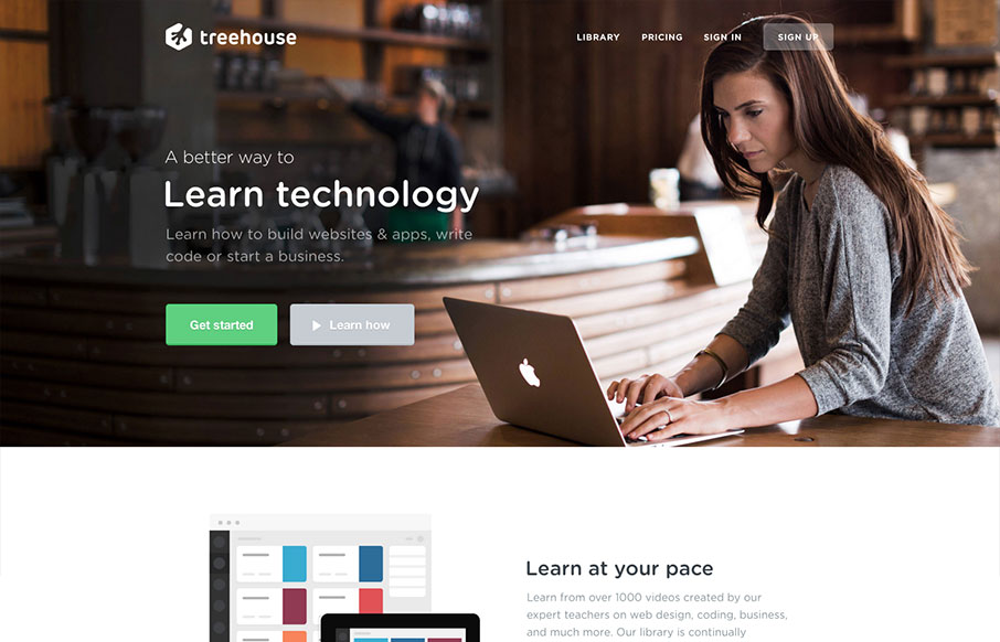
Newly updated design for Treehouse. The design is incredibly focused and direct yet at the same time the photography and illustrations are open and inviting feeling. The color palette also plays on the essence of making you feel relaxed. Good responsive work here too, particularly the way the main image scales – keeping the image focused properly across mostly all device widths.


Fitts’s Law: Why the Easy Button Wins
Large, close targets are faster to hit than small, distant ones, that’s Fitts’s Law. A look at the 1954 rule behind buttons, prime and magic pixels, thumb zones, and dark patterns.


I like your point about it being well focused. The new design feels much more grown up and “premium” than the previous one which I’m guessing is the direction they are taking.