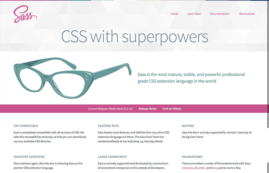
The new Sass site! It’s what you’d expect, good quality simple design. The new logo is quite nice, very succinct and direct, it’s a good mark. Nice illustration of the glasses too. This site has to do so much, it has to be easy to read through, fast to get to and perform well across the board – I don’t envy the team that took this project on, good work guys!


The Call to Action, Revisited
The Call to Action hasn’t changed in a decade, but the bar has. A fresh look at prominence, copy, mobile tap targets, and accessibility, with lessons from three major design systems.


0 Comments