
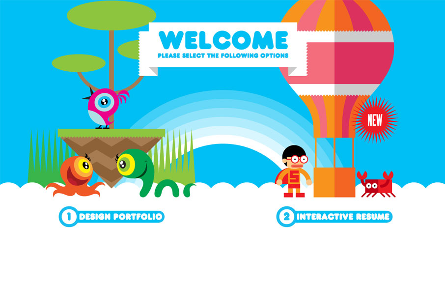
Both his portfolio and resume are cool, but mainly go check out the resume page of this site. Fantastic stuff. This is a really neat take on a single page website design that employs scrolling as primary navigation across the site. Great illustration work and cool narrative based on what you’d expect to get from a normal text only resume but delivered in a way that’s completely immersive and memorable. Hire this man.


Fitts’s Law: Why the Easy Button Wins
Large, close targets are faster to hit than small, distant ones, that’s Fitts’s Law. A look at the 1954 rule behind buttons, prime and magic pixels, thumb zones, and dark patterns.


Are you kidding? It’s a usability nightmare! You get cramp just trying to find out what job experience he has.
Disagree entirely…
I think it’s a great way to show off and get noticed. If you can’t do that on your own site where can you? It’s well executed too. Having said that, John makes a good point – it’s a nightmare to anyone wishing to just get the information quickly and especially if you want an overview. Feels to me like a quick fix would be to add a “lighter” option to the main site – this could even just be a pdf or simple html page. There’s a pdf on the design portfolio page but not on the interactive resume. Interesting discussion!!