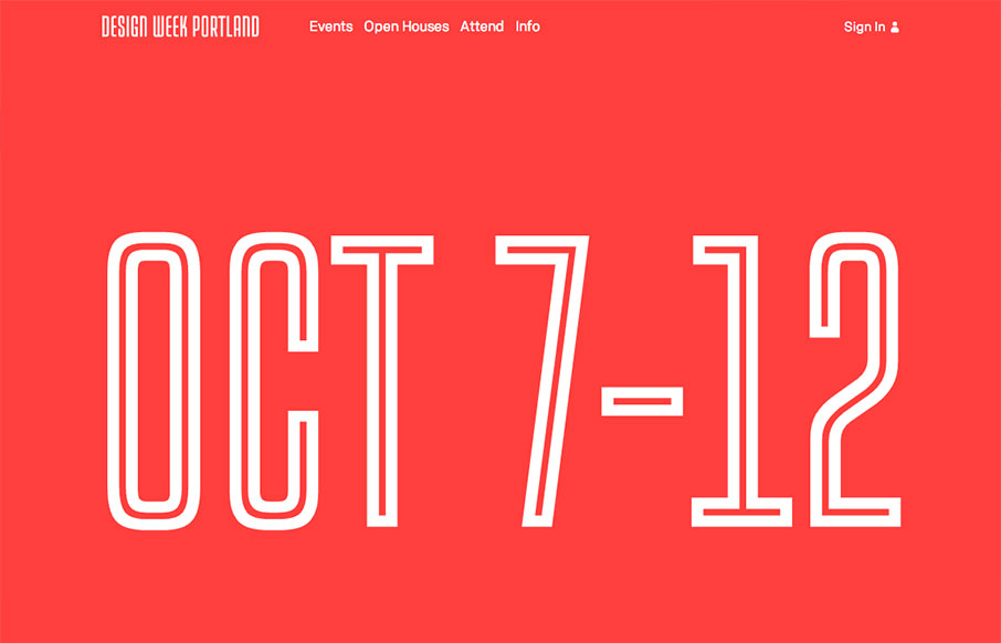
I love the Design Week Portland 2013 site design. The way the images flow through in the main image area as you scroll down the page is a very cool interaction. Taking your mouse away from the area makes the image disappear as well. I like the rest of the layout too, it’s much denser content wise than the top half which is natural and effective.


The Call to Action, Revisited
The Call to Action hasn’t changed in a decade, but the bar has. A fresh look at prominence, copy, mobile tap targets, and accessibility, with lessons from three major design systems.


0 Comments