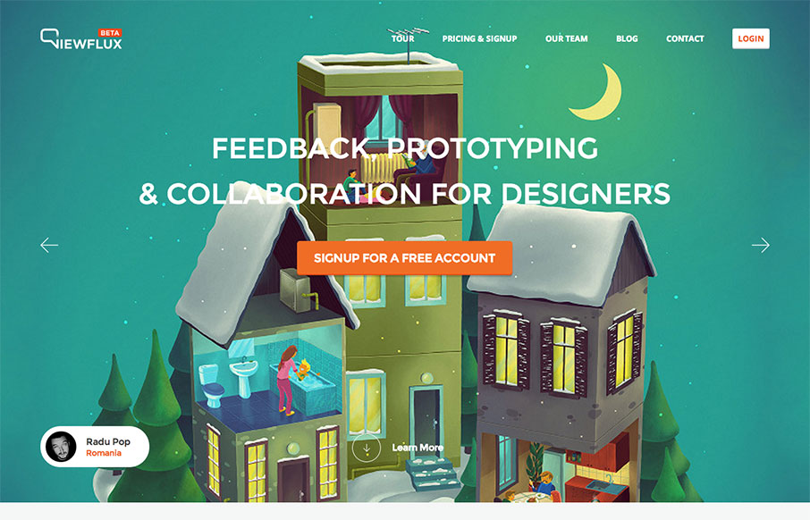
I like the implied simplicity of the viewflux site design. It starts off with large photos in a slideshow which seem noisy visually but then it tapers off into some really nicely done grid layout and easy to read copy design. I particularly dig the way the tour page is designed the most.


The Call to Action, Revisited
The Call to Action hasn’t changed in a decade, but the bar has. A fresh look at prominence, copy, mobile tap targets, and accessibility, with lessons from three major design systems.


0 Comments