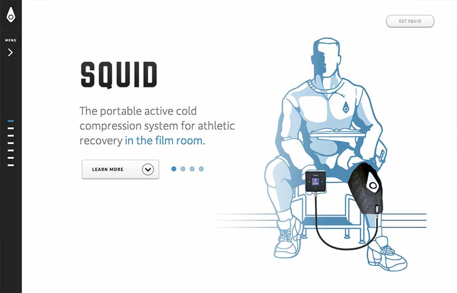
I like a simple approach, the Squid website does just that. Basically working much like a keynote/powerpoint slideshow – which is really all it needs to do in this instance. The navigation works pretty well, with the down arrow at the bottom and the different highlighted “dots” for when you’re on a specific section. Slide the nav more open and they have labels for the sections. Beautiful illustrations and renderings of the product too make the page really come to life.


The Call to Action, Revisited
The Call to Action hasn’t changed in a decade, but the bar has. A fresh look at prominence, copy, mobile tap targets, and accessibility, with lessons from three major design systems.


0 Comments