Web Design Inspiration Curated
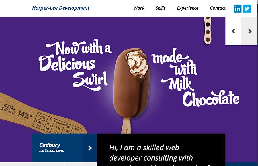
Harper-Lee Development
No - not that Harper Lee (who is releasing the sequel of To Kill a Mockingbird this year) - but Martin Harper-Lee is doing some pretty decent work too. Like how the home page has no scrolling, and instead of a traditional slideshow, he has used canvas to give an...
Black Pixel
I have a new weather app because of the Black Pixel agency out of Seattle, Washington (The Funny or Die Weather app from Will Ferrell's company). Black Pixel did the redesign. They also redesigned their website, which is pretty awesome, design-wise, and every other...
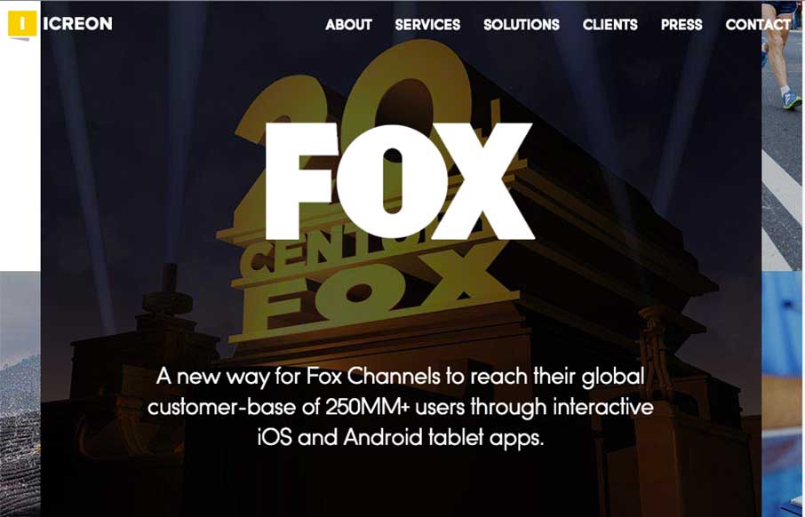
Icreon Tech
I really dig the main hero area, the 'masonry' type layout and animation for the imagery. Solid design and overall organization too. Working with marketing, operations, sales, and of course the design team - we designed a website that is 100% focused on the user. From...
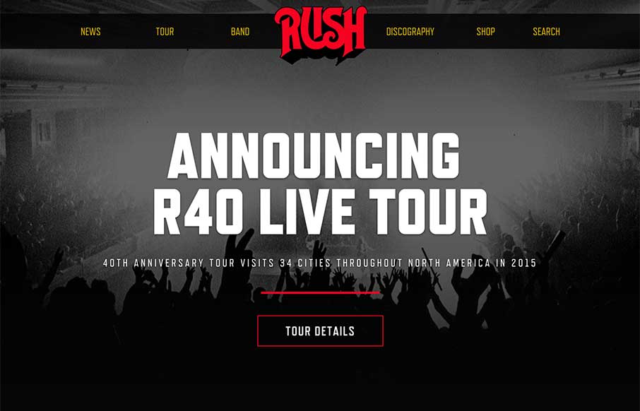
Rush
Pretty dang nice website for a classic band. I love the header/logo and how it moves a bit as you scroll. It stays "maximized" as you make your way past the hero image area and then gets much smaller as you go past it. Smart stuff. There's other little movement and...
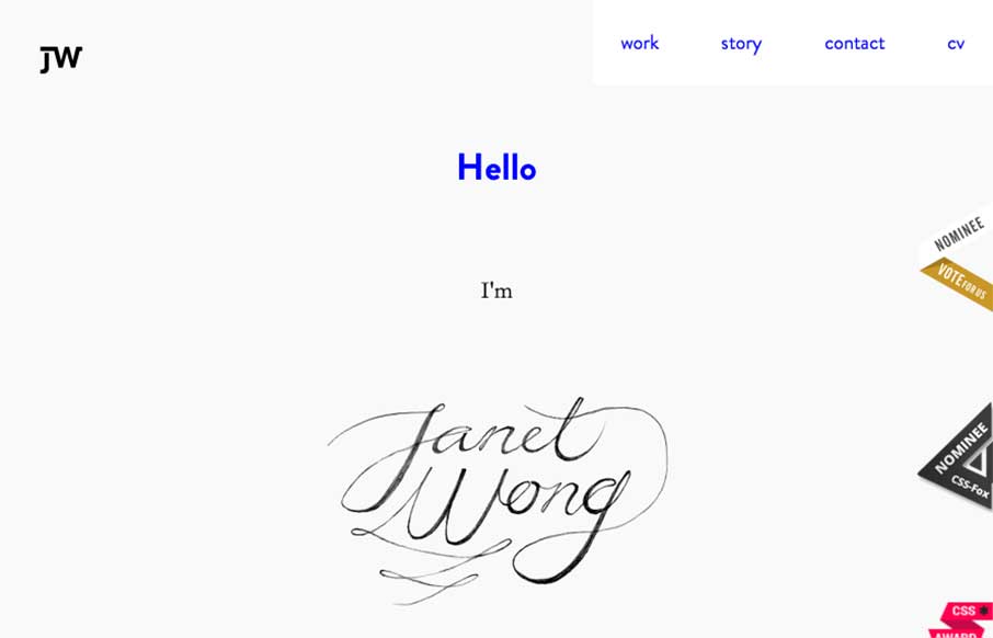
Janet Wong Portfolio
Pretty cool stuff going on with Janet Wong's portfolio site. I actually enjoyed the loading animation and the way you move around the page as user, simple but with some little quirky things here and there. Check out her CV - interesting way of presenting yourself on...
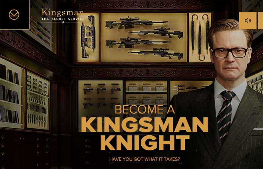
Become a Kingsman Knight
Man - Unit9 has done it again. This time with an interactive game / gamified trailer for the Kingsman Secret Service movie from Fox that comes out this weekend. It uses a combination of website / Google Street View / YouTube - and then a syncs with your phone to...
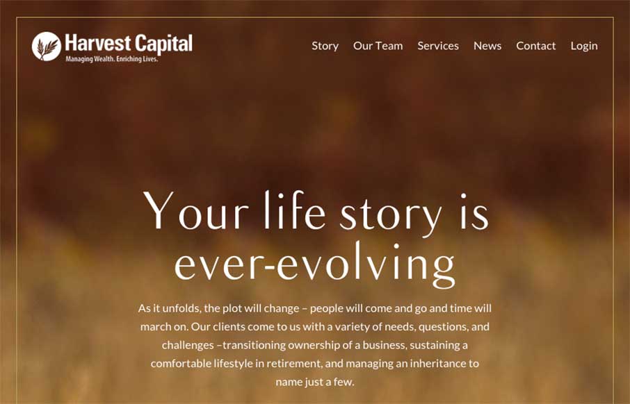
Harvest Capital
Interesting website here for Harvest Capital. I many ways I like the approach but have issues with it on other levels. I put it here in the gallery to hopefully get some feedback on it from you all. So, what do you guys think? Harvest Capital wanted to convey their...
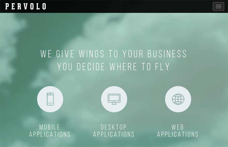
Pervolo
I like the monochromatic approach to the color and the simple line art icons give it a good vibe. I also like the way the header is treated visually as you scroll down a bit.
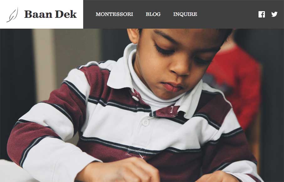
Baan Dek
Simple and straightforward the Baan Dek site is. I like the oversized imagery and the simple layout. Solid responsive design and minimal page count make this a pretty easy to digest website. Bravo for their brevity. Submitted by: Bobby George @baandek Role: Designer
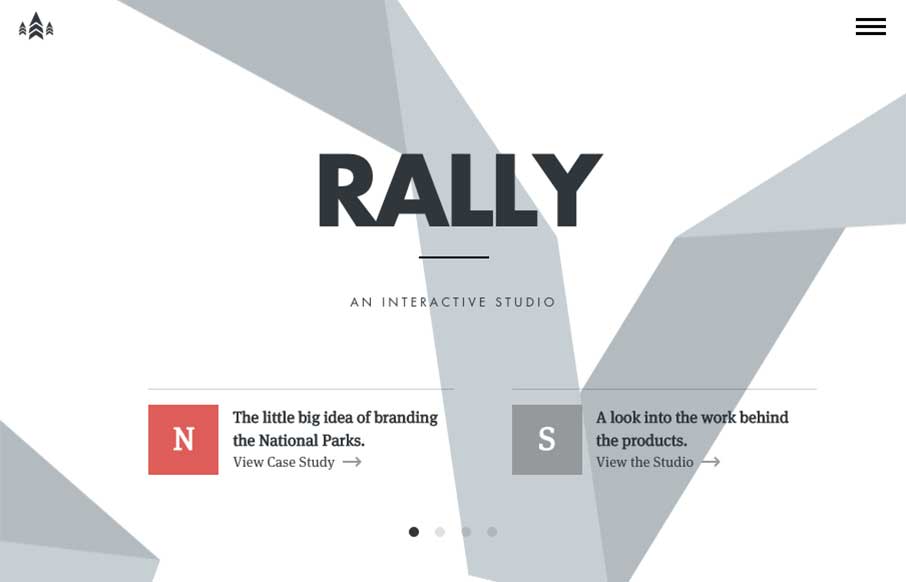
Rally Interactive
I love just about everything there is about the Rally website. The main "hero" area, not sure what to call this area anymore really, is super dope. The "ribbon" graphic is very nicely executed, even when you scale the screen down the ribbon stays relevant. I love how...
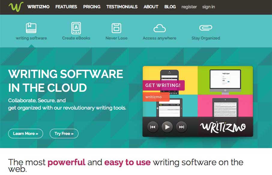
Writizmo
I like how Writizmo went with their main content in the hero area. The marketing messages / feature lists that a lot of web apps use are normally in a long scroll below the fold, or in a rotating barrage / slideshow that no one really looks at...( just sayin'). Get to...
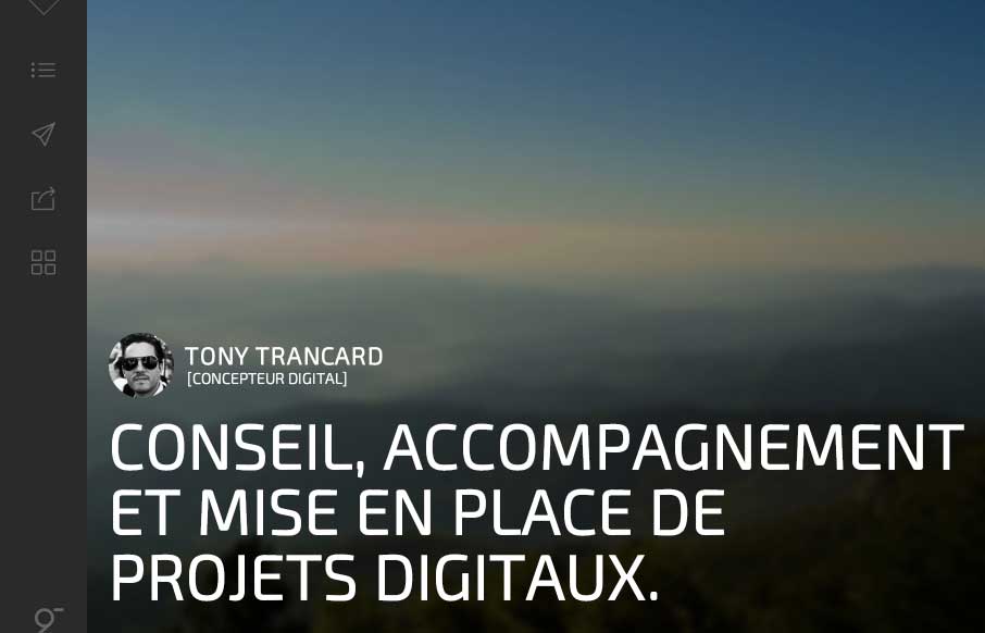
Tony Trancard
It took me a minute to get into Tony Trancard's portfolio site (out of France), because it was a little deceiving at first. The large image with the mostly text and gray below threw me off. But then I remembered that there was vertical navigation, and anyone that uses...
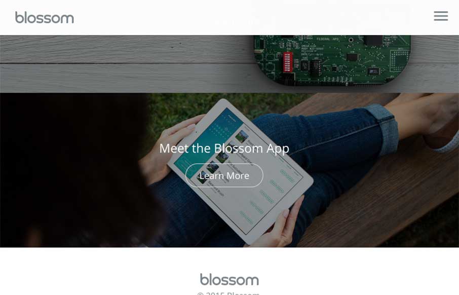
Blossom
I was reading back though an article we published about Web Design Trends for 2015, and realized that Josh Hemsley's company out of Californina, Envoy just produced a website, Blossom that fits in well with the upcoming trends: The Blossom site has great, vibrant,...
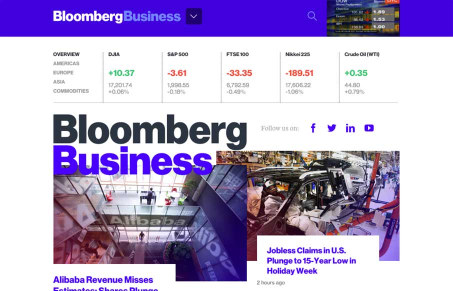
Bloomberg
I just mentioned to Gene that I don't even know where to start on this site review. Brad Weaver's tweet (below) kind of says it all of Bloomberg's (@business) new website - gorgeous and usable. There's already been so much praise and controversy over this new site...
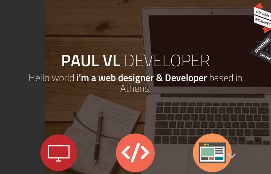
Paul vl
Good portfolio site from Paul VL out of Greece. Like the large fonts with white type on a different color palette than everyone else is using right now. Wish the work detail pieces were more than just a pop-up so you could see a little more of the quality of his work...
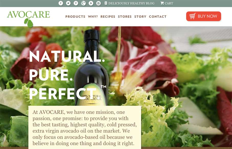
Avocare Avocado Oil
I've been actually eating healthier this new year, and keeping in tune with foods and products that fit into more of a "Paleo" lifestyle. Avocare Avocado Oil fits that for me (healthy fat) - must learn more about it for personal use. Professionally, I'm looking at the...
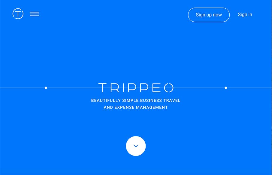
Trippeo
We reviewed the Trippeo site last year, pre-launch, and remembered it was pretty cool. So we're looking at it again today - even better. The SVG animation that's integrated with the video backgrounds and content areas give you a good idea of what the app is about -...
Creative Designs
Man that site is shiny, and twinkly. I like how Kurzik, out of the Ukraine has amped up the look and feel of their site with dark backgrounds and bright highlights. And I swear the video background is responding to me / my mouse - I know it's not.. but it's a cool...
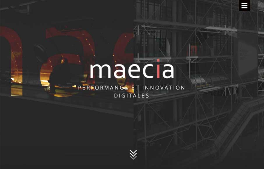
Maecia
Go ahead - click the hamburger icon... didn't expect that did you? Maecia, out of Paris has a great site that combines old and new, from the 1800's industrial line art to the animated svgs and video backgrounds and motion when you're not expecting it. The menu coming...
Kevin Haag – Portfolio
Yep - it's good. Kevin Haag is out of Los Angeles, and his portfolio site is out of site. The opening animation / parallax that happens on scroll is pretty awesome. There are some sites that I feel that should have a soundtrack or background music (in your head), and...
EMAIL NEWSLETTER
News & Articles
BizCraft Episode 8 – Live at WebAfternoon
 Episode 8 of the BizCraft podcast with Carl Smith and Gene Crawford. Recorded live in front of people at WebAfternoon in Charlotte on September 22nd.
All About Responsive Design – Ep.80
 This UMS Video Podcast is all about Responsive Website Design. We take a look at a few great responsive sites, review some RWD workflow and talk with Dave Rupert of Paravel about how he does things.
Draft Episode 06: Good Artists Borrow, Great Artists Steal
 Draft is a podcast about the craft of designing for the web, in this episode we take a look at that all time greatest quote by Steve Jobs, or was it really him…

HARD WORK. CLEAN FUEL. NO EXCUSES
Use “WARRIOR2023″ for 10% off.