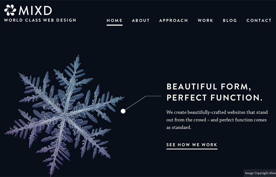
This is from the Mixd design house out of North Yorkshire, UK. I like how each page has it’s own initial background color, while still keeping the same aesthetic throughout the site. Also like that they must maintain the site and switch out the home page, that is a lead in to everything else. When I first checked the site out a few weeks ago (yep, we have a lot of great site sumissions to go through), the home page looked like this:
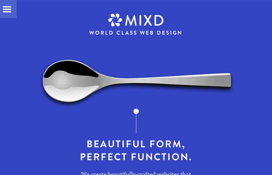
Either way – I like the message of “Beautiful Form, Perfect Function” – keep it up!


You have a great combination of message and image. The only drawback in my opinion is the small copyright notice on the front page.