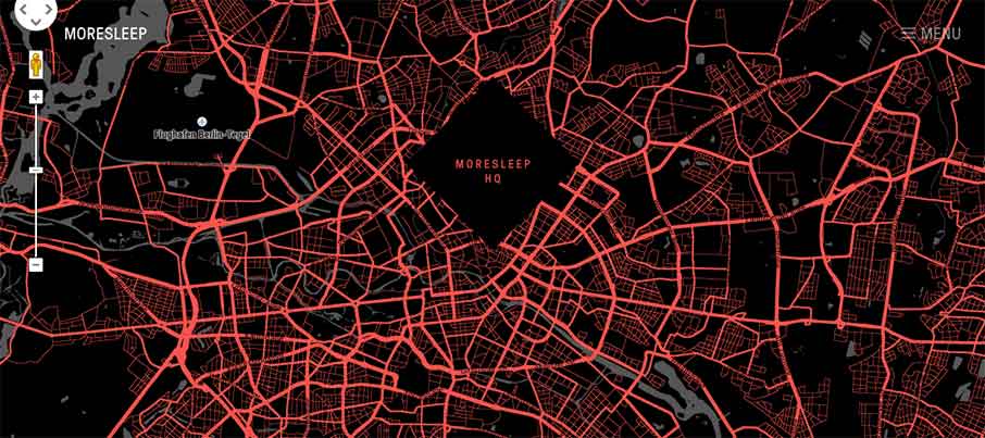
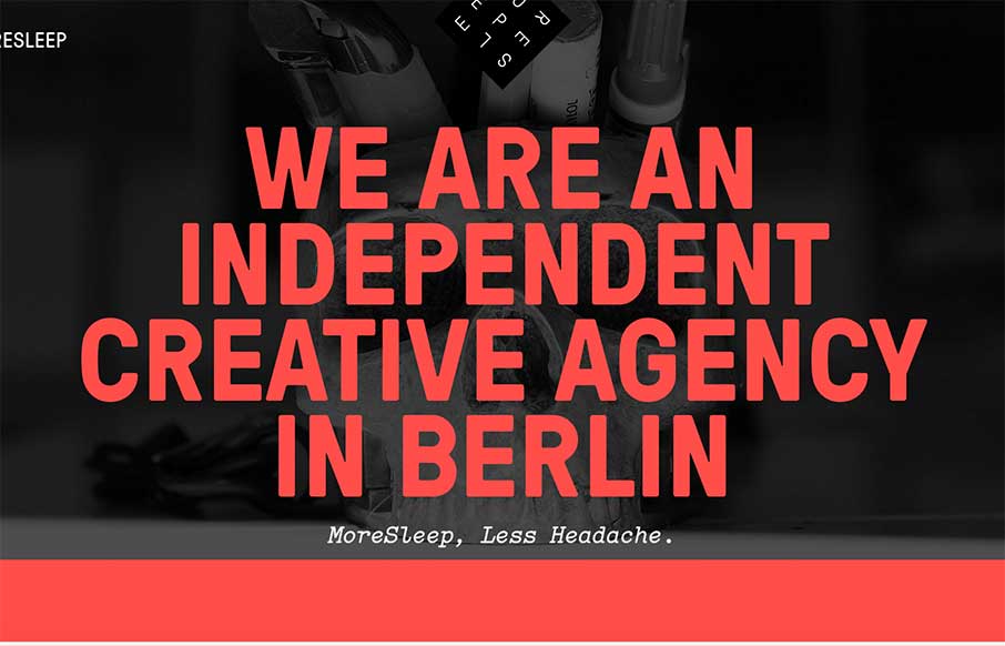
“More Sleep, Less Headache” – we should all be so lucky! The MoreSleep web design agency out of Berlin, Germany is promising that. Based on their website and portfolio of work, I would have to say “das ist richtig”. Like the off screen menu actually produces a horizontal nav sticky header. Considering they have a lot of large images around the site, it makes good sense to do nav this way. The portfolio area are good case studies – and really like the Google map color treatment on the contact page – sehr gut und gute Nacht.


Fabulous work in clarity, smoothness,creativity sound good performance !