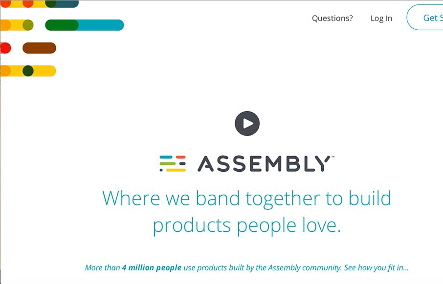
Really cool concept here with Assembly – looks like a crowdsourcing site directed toward different design / development products, with shared revenue for participants. Love the white space with color accents. Interesting how the sticky header comes out when you scroll back up so that it doesn’t interfere with the animation that happens as you scroll down.
Glassmorphism: The Transparent Design Trend That Refuses to Fade
Glassmorphism brings transparency, depth, and light back into modern UI. Learn how this “frosted glass” design trend enhances hierarchy, focus, and atmosphere, plus how to implement it in CSS responsibly.


0 Comments