Web Design Inspiration Curated
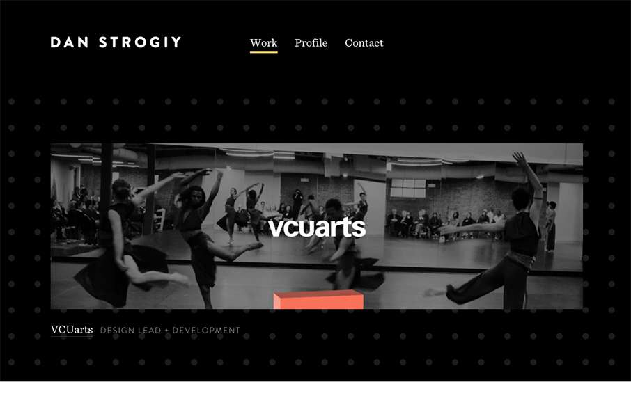
Dan Strogiy
Rather minimal layout overall but there's enough here to be visually striking. Strong work across the board. I like the background image and how it scales based on the screen width you target as well. Smart.
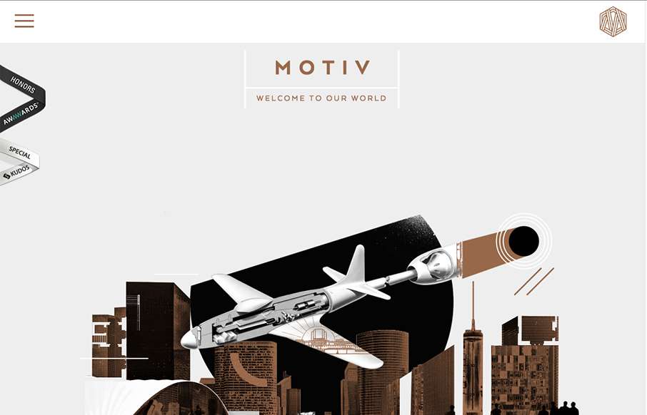
Motiv
Sometimes architect's websites can be crazy and very "flash" like. Remember that? I'm still seeing things like that, particularly in this industry for some reason... The Motive site skirts the line with the page loader on each section and the atypical layout scheme....
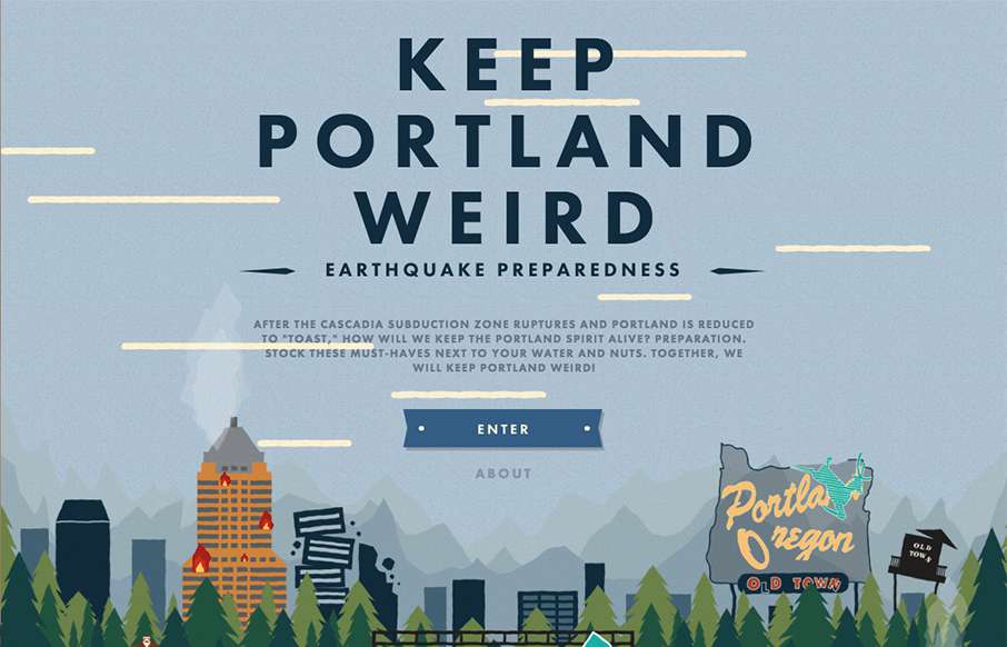
Keep Portland Weird
Great intern project site (with oversight) from the folks at Oblio out of Portland - based on what to do when the earthquake comes to destroy their city... Love the line in the About section: "The earthquake may take away our electricity, but it will never take away...
Diyanshu
Pretty standard approach but made interesting by doing things a little bit different. I love the way the hero image/area slides up in an animated manner as you scroll, that was surprising and I liked it. I also really like the way they are displaying the work images,...
Sunday Grind
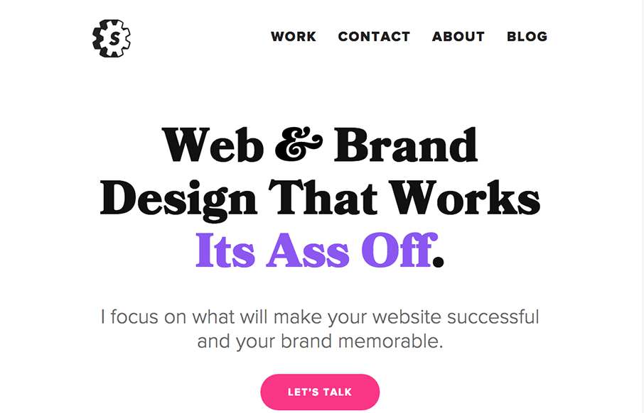
Simple yet powerful visuals and text make this website stand out to me. I love the headline and I love the typography. The way the work samples are presented are visually bold and lead you down the page scrolling for more.
Fable&Co
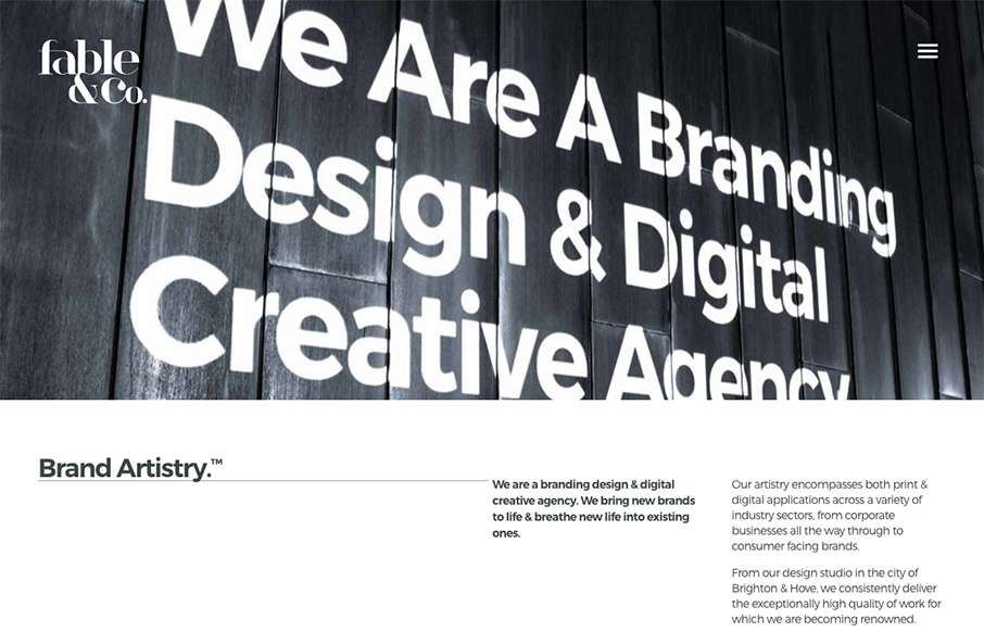
I really love the big images used on the home page for the work samples, I also love the way the images slightly zoom in as youm mouse over them too. Overall the design has a such a great vibe and comes off feeling very cool. There's a rather interesting visual moment...
Norwegian Airlines
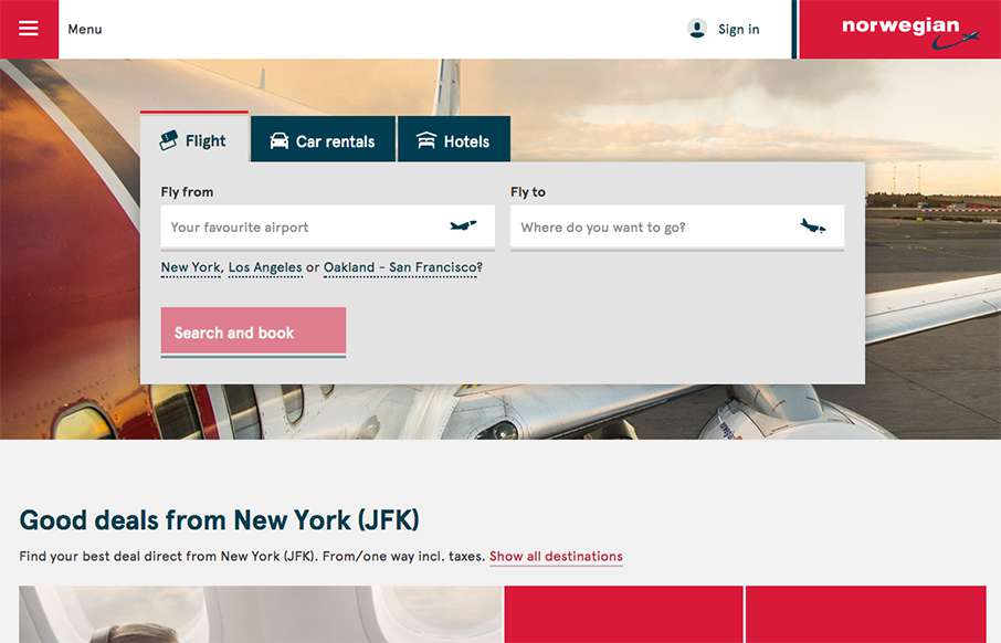
Our opinion of restaurant sites is usually like our opinion of airline sites - they generally stink. That's why it's refreshing to see Norwegian Airlines' site. It's clean, and simple, and functional. They've taken a lot of the business out of the home page, and put...
Modsy
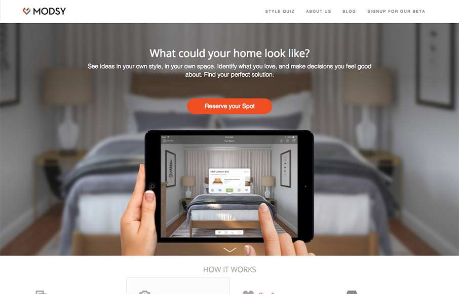
The product looks pretty stellar and the website matches it quite well. I dig the simplified lines and approach to the layout. The slider being place down lower on the page scroll is well placed and timed too.
Flatiron
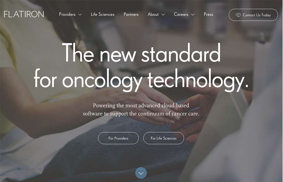
Very nicely done business oriented website here. It's enterprise-y in all it's glory but also very slick and not busted. I love the way the main nav changes color to indicate state on the page. Then when you hit the section as you scroll that walks you through the...
Google Ventures
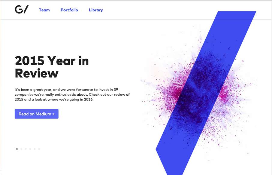
Another stunning version of the Google Ventures website. I love the slight parallax on the main imagery paired with the overall minimalism. The new logo is quite nice as well.
The Forecaster
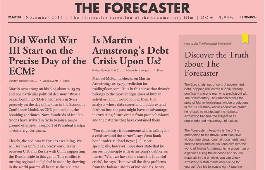
Have you ever watched a movie (documentary or historicalish fiction), and wished you had some extra insight into the background of the film? Well, for The Forecaster (see info below - and, well the website attached), they've done just that. It has a Financial Times...
Radar #121
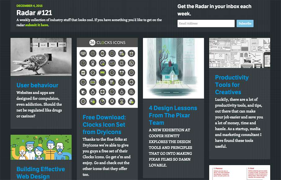
Each week, we do a round up of curated "stuff from the interwebs" that we call Radar. In this week's 121st Radar: User behaviour Websites and apps are designed for compulsion, even addiction. Should the net be regulated like drugs or casinos? Free Download: Clocks...
NJ(LA)
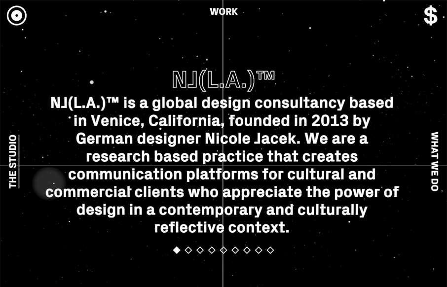
um... wut? Crazy, but cool site from Nicole Jacek out of California - be careful clicking on the circle on the top left with your headphones on... or off. Enjoy some experimental stuff!
Circles Conference 2016
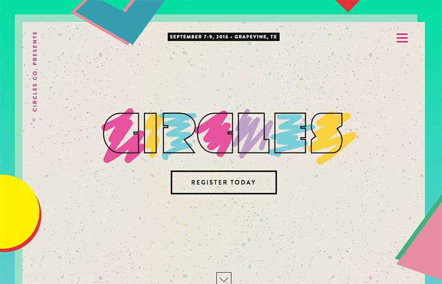
Arrrrgh - it's killing me - I've been trying to figure out / remember for the past two days what album cover that the Circles Conference is pulling their hero image from... at least I think it's an album cover - I'm doubting myself more and more on this over the week...
Sandows
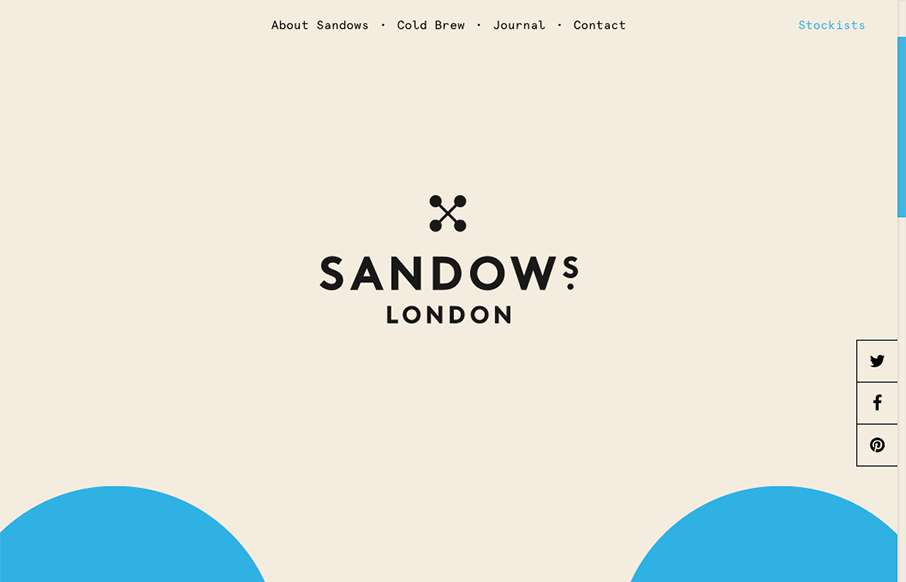
Super cool scrolling image in the background of the site, turns out it's the logo too. Pretty solid. I love the minimal yet engrossing vibe of the site. If only I could try this coldbrew!
Morphix
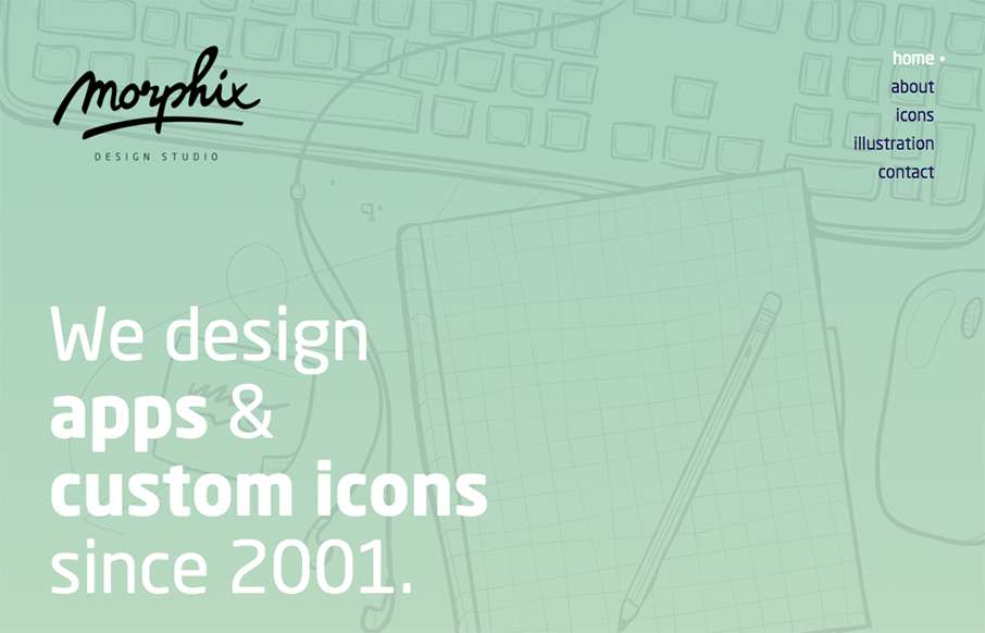
Pretty nice soft yet solid vibe for the Morphix Studios website. I love the illustration work across the site and the simple layout details make me smile. From the Designer: Website of a design studio, based in Slovenia, Europe. We're specialized in product design...
Y Collective
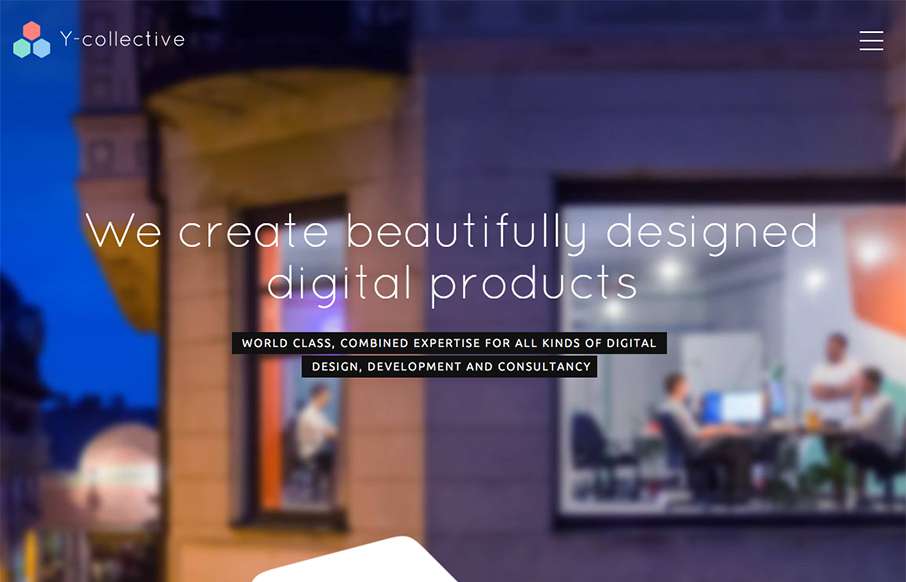
Really cool layout and detail work for the Y Collective website. I love the honeycomb stuff and the load in animations on the different sections of the home page. Bravo on this design guys! From the Designer: When I have created logo, I decided that I will use the...
El Burro Oslo
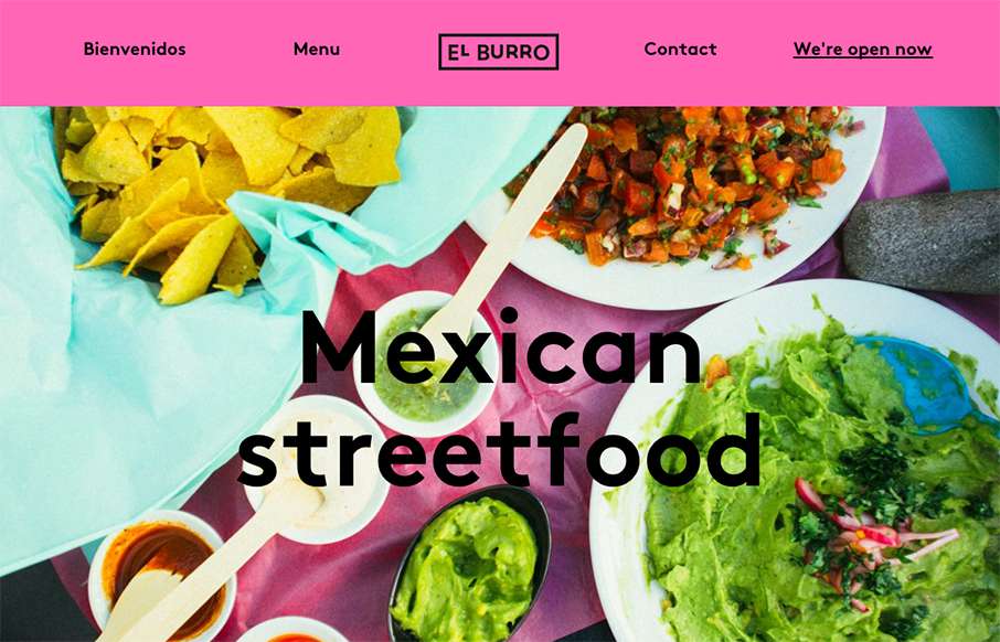
Tacos in Oslo.. yep. When I lived in Australia, getting Mexican food was always hit or miss - so hope El Burro's food is as good as their website. BTW - this is a great one-pager for a restaurant (which we've said before... restaurant websites usually stink). I'm not...
This Also
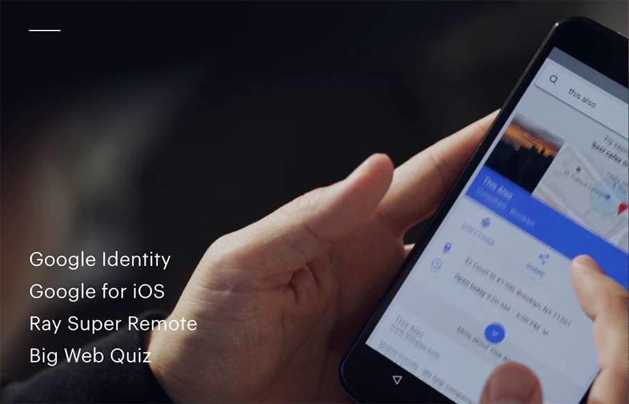
Awesome site from This Also out of Brooklyn. Great home page with video background - great use of navigation that is hamburger, but it's not - and great way of each page always leading back to the home page, but it's also the footer, that's the home page... cool.
Leandro Lima
Leandro Lima, out of Barcelona has some great work highlighted here - especially the illustration side of the site. I also like the look and motion of the hamburger drawer on the left.
EMAIL NEWSLETTER
News & Articles
HARD WORK. CLEAN FUEL. NO EXCUSES
Use “WARRIOR2023″ for 10% off.

