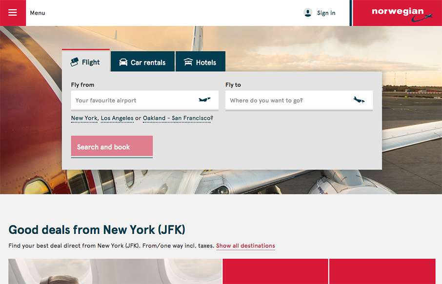
Our opinion of restaurant sites is usually like our opinion of airline sites – they generally stink. That’s why it’s refreshing to see Norwegian Airlines’ site. It’s clean, and simple, and functional. They’ve taken a lot of the business out of the home page, and put it in the hamburger drawer menu, so you can concentrate on the thing you need to really do – find a flight – nice.
Glassmorphism: The Transparent Design Trend That Refuses to Fade
Glassmorphism brings transparency, depth, and light back into modern UI. Learn how this “frosted glass” design trend enhances hierarchy, focus, and atmosphere, plus how to implement it in CSS responsibly.


0 Comments