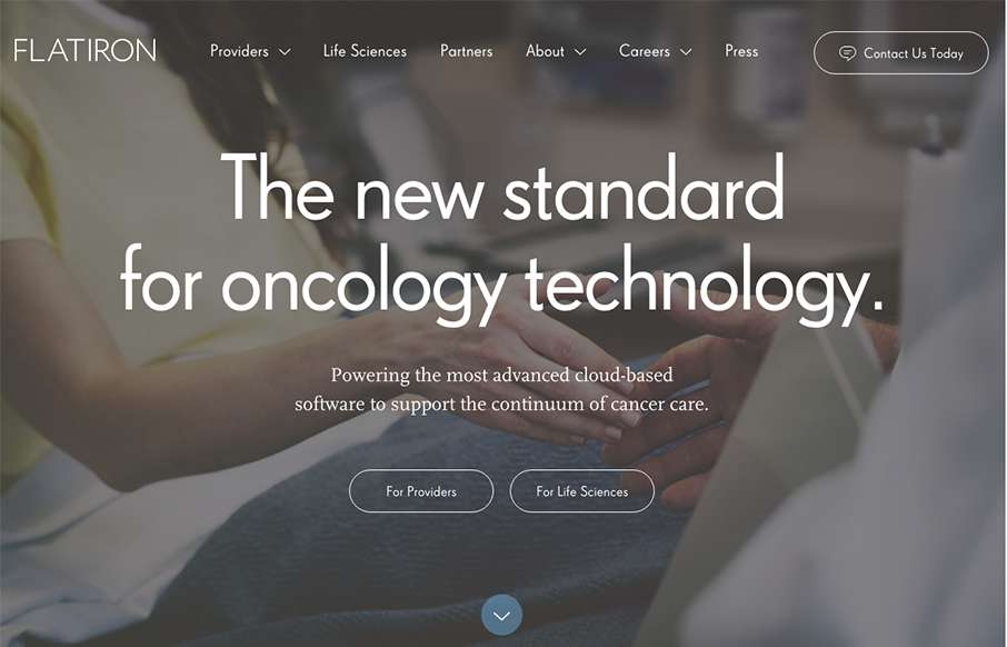
Very nicely done business oriented website here. It’s enterprise-y in all it’s glory but also very slick and not busted. I love the way the main nav changes color to indicate state on the page. Then when you hit the section as you scroll that walks you through the screens is nice.
Glassmorphism: The Transparent Design Trend That Refuses to Fade
Glassmorphism brings transparency, depth, and light back into modern UI. Learn how this “frosted glass” design trend enhances hierarchy, focus, and atmosphere, plus how to implement it in CSS responsibly.


0 Comments