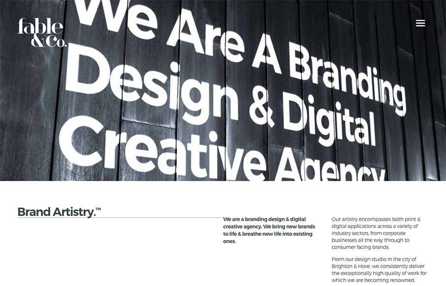
I really love the big images used on the home page for the work samples, I also love the way the images slightly zoom in as youm mouse over them too. Overall the design has a such a great vibe and comes off feeling very cool.
There’s a rather interesting visual moment here on the page, when you scroll down and see this case study and the dueling hamburger menus confuse you a bit out of the corner of your eye.
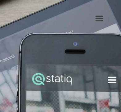
They mitigate this really well by having the menu open just by hovering over it and not just a click though. Good idea.


0 Comments