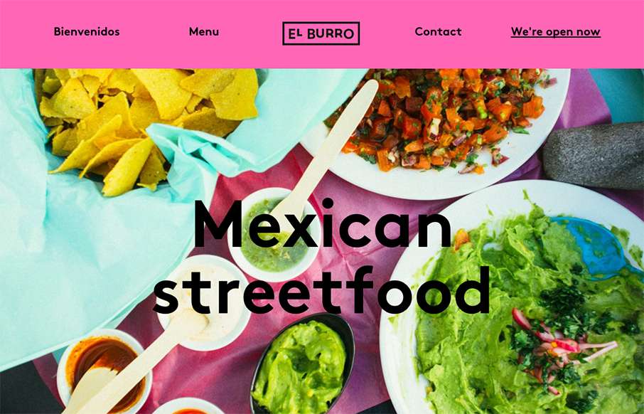
Tacos in Oslo.. yep. When I lived in Australia, getting Mexican food was always hit or miss – so hope El Burro’s food is as good as their website. BTW – this is a great one-pager for a restaurant (which we’ve said before… restaurant websites usually stink). I’m not usually a big fan of gradients – but this one (on the menu area) has such a gradual fade that it feels a little magical… yep – time to get coffee – but it’s pretty cool.
Glassmorphism: The Transparent Design Trend That Refuses to Fade
Glassmorphism brings transparency, depth, and light back into modern UI. Learn how this “frosted glass” design trend enhances hierarchy, focus, and atmosphere, plus how to implement it in CSS responsibly.


0 Comments