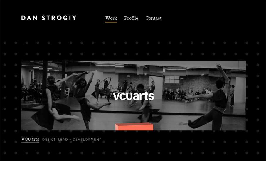
Rather minimal layout overall but there’s enough here to be visually striking. Strong work across the board. I like the background image and how it scales based on the screen width you target as well. Smart.
Glassmorphism: The Transparent Design Trend That Refuses to Fade
Glassmorphism brings transparency, depth, and light back into modern UI. Learn how this “frosted glass” design trend enhances hierarchy, focus, and atmosphere, plus how to implement it in CSS responsibly.


0 Comments