
Web Design Inspiration Curated
RCI UK
Submitted by Nathan Reed, Developer. This site has one of the wildest background images i've seen used. It's crazy. But the point here is that once you lose that background image the design becomes fairly normal and predictable, the background really adds the life the...
shawnjohnston.ca
This site uses real world elements very well, I always like it when sites do that. All the hand lettering is really cool too. Probably the most interesting pages on this site to me are the form pages, contact me and get a quote. The hand created treatment around each...
vacationrentalstation.com
I've seen a lot of rental & real estate websites, we get them as submissions by the hundreds, this one really stood out to me though. I really like how it's engaging visually, there's a ton of detail work put into this site and it all adds a great deal to making the...
heyindy.com
Really simple website design, it's just a blog and nothing more. What I especially love is the illustrations, I really love how this design is all about the illustration in the header area. When you have some skills in drawing you can really show them off and make an...
siteremark.com
We've all seen these product websites that sport the big screen shot I know. There's not a ton unique about this one either. The thing I like about it that I thought was worth sharing was the call to action, it's one thing, simple and they have an arrow pointing at...
davebrookes.info
I like the play between the dark background and white background that holds the main copy and extras on this site. The top of the site is a skyline, which is done quite well, and the bottom just becomes shapes that somehow work together visually. There's not a ton of...
helloimtom.com
This site is very unique looking. The background really pops out at you and the texture used in it almost looks like the surface of the moon. The other details on the page all share a similar rounded feeling. The site is really just a basic blog layout, with each post...
feastongood.com
This site sticks out to me because it doesn't use any pictures on the home page. It's entirely graphical in it's visual makeup. The design is very consistent and clean. The colors sort of remind me of the macromedia website from around 2001 or so somehow, maybe it's...
frozn.fi
I have no idea what this website is for, it's clearly commercial in nature, but I really like the non-standard treatment of several elements on the page. The hand-drawn 'pencil' looking drawings are very unique along with the rounded/oblong shape that holds the...
media140.com (London)
You gotta love a twitter bird on steroids... I really like the blue background of this website, the texture/pattern gives it what it would otherwise be lacking. I also like the transition from the blue to the white background with the pattern. The illustrations are...
cellar-app.com
Nice single page product website. I love that this site uses the iPhone image to show off the app and it's turned horizontally, that's really different. I know it's just how the app is used but you never see them turned on their side on sites. There really isn't a lot...
webdesignworld.com
I love this dark background site that manages to use brown instead of black, the texture on the background is very nice as well. When you pair that off with the stark red and white elements on this page just start to leap off at you. Looks like the event is today,...
virgin.com
This is another big corporate feeling website design. Although it is quite nice, I really like the clean nature to this design. The details are all very tightly integrated, especially the ones that let you control the page's content. This site is so vast and deep with...
livestream.com
There isn't much about this site that isn't finished looking. It's so slick and complete, clearly lucky to have a big budget behind it. The thing that really catches my attention on this site is all the small detail, it's small yes, but so well done it really stands...
evie s. blog
This is just a nicely designed, simple, straight-up blog for Evie S. makers of fine handcrafted things. I love the simplicity of the design, nothing super fancy programing or interaction wise just clever visual elements and great photos of work to look at.
sourceforge.net
The new sourceforge.net website. Of course sourceforge.net is huge and expansive in it's content. I really think this new homepage helps a ton in bringing more content to the surface, really helping to quickly show the width and breadth that is sourceforge.net. The...
worldwidemoment.org
This is just a nice clean dark-background styled website that I really liked. The photos across the top in the header area make it interesting visually. The design just feels a little non-conventional to me and I like that, even though it's pretty straight-forward at...
superfan.com
This is a really great, hip looking website. I love the sign up form right there on the home page like this. It's so simple and clear to understand and they've got facebook connect there ready for you to connect that way as well. The 'cloudy' corners placed around the...
treforestdesign.com
Really simple and clean layout with dark background. The header is interesting to me, there is a line that divides the header region and the rest of the site but the backgrounds of each are exactly the same. In any other situation this probably wouldn't work too well,...
craftscouncil.org.uk
I love the stark graphic nature of this layout, with clean lines and tight boxes make up this website. Overall I like the typography on this website, however using it in the main navigation like this leaves something to be desired. It gets a little washed out and...
EMAIL NEWSLETTER
News & Articles
No Results Found
The page you requested could not be found. Try refining your search, or use the navigation above to locate the post.
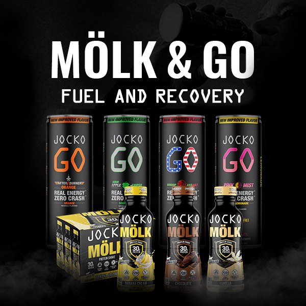
HARD WORK. CLEAN FUEL. NO EXCUSES
Use “WARRIOR2023″ for 10% off.