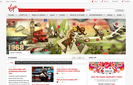
This is another big corporate feeling website design. Although it is quite nice, I really like the clean nature to this design. The details are all very tightly integrated, especially the ones that let you control the page’s content. This site is so vast and deep with content it’s ridiculous.
Glassmorphism: The Transparent Design Trend That Refuses to Fade
Glassmorphism brings transparency, depth, and light back into modern UI. Learn how this “frosted glass” design trend enhances hierarchy, focus, and atmosphere, plus how to implement it in CSS responsibly.


I really like this website, very professional yet still maintains personality. The illustrations really make the site, not sure how much I would really like it without them. Also, like they way it is able to encompass all of Virgins branches, travel, mobile, music, and etc.
Some of the content does seem a bit odd, like the entrepreneur section, i’m not entirely sure why the virgin site would have content like that, maybe it’s part of a larger strategy at work?
You make a good point Gene, I’m going to have to agree that some of the content in the entrepreneur section is a little odd. In all though you may need to consider that Virgin has over 75 brands, getting all of those under one website is no easy task.