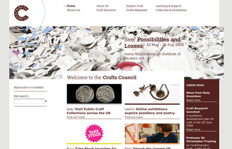
I love the stark graphic nature of this layout, with clean lines and tight boxes make up this website. Overall I like the typography on this website, however using it in the main navigation like this leaves something to be desired. It gets a little washed out and could really stand to be live text instead of the image like it is. I think that would really add to the overall feel of this website and actually complete it. I particularly like the sub pages for the sub sections like this one. It’s really quite nice as you dig through this website which is fairly expansive in content.
Glassmorphism: The Transparent Design Trend That Refuses to Fade
Glassmorphism brings transparency, depth, and light back into modern UI. Learn how this “frosted glass” design trend enhances hierarchy, focus, and atmosphere, plus how to implement it in CSS responsibly.


0 Comments