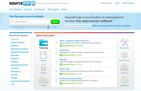
The new sourceforge.net website. Of course sourceforge.net is huge and expansive in it’s content. I really think this new homepage helps a ton in bringing more content to the surface, really helping to quickly show the width and breadth that is sourceforge.net. The search box is wisely placed and looks good, the colors are nice and light and there’s a pretty decent attempt at hierarchy with the placement of all the elements. If I had a big complaint it would be the action in the main ‘middle’ section, the one that lists out all the featured content, the scrolling is really distracting and unnecessary feeling. Overall this is a really great redesign.
Glassmorphism: The Transparent Design Trend That Refuses to Fade
Glassmorphism brings transparency, depth, and light back into modern UI. Learn how this “frosted glass” design trend enhances hierarchy, focus, and atmosphere, plus how to implement it in CSS responsibly.


agreed about the scrolling area. it is awkward, and really doesnt make sense. Is it left to right columns?
they also seemed to take a lot of influence from amazon’s menu, which is fine and all, because it is a clever design.
to solve the “scrolling” content area, they should just do a fade in/out. anyway, looks much better!