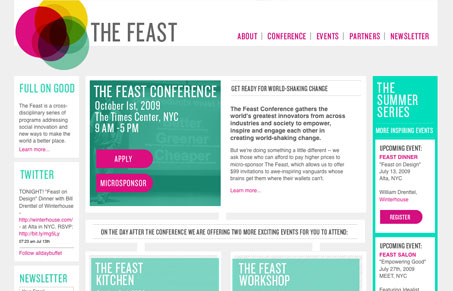
This site sticks out to me because it doesn’t use any pictures on the home page. It’s entirely graphical in it’s visual makeup. The design is very consistent and clean. The colors sort of remind me of the macromedia website from around 2001 or so somehow, maybe it’s the green and magenta colors working together like this that does it for me.
Glassmorphism: The Transparent Design Trend That Refuses to Fade
Glassmorphism brings transparency, depth, and light back into modern UI. Learn how this “frosted glass” design trend enhances hierarchy, focus, and atmosphere, plus how to implement it in CSS responsibly.


0 Comments