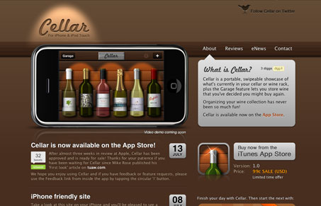
Nice single page product website. I love that this site uses the iPhone image to show off the app and it’s turned horizontally, that’s really different. I know it’s just how the app is used but you never see them turned on their side on sites. There really isn’t a lot to this website, it’s just a single page, but they’ve managed to pack in all the necessary info. I also really like how they handled the copy and form elements in the top right corner, that call-out section that holds the info is pretty clever.
Glassmorphism: The Transparent Design Trend That Refuses to Fade
Glassmorphism brings transparency, depth, and light back into modern UI. Learn how this “frosted glass” design trend enhances hierarchy, focus, and atmosphere, plus how to implement it in CSS responsibly.


0 Comments