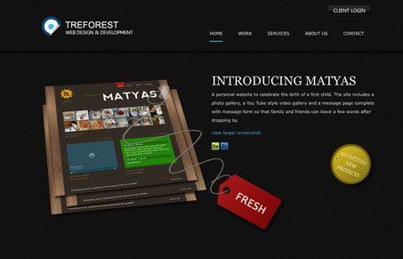
Really simple and clean layout with dark background. The header is interesting to me, there is a line that divides the header region and the rest of the site but the backgrounds of each are exactly the same. In any other situation this probably wouldn’t work too well, but it seems to be working fine in this design. I also like the portfolio section, it has just enough info for me to get some idea of what the designer did for each project the use of the program’s icons is also something I don’t think i’ve seen before.
Glassmorphism: The Transparent Design Trend That Refuses to Fade
Glassmorphism brings transparency, depth, and light back into modern UI. Learn how this “frosted glass” design trend enhances hierarchy, focus, and atmosphere, plus how to implement it in CSS responsibly.


0 Comments