Web Design Inspiration Curated

modo
The thing about this site that excites me is the experience it builds as you scroll down. It just keeps making you want to see more and you're kind of sad when you get the "FIN" part. I love the interactions designed in here and there, like on the portfolio links....
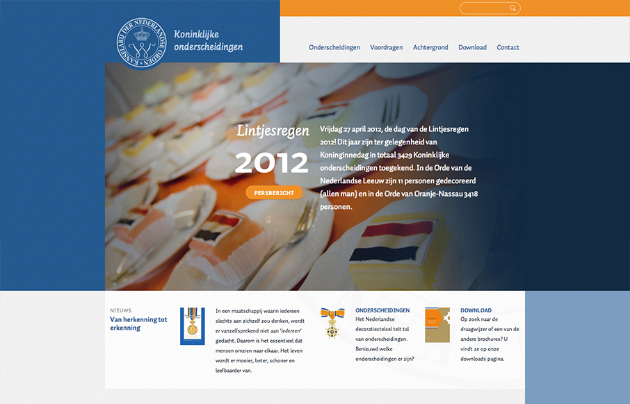
lintjes
Cool kinda asymmetrical design here. Very fluid design too for the responsive implementation for this site as well, check it out when you get a chance.
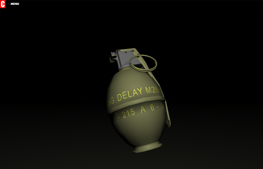
Cartelle
Really crazy site here. I just can't stop throwing the grenade. What do you guys think?
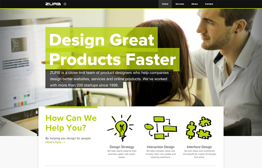
Zurb
I like the clean yet dense design for the Zurb site. The little drop-dow stuff that's linked up beside the logo is pretty smart. The plus leads to the close x, nice little animation too. I like putting that stuff there like that, it helps the message that they have...
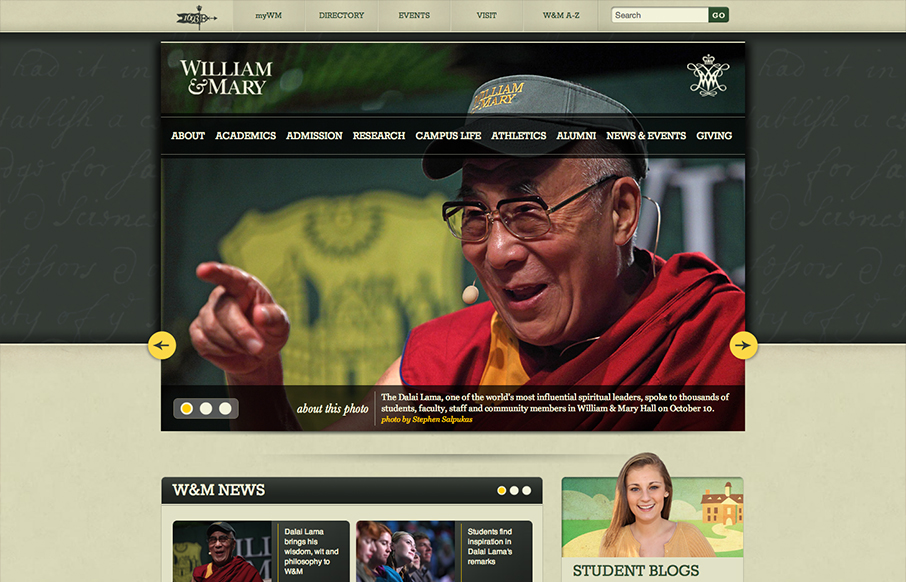
William & Mary
The William & Mary website is gorgeous. Solid responsive design solution, dig it. Then I just love the proportions of everything, it feels really natural to me to use. I also like the bottom half, as I know the designers are forced to put in a bunch of boxes/marquee...
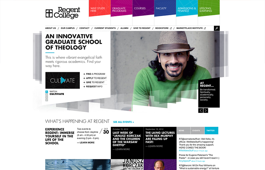
Regent College
The navigation design for Regent College is quite interesting. The multi-colors and angles make it visually dynamic. Then there's a strong drop-down design too. Good responsive execution to boot makes it a pretty dang nice design overall to check out.
Skrp
Basically a "splash page" to house links off to the EP and 12" or download stuff. But it's wonderful and sets a nice visual for the music. It's like doing a cover song, if you're going to cover it make it your own or better. They've done that here, it's just a splash...
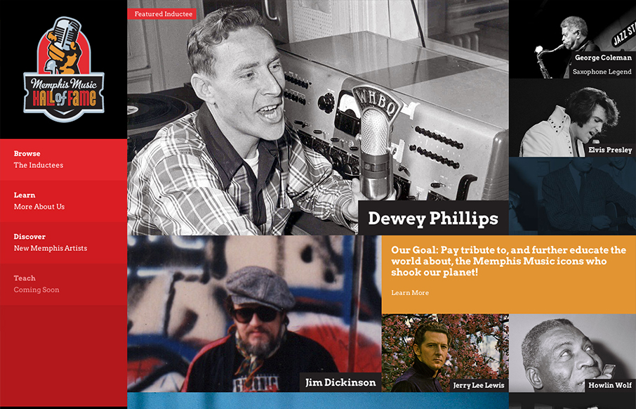
Memphis Music Hall of Fame
By SimpleFocus out of Memphis TN. Beautiful website design for the Memphis Music Hall of Fame by the fine team at Simple Focus. I really love the interactions on the images, it let's people know right away by way of visual feedback what's an active link. The overall...
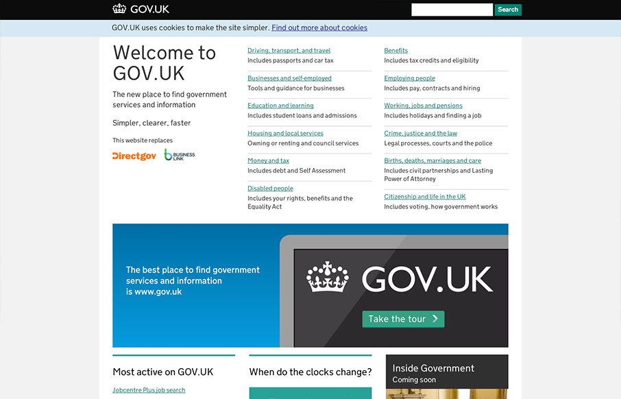
GOV.UK
I absolutely love this design. I've tried to accomplish a design like this myself (a site that's largely a big set of text links) and have fought opposition from management from the client and lost. Makes me very excited to see a solution like this for a government...
Abduzeedo
An evolving project. Note about the design from their blogpost. Abduzeedo will always be a work in progress. It's in our DNA, we need to change and we want to change. We love to design things and with the blog we have freedom to try. We might fail, but the only way to...
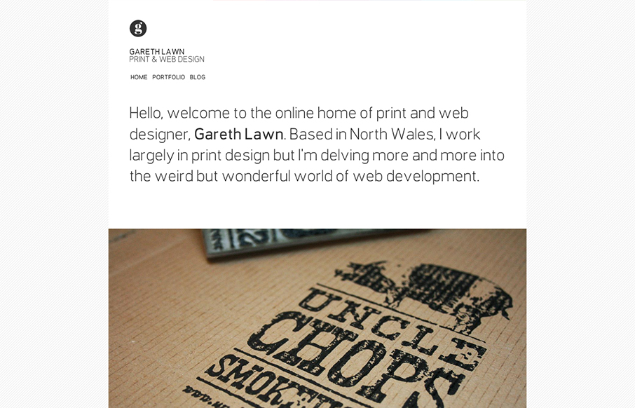
Gareth Lawn
I like the minimal design for Gareth Lawn's website. Putting the type front and center with a big central image. Nicely designed responsive solution too.
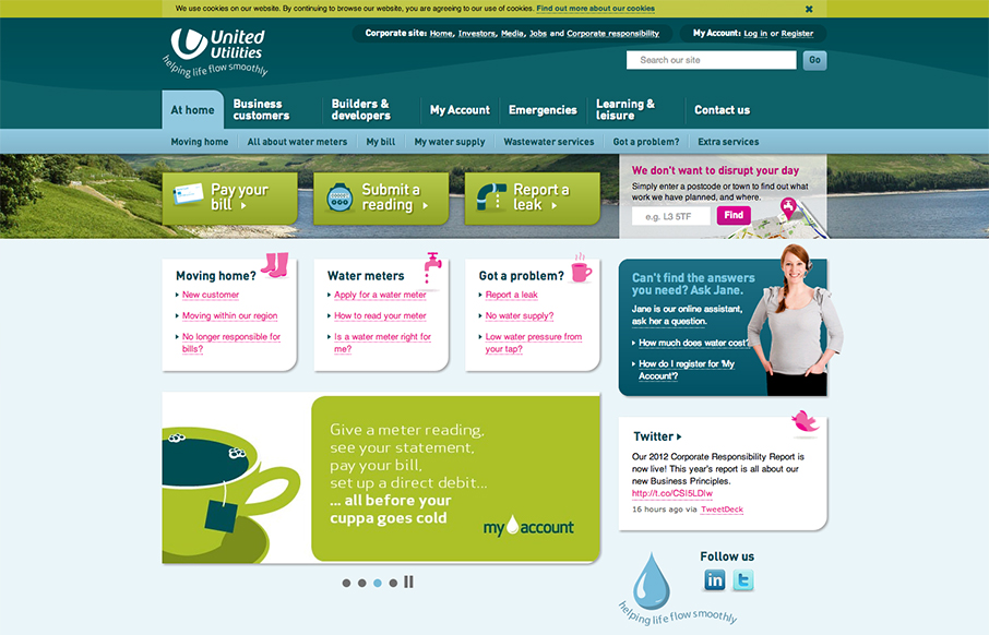
United Utilities
Nice example of a responsive site design clearly for a non-education non-design firm client. Love seeing this in the wild. am-i-right?
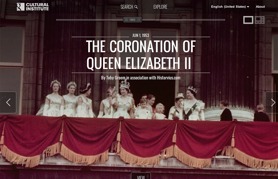
Google Cultural Inst.
This design is just crazy. Super intense interaction work both full window then grid style ways to get into the content/stories. Spend some time on this site and really dig into it. It's worth it.
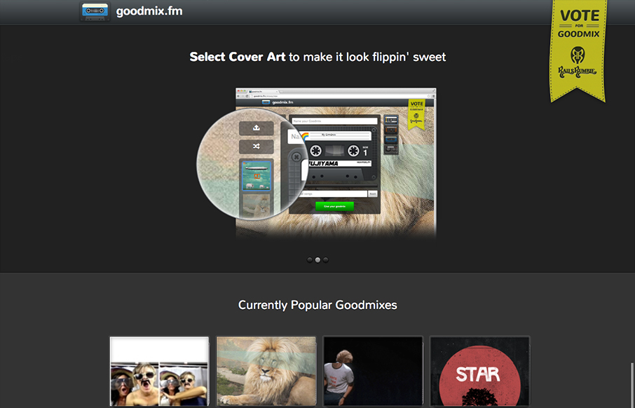
goodmix.fm
Submitted by: Michael Parenteau @parenteau Role: Designer & Developer When asked to participate in a Rails Rumble, I was like, "Hell yes!" We assembled a team, planned our app, roles on the team and then at 8pm last Friday, Jason Rudolph, Jared Pace, Kevin Altman and...
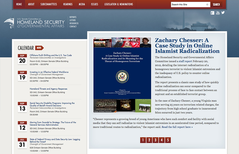
Homeland Security
This responsive design for the Homeland Security site has some really nicely placed breakpoints. I really dig how the layout just really seems to flow so well in between the breakpoints too. Nice clean type and it seems really easy to use on a tablet and iPhone too.

Temple University Japan
There is a ton of stuff going on with this home page. There's buttons and links everywhere but somehow they've managed to keep it all straight visually so you can scan it and get around. There are 3 main navigation sections/schemes in play but they're visually...
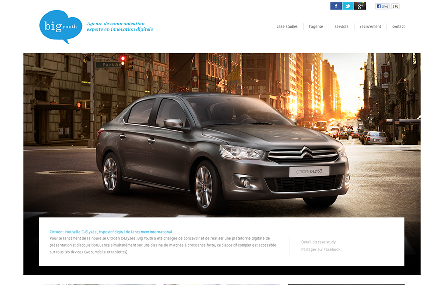
Big Youth
Nice and clean and full of sharp corners but somehow it feels open and inviting to read. Super awesome photography in play makes this site really stand out, when you have photos like these you got to show them off, right? I also like the mouse over zoom effect on the...
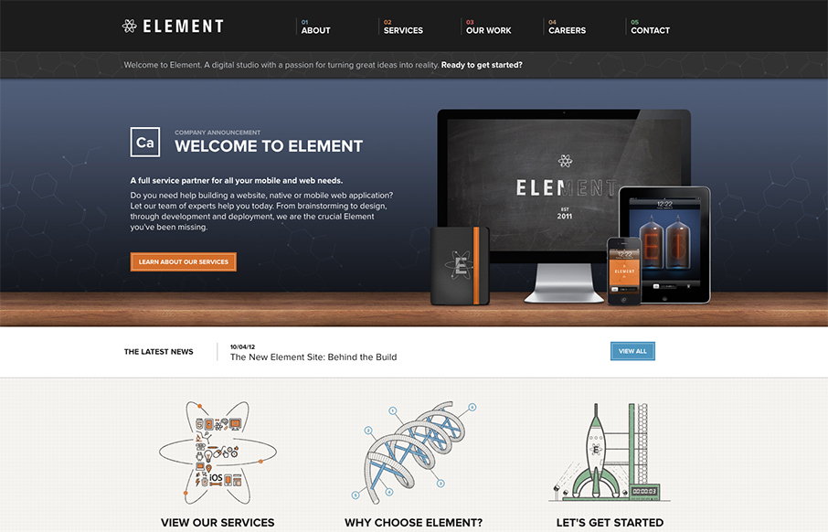
Element Creative
Element has just launched a really well done site. It has all the fancy bells and whistles of a hero carousel, responsive design, and snazzy graphics. What I really appreciate though is how overall what they've done is create a mature and solid brand experience. To...
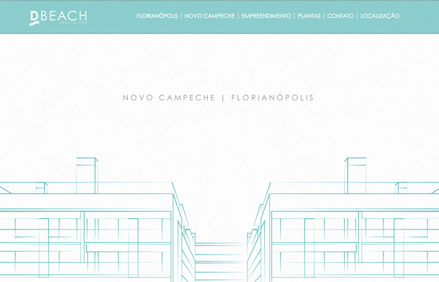
D’Beach
Very intense parallax design. Lots of movement and photos flying around, it's almost too much. But in the end it's a nice design and execution. D'Beach building parallax website - developed for those who want to live in a beautiful place near the ocean.
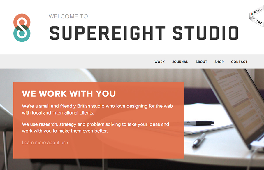
Supereight Studio
Submitted by: Matt Hamm @matthamm Role: Designer & Developer It's our newly designed responsive website. It's been 2 years in the pipeline. We hope you like it! Solid responsive design. I'd say two years work is worth it for such a clean and crisp new design. Well...
EMAIL NEWSLETTER
News & Articles
YQL with Jonathan Leblanc from the Yahoo Developer Network
Jonathan Leblanc from the Yahoo Developer Network discusses YQL with our own Jason Johnson.
Design Details: Inset Text Shadows
Jonathan Longnecker of FortySeven Media shows us how to get the most out of the “text-shadow property”.
Los Angeles Times
As a designer, I hope that if newspapers can be saved, that design will play a prominent role. Currently, many newspaper sites are dense, cluttered and so hard to read that it’s a wonder anybody goes to them (not to mention the cesspool that is the comments section of...

HARD WORK. CLEAN FUEL. NO EXCUSES
Use “WARRIOR2023″ for 10% off.