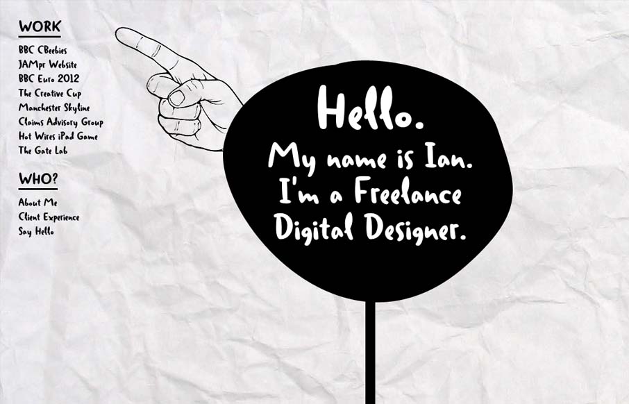
Ian put together a nice post for us about his thought process while building this site. I love the experimental feel of the design, so I thought I’d throw it in the gallery.
As Ian mentioned, this site certainly makes accessibility sacrifices to accomplish the desired experience, but it’s important to note that Ian is trying to follow an idea, not adhere to a particular standard. We need sites that push the limits of our technology, just to see whats possible.
I think that the quirky feel that the scrolling effect creates is interesting and provocative. The art is great and each ‘page’ of the design is laid out organically, as an image. The animation ‘path’ certainly goes a long way toward tying all of the content areas together, so that I can easily create a mental model of the whole site. It’s a cool effect. While this is a nontraditional page transition effect, it feels natural and smooth.
The site pretty much blows up on an iPhone (couldn’t check Android), it’s not intended for that use case. I am interested to see how he deals with an ever growing mobile market.


0 Comments