
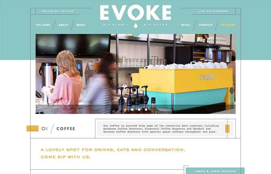
What a great vibe this website has. I love the lines and stark yet very soft graphic feel to it. It’s amazing how this shows off hard edges and soft colors at the same time. Truly creating a harmony of the two. It’s also a superbly designed adaptive experience. Each main screen size they’ve targeted looks painstakingly adapted.


Fitts’s Law: Why the Easy Button Wins
Large, close targets are faster to hit than small, distant ones, that’s Fitts’s Law. A look at the 1954 rule behind buttons, prime and magic pixels, thumb zones, and dark patterns.


0 Comments