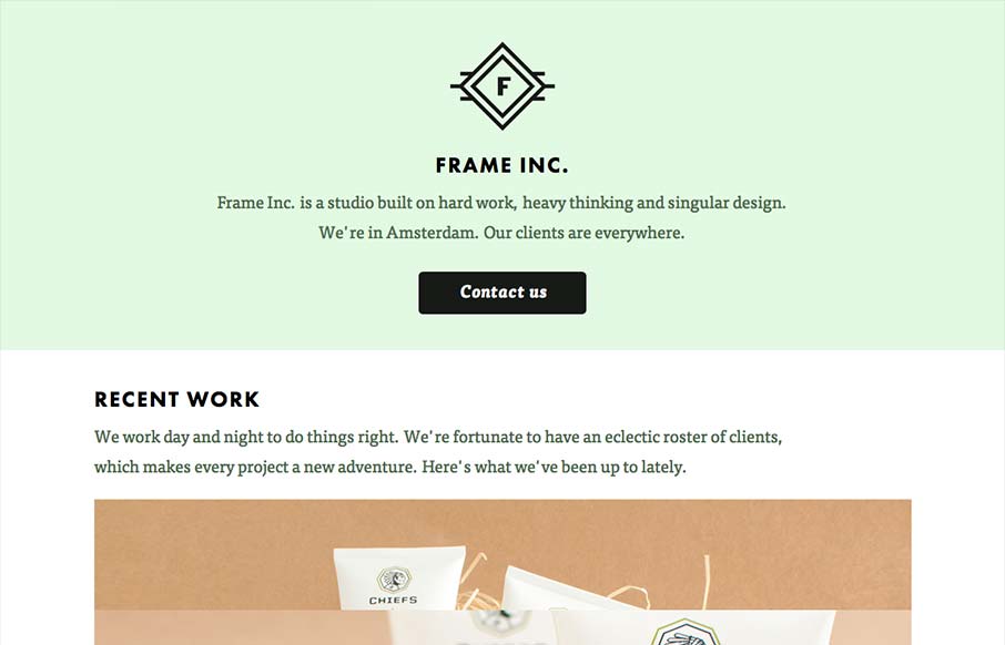
I can really get behind the minimal approach to content that frameinc presents. The site isn’t cluttered up with overblown copy or quirky language and I’m not forced to wade through a huge portfolio to get a sense of what this business does. The design and the short slideshow tell me all I need to know to make a decision about working with frameinc. The design is a beautiful mix of modern sensibilities and old school identity design.
My only gripe: A site this simple and symmetrical should be responsive. The design has clearly natural breakpoints and would stack beautifully at smaller sizes. Even the slideshow could be broken out into static images, with small captions. I feel it’s a missed opportunity, though I’m sure the designers had their reasons.
Other than that, love it to pieces!


0 Comments