Five Minutes – G-Shock

Five Minutes – G-Shock

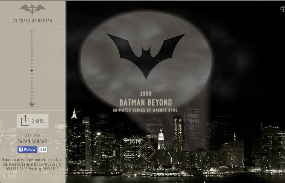
New Years is a time of new beginnings. Each year at this time, billions of people try to re-ground themselves, decide what they'll focus on for the upcoming year (or couple of weeks...you know what I mean), and grow into that new person they want to be. So it's...

75 Years of Batman

75 Years of Batman

I was working on some Top 10 posts for the end of the year, and stumbled onto Tapan Babbar's site: 75 Years of Batman. @tapanbabbar He made all of the Batman logos using CSS, with a little parallax thrown into Gotham itself. Pretty cool! And... if this and his other...

Unify Media

Unify Media

Very simple, clean, minimal site from Unify out of the Netherlands. What I really like is on their portfolio detail pages - they've posted they color palette and font's they used. Would be cool if they named the fonts too - but this way you can see how the parts come...

Google & NORAD Santa Tracker

Google & NORAD Santa Tracker

No matter what you celebrate, or where you live, we here at UnmatchedStyle wish you the safest and warmest of holidays, and are looking forward to a great 2015 with all of you! In the website world - two of the most popular websites today, December 24th are the Google...

Ars Thanea

Ars Thanea

Crash, bang, wow! Ars Thanea's agency site is a visual assault on your senses - that's a good thing. The video background / slideshow on the home page actually makes you stay on the page / and watch a slideshow. Cool how when you mouse to the left or right of the...

Assembly

Assembly

Really cool concept here with Assembly - looks like a crowdsourcing site directed toward different design / development products, with shared revenue for participants. Love the white space with color accents. Interesting how the sticky header comes out when you scroll...

MailGun

MailGun

Good interactive site from Rackspace with their new email service MailGun, that's more developer based. Lot's-o SVG work, some subtle animation on the logo, some on-scroll work - but the cool thing is how they present their API in the interactive area in different...

Burning of Columbia

Burning of Columbia

This February marks the 150th anniversary of General Sherman's burning of Columbia, South Carolina. The City of Columbia is commemorating the rebirth and reconstruction of the Capital City through a series of events designed to appeal to history buffs from all over....

Joel Califa

Joel Califa

Theme of the day is clean and simple. Joel Califa's portfolio site out of Brooklyn is exactly that. Love two main things: 1 - The "text-heavy portfolio" are really more than just "I did that" - there's a ton of detail on HOW he did everything, completely referenced....

Simple As Milk

Simple As Milk

You know I like simple websites - Simple as Milk, an agency out of Eastbourne, UK keeps to their name - which is always good! I want to say they have made some slight changes since I first looked at their site - changing up the home page coloring and some messaging...

Thankful Registry

Thankful Registry

Good way to end the week. Since you may be in "giving" mode right now, Thankful Registry - a gift registry site that doesn't feel clunky, and makes the experience for the gift giver a little easier. Nice large images on the home page and the registries - good...

MoreSleep

MoreSleep

"More Sleep, Less Headache" - we should all be so lucky! The MoreSleep web design agency out of Berlin, Germany is promising that. Based on their website and portfolio of work, I would have to say "das ist richtig".  Like the off screen menu actually produces a...

The Girl Effect

The Girl Effect

I was saving this review for today. I'm glad I did - looks like The Girl Effect website changed over last night (at least I think it did) - and is stunning. I really dig the off-screen navigation on the left, that really allows space to get their stories front and...

Mixd

Mixd

This is from the Mixd design house out of North Yorkshire, UK. I like how each page has it's own initial background color, while still keeping the same aesthetic throughout the site. Also like that they must maintain the site and switch out the home page, that is a...

Mammoth Booth

Mammoth Booth

Listen... good marketing is this: Do Not Press Button. What's the first thing you want to do? This is how the Mammoth Booth site starts out - good irreverence coupled with some nifty illustration and CSS animation, and then the pay-off: an explosion of cool photos...

Robby Leonardi

Robby Leonardi

Yeeeeeaaaaaaaaah! If you don't click on the "Interactive Resume" and go into a Nintendo glazed over comatose, eating Doritos, drinking Jolt Cola, wondering why your thumb joints ache and you have thumb calluses... then you're probably under the age of 35. Doesn't...

mikeandara.com

mikeandara.com

Listen - we don't normally do wedding / proposal sites - but this one from Mike Pechardo out of the San Francisco area is really well done. Looks like he spent a lot of time to make everything come together seamlessly on the web side - hope that continues for him and...

Station Four

Station Four

Good design company site from Station Four out of Jacksonville. These folks have come and hung out with us at ConvergeFL - good people. They work on a bunch of different platforms, and their work and their site looks clean, has cool icons / infographics to tell their...

True Fish Tales

True Fish Tales

So.. here's the story... this site is all about true whopper fish tales... "the lucky few who have done the impossible and reeled in a true monster." Yeah sure, great on the CSS animation, map and interesting way they present the stories so you see the magnitude of...

The Bright Future of Car Sharing

The Bright Future of Car Sharing

Ok - awesome fonts, flat images, and animation in an interactive full web page infographic. It took me a minute to navigate what to do with my car (hint: use the scroll bar at the bottom or use your left and right keys), but once I got going, I think it's excellent...

Life In My Shoes

Life In My Shoes

I like the contrast of using stark white space and texture in the background and around important shapes/spaces on the page itself. Contrast can go really far as a design tool.

Longitude

Longitude

Pretty straight forward layout, but fitted with some nice tight detail work. I really dig the subtle impression you gain by viewing this site. Submitted by: Dustin Myers @dmyers09 Role: Designer

kylereadsays.com

kylereadsays.com

Very nice project/website to showcase the skills. I love stuff like this and this site for Kyle Read is one nifty example of how to do it. Love this site by @kyleread: http://t.co/DM0IobW5GI /via @timbrown — Elliot Jay Stocks (@elliotjaystocks) November 18,...

JSConf BA

JSConf BA

Pretty dang awesome! I know you can do a lot now with Javascript - so the .jsConf out of Buenos Aires did it all. Their conference just ended on November 29th, but I'm glad they left the site up so that I can destroy the alien bad guys.... Just check out my...

Jon Contino

Jon Contino

Make sure you check out the detail pages for Jon Contino's (out of New York) portfolio - really sweet designs. I like the "Work" page too - faceted search so you get the idea of Jon's strengths - and a hint of parallax (kind of like the icons on your iPhone home page...

Lab Partners

Lab Partners

I love non-standard stuff, like with Lab Partners. For instance the clock in the upper right, works! I'm sure there's a way to make this design responsive, but it's still pretty sweet looking to me.

Angra Maria

Angra Maria

I like quirky design and I extra like it when it's working hand in hand with solid tried and true design techniques. Just like with Angra Maria's portfolio site, beautiful work.

Blueion

Blueion

There is some really great stuff here on the Blueion website design. I particularly like the 8bit looking illustration section for the team pics and some good video never hurts.

Hunger Crunch

Hunger Crunch

Gio and I saw these guys talk in Greenville at Grok last year. Listen - the site is great. It has some subtle animation and appropriate parallax, making you feel like you're in the game. But.. the point of the Hunger Crunch site is not just the game attached to it -...

Chickenbot

Chickenbot

Note to self - don't do website reviews on food sites three hours before lunch - especially when it looks as appealing as the Chickenbot website out of Italy... yes, Chickenbot. Great, savory images and pretty decent ordering functionality for delivery... they just...