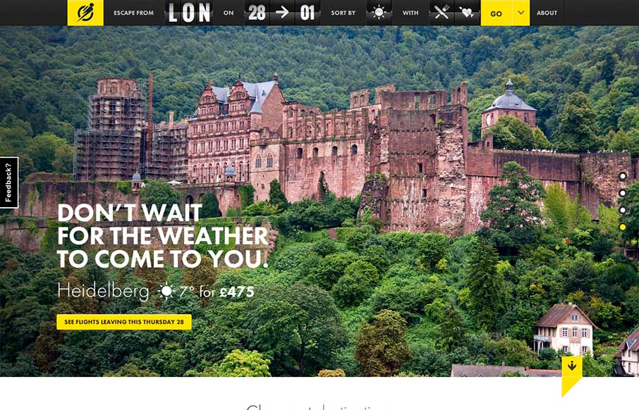
I love the way the search is put together on this site. Human logic based or whatever you'd call that. Also the interactions are quite nicely done. The slight parallax on the main slideshow images is great and not overused and the photos are just brilliant. The one of...
invision
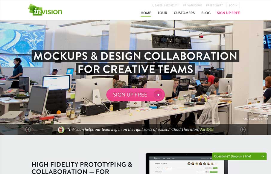
What a nice slick design. The content of the blog is tied into the main slideshow imagery which also matches up with the purpose of the product. Dang, that's some meta design thinking there fellas. I love it. I also love the well timed animation of the content...
Carlos Ousa
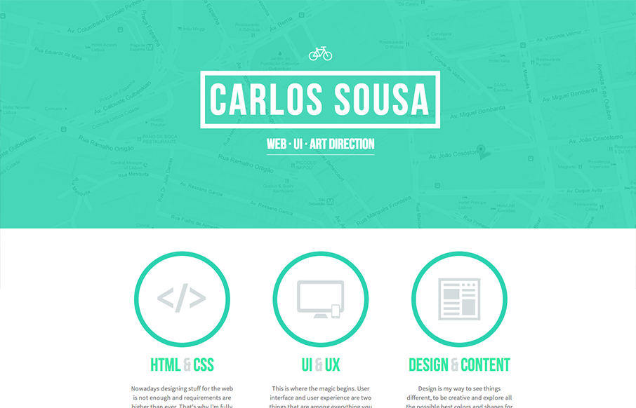
I love the solid blocky feel to the elements on the page here. The rich graphic vibe and the limited color palette make for some nice design in this case. The little interactions are also well used and not overly so.
Amazon Guyane Park
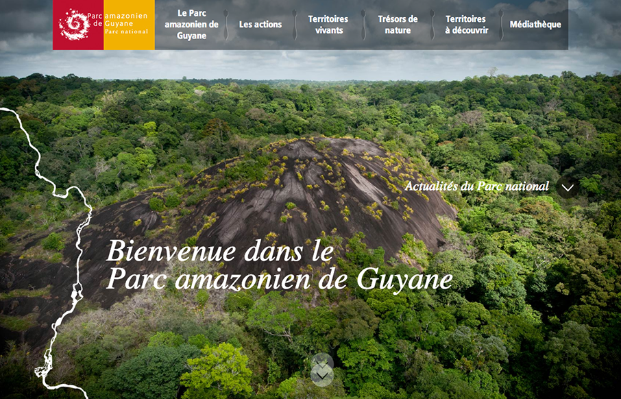
I like the rich photography and the way it's used to time up with the "river based navigation". It almost feels like a parallax style design but it's not, I dig that. I also like how the nav kinda goes away and you then come to rely on the river links.
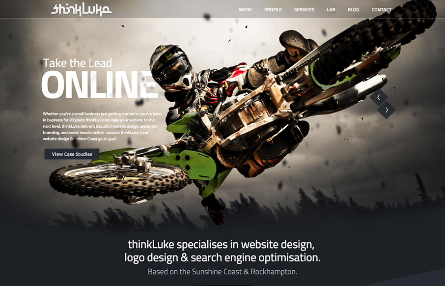
ThinkLuke
I love the "mouse follow" animation, i'm not sure what to call that, worked into the main image and slide show on the home page. They've managed to make it look cool with the photography. I also like the diagonals and greens worked into the page as you scroll down it....
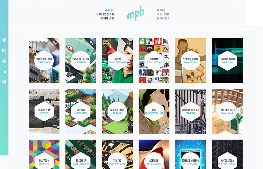
My Poor Brain
Nice simple display of the artist's work with a clean grid and minimal color palette. But it's the little details, the RWD and the interactions on the title shapes that complete the design and make it feel so finished and polished. Great work here. Submitted by: Tim...
Sputnik
I love the start graphic feel to this site and the minimal color palette is just great. The lead in animation with the logo and slide up to the fixed navigation give this site a nice vibe of technical sophistication. I also like the clearly differentiated sections of...
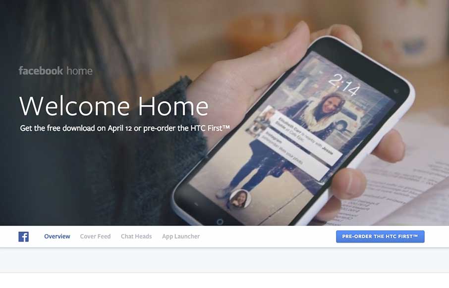
Facebook Home
This website for Facebook Home is just a visual feast. Yes, it has all the Facebook visual brand baked in but it's beautiful. The video in the background for the top of the page and the slide up fixed navigation design bringa nice level of fancy to this simple feeling...
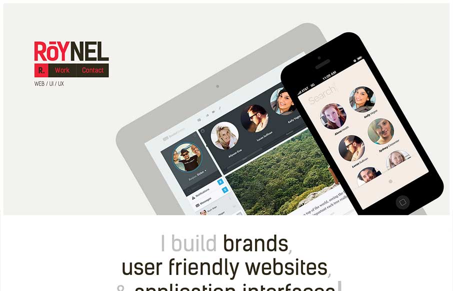
Roynel
This site feels pretty smooth/slick to use. I like the slider on the home page and the way the nav slides up to be fixed in position. Then all the sub pages are well designed and cleanly executed. I like this less is more approach to the layout with the nice...
Forty Agency
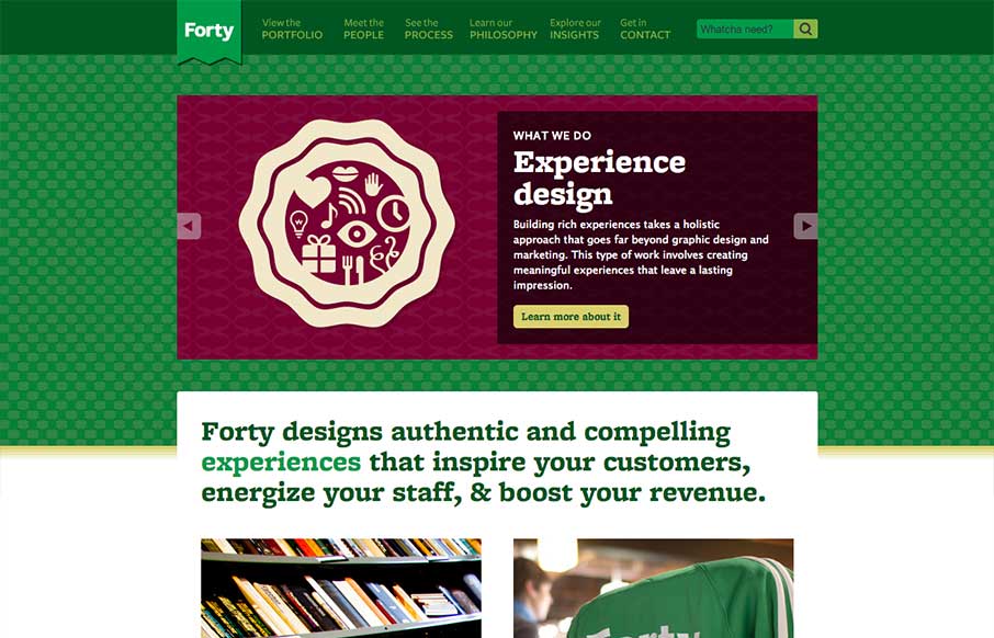
The thing that stands out to me most on the Forty Agency website is the copy. It's clean, thorough and has a really strong personality too. I love the main navigation naming too with the sub titles/microcopy. Overall solid design too, nice fixed header layout.
Geckoboard
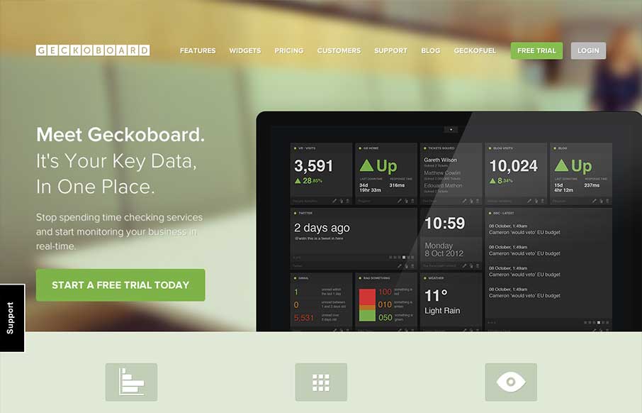
Apparently dashboards are still a thing. When I figured out what this was I had a flashback to designing overly-detailed mockups of graphs and some sort of thing that looks like a speedometer that has no possibility of ever being made functional (but it would probably...
gaia interactive
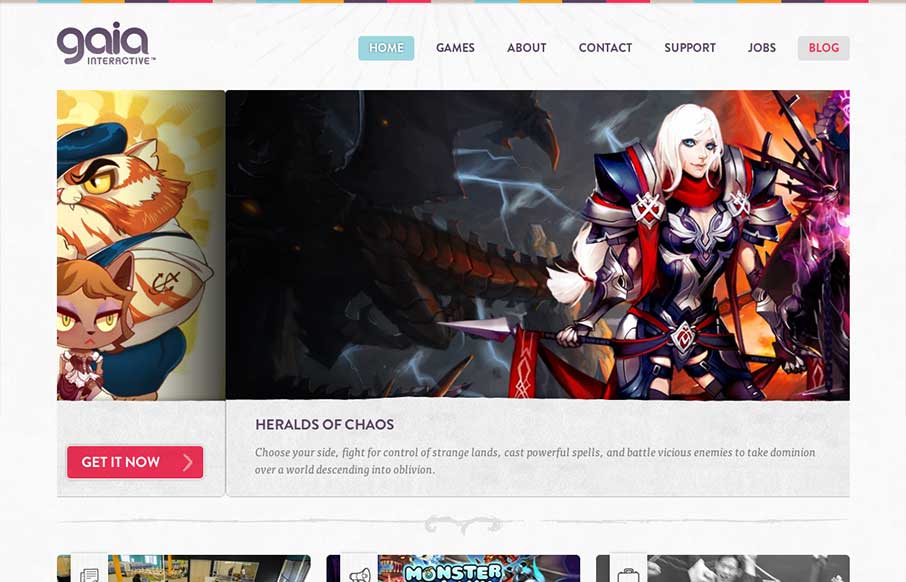
A very colorful and clean design for gia interactive. It's a perfect fit and seems to provide perfect function for the gaming company. It's the right amount of stuff and balanced design elements across the breadth of this site. Lovely work. Case study on the...
Summly
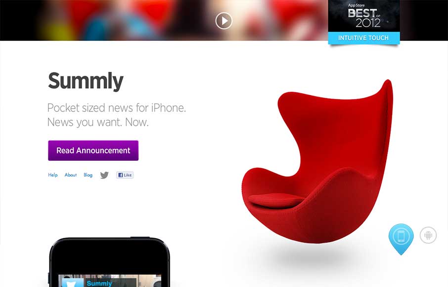
Summly has been in the news lately because the creator, Nick D'Aloisio, has just sold it for $30m to Yahoo. And he's only 17. I haven't used the app itself (it's not available in the US), but it looks very cool and smart. The video is entertaining and is a great...
Richard Photo Lab
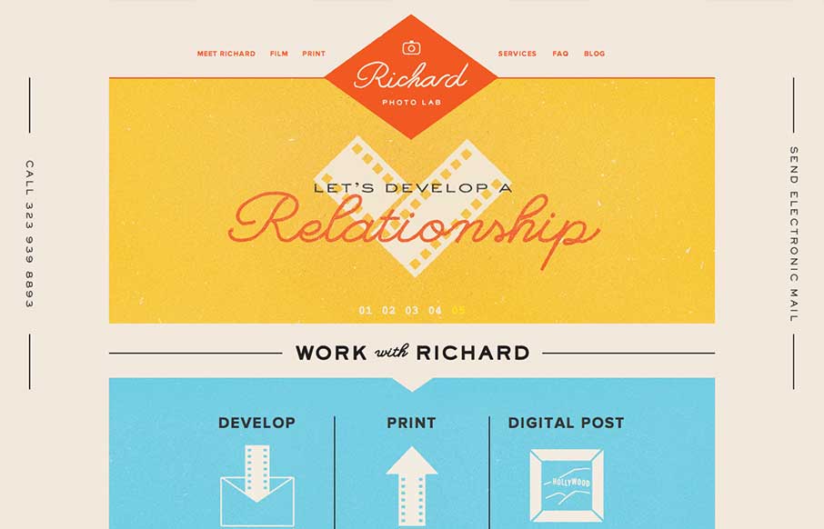
Lovely website design. I particularly love the way the logo changes to a smaller mark as you scroll down the page. Overall the feeling of the design is very comforting and fresh. It's a responsive solution as well which is a nice finishing touch.
Kotaku
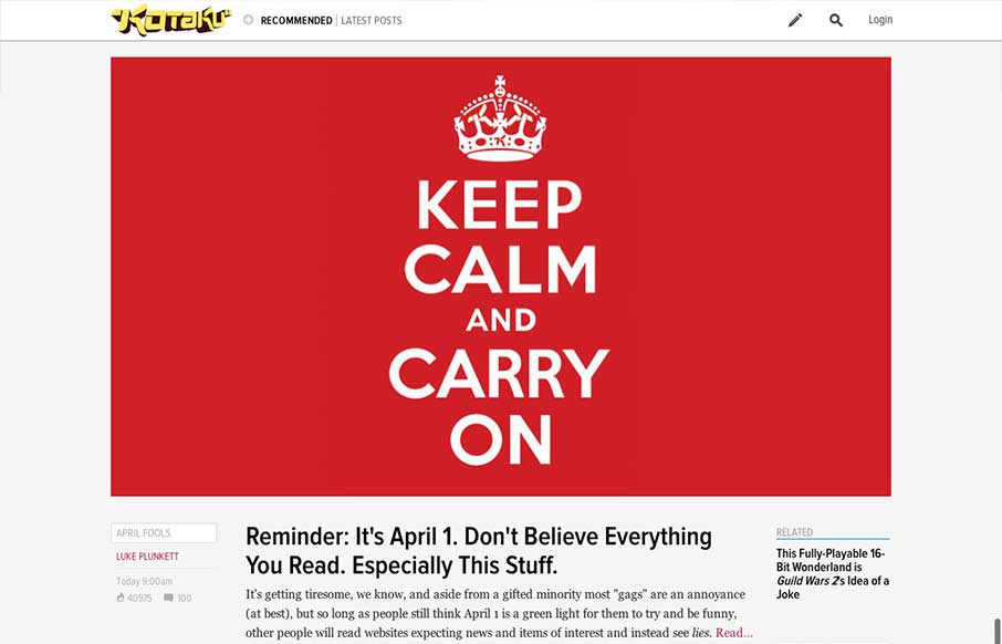
The new Kotaku site is part of a rollout of a new platform from Gawker. Other sites using the same platform so far include Jalopnik and Deadspin. It's helpful that they've linked to a post about the new look, but it doesn't give us much insight into why the new site...
The Church London
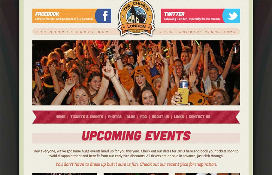
Overall a pretty simple design but it works great here. The mobile approach is a great choice, generally speaking, but for this party bar specifically it's done right. I like the big twitter and facebook icons across the top of the page, those are going to be very...
Romotive
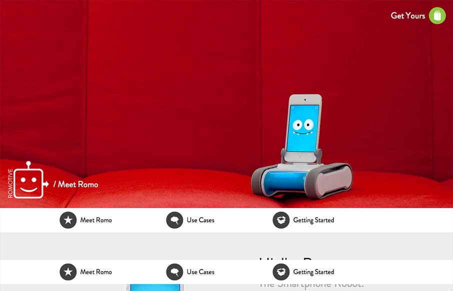
This website has an interesting story to tell. Meet Romo. It's a fun and whimsical robot/device and the pages of this website really dig in and give you the narrative of each of the major points of this thing. How it all works, how to buy/sell it and "hey look it's...
Build
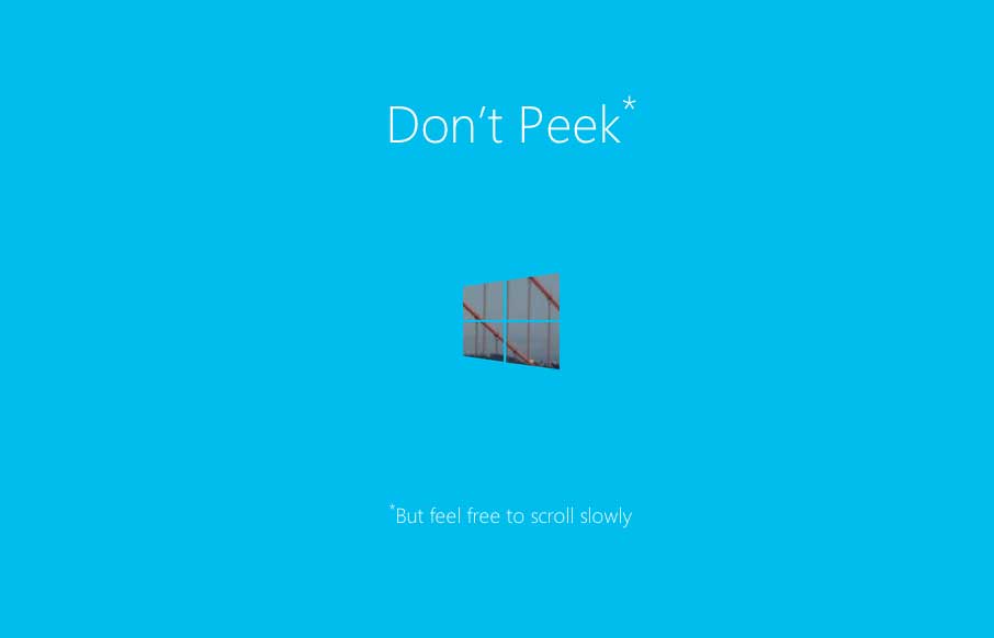
I really dig this splash page for the Build Windows conference series. It's simple and straight forward but there is also a little magic baked in with the mask like parallax design. We work on a lot of similar type work here at UMS for our conferences and this design...
teehan+lax
I love how this site puts just what's needed out for you to see. Just a single headline at first but then you notice the fixed header and built for mobile navigation design. The entire nav slides down to give you an easy to take in navigation design, just main links...
Heliom
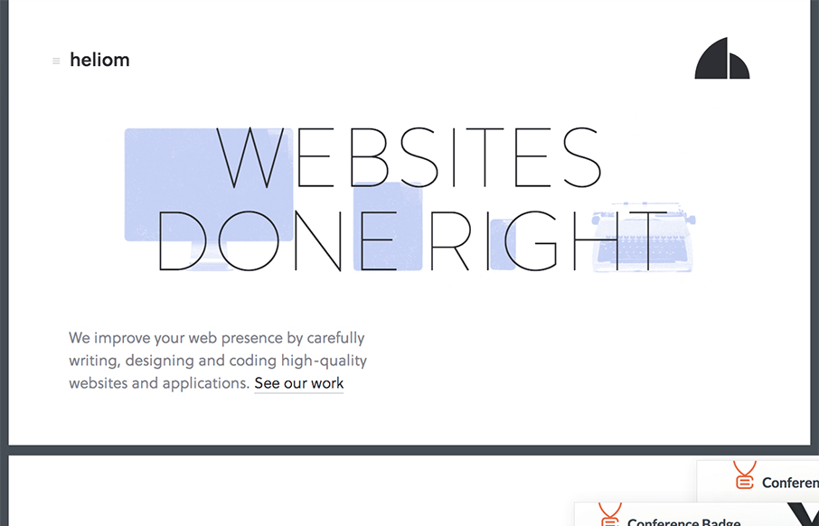
There are a ton of really great interactions both for desktop and mobile worked into the Heliom website design. The thing I love most about it is it feels very new, like new interactions for me. As I make my way through the different experiences on this site, from...
Dwolla
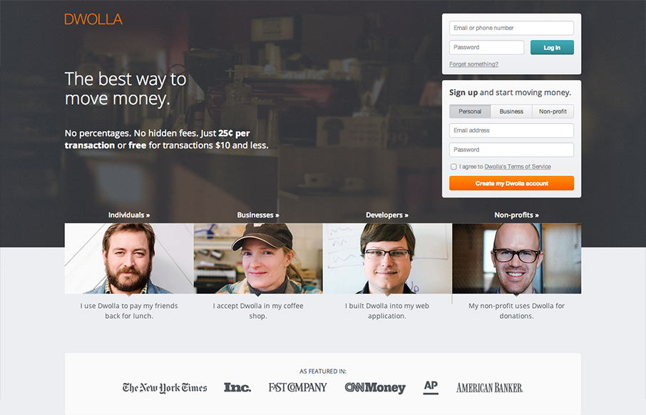
The Dwolla site design is of good quality and execution. I like the different configuration and stacking of the elements on the page as you scale the page down to smaller screen widths. What I like most of all is the use of negative space between the main/topmost copy...
Shun Cutlery
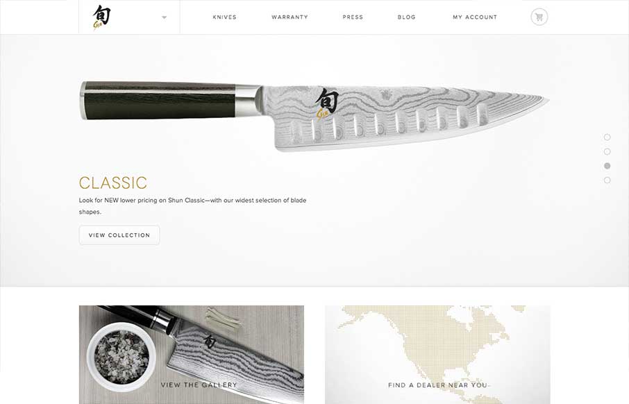
Submitted by: Jordan Sowers @jordanpsowers Role: Designer A great responsive ecommerce experience for Shun Cultery. Inspired by the blade-making traditions of ancient Japan, today’s highly skilled Shun artisans produce blades of unparalleled quality and exquisite...
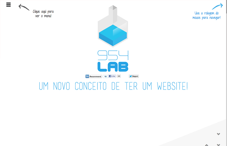
954lab
Pretty fun design with some nifty interactions baked in. It's also a really well done responsive selection given it's interactions. It's fairly clean and straight forward too which is refreshing in this case.
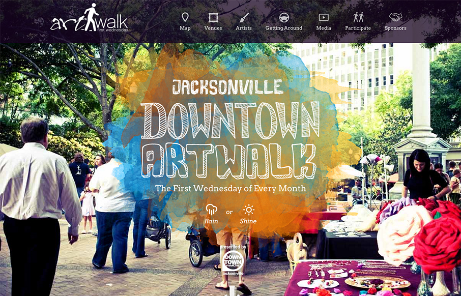
Jacksonville Art Walk
This site perfectly sells the Jacksonville Art Walk. The colors are inviting the type if accessible to most people yet fresh feeling. It's also responsive which is a great move since a lot of folks will hit this site while at the event or close trying to find their...
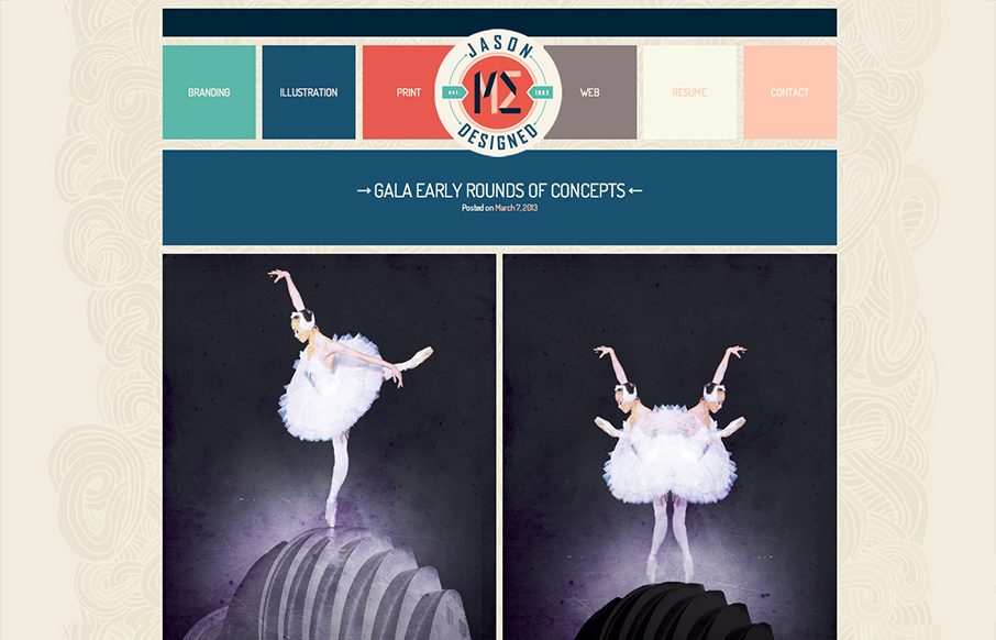
Jason Designed
Overall pretty simple design. I just like scrolling and looking through the work, in a way it's almost minimal in this aspect, but the color palette is pretty expansive so i'm not quite sure I can give it that moniker. It scales down to support smaller screen widths,...
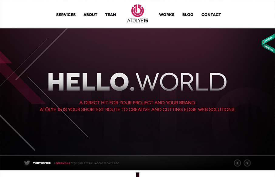
Atolye15
I love the visual transitions between section to section. They are simple yet feel almost fantastical as you scroll the page. The logo even changes sizes as you get to the fixed header when you scroll. Super nice details like this make me smile.
Hybrid Conf
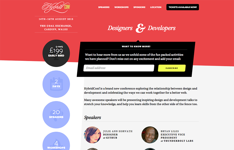
Beautiful asymmetrical design here for the Hybrid Conf website. I love it when simple design solutions wind up having such great dynamic results. The offset sidebar with the rounded profile pics just set the whole thing off right. I like the big subscribe box and the...
Mark Simonson
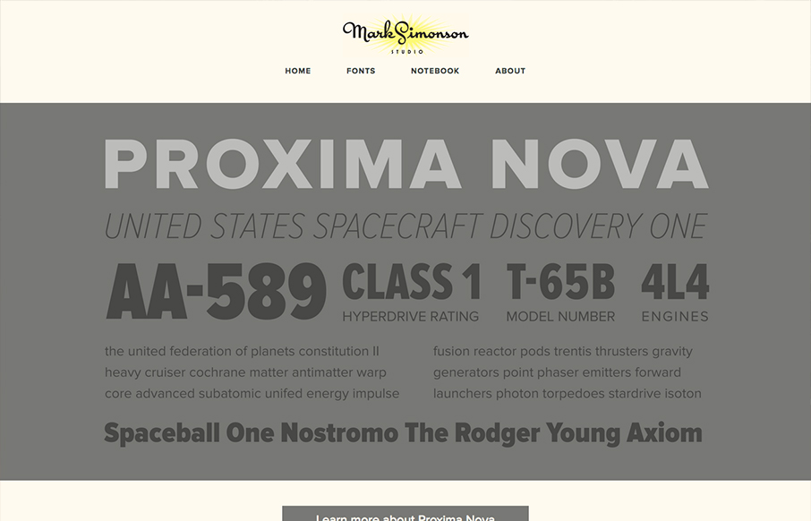
The site’s layout was planned from scratch to be fully-flexible and responsive. Users can easily browse Mark’s typefaces and read his articles from any modern device. We’re particularly fond of how the fonts page turned out. - From Parvel's Post on the website design...
George Badea
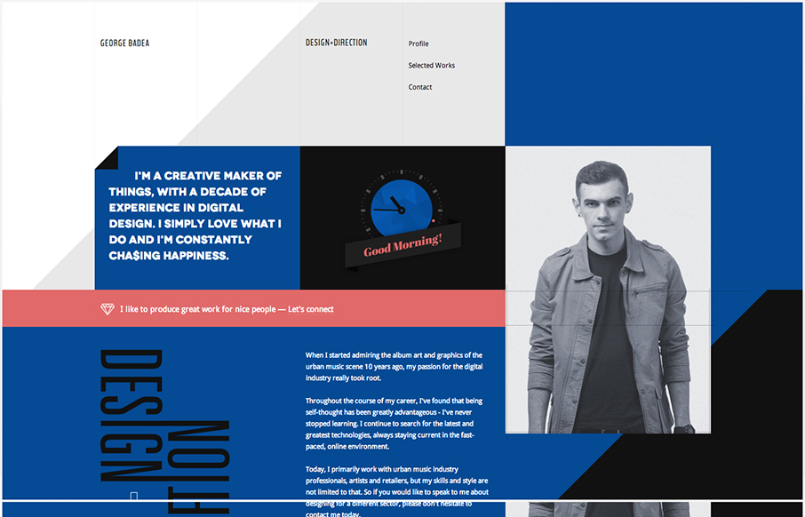
Lots of interesting interactions in this website. with some neat easter egg(ish) things, like the skeleton face as you scroll down. Everything seems smooth as you use it and pretty natural in terms of the transitions.
Peugeot Hybrid4
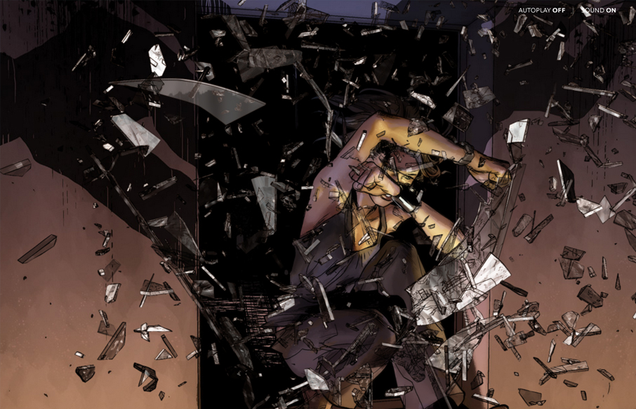
I've always been a fan of comic books and graphic novels. I'm also a huge fan of experimental projects that push the boundaries of what we think is possible with websites. Peugeot Hybrid4 is a perfect example of one of these sites. The artwork is gorgeous and the...

