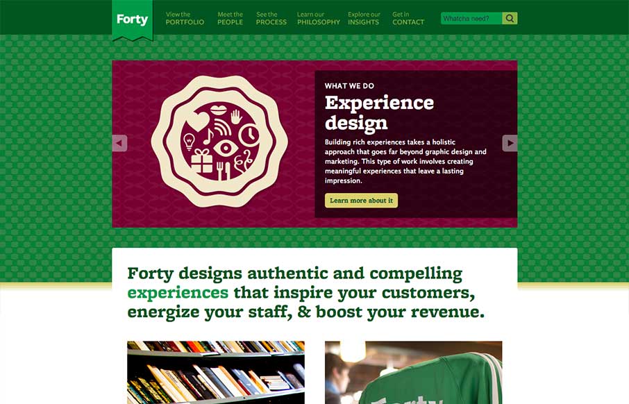
The thing that stands out to me most on the Forty Agency website is the copy. It’s clean, thorough and has a really strong personality too. I love the main navigation naming too with the sub titles/microcopy. Overall solid design too, nice fixed header layout.


The Call to Action, Revisited
The Call to Action hasn’t changed in a decade, but the bar has. A fresh look at prominence, copy, mobile tap targets, and accessibility, with lessons from three major design systems.


0 Comments