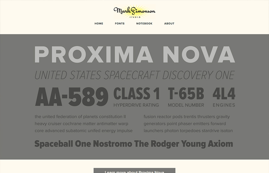
The site’s layout was planned from scratch to be fully-flexible and responsive. Users can easily browse Mark’s typefaces and read his articles from any modern device. We’re particularly fond of how the fonts page turned out. – From Parvel’s Post on the website design
Another great RWD addition by the Paravel team. It’s clean and simple and the design solution just speaks to you as you make your way through the site. Putting the subject matter front and center, in this case the beautiful typography of Mark Simonson, isn’t easy to do. Often we as designers get caught up in our own methods and design agendas we lose site of the core/soul of the work. I’ve watched Paravel roll out many websites and they never get lost, they are always on target and this latest example of their work is a great example of this approach.


0 Comments