

I love how this site puts just what’s needed out for you to see. Just a single headline at first but then you notice the fixed header and built for mobile navigation design. The entire nav slides down to give you an easy to take in navigation design, just main links and some stories to read. Keep it simple stupid is the core idea for this website and it’s brilliantly executed.

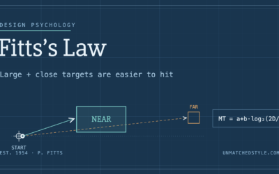
Fitts’s Law: Why the Easy Button Wins
Large, close targets are faster to hit than small, distant ones, that’s Fitts’s Law. A look at the 1954 rule behind buttons, prime and magic pixels, thumb zones, and dark patterns.
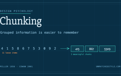

Really like how when you scroll down the header nav bar disappears but re-appears when you start scrolling up. – So when you get further down you automatically start scrolling up to look for the nav bar and it appears – bit nicer than having it always fixed over content or constantly at the top of the website. The “our story” page is amzing.