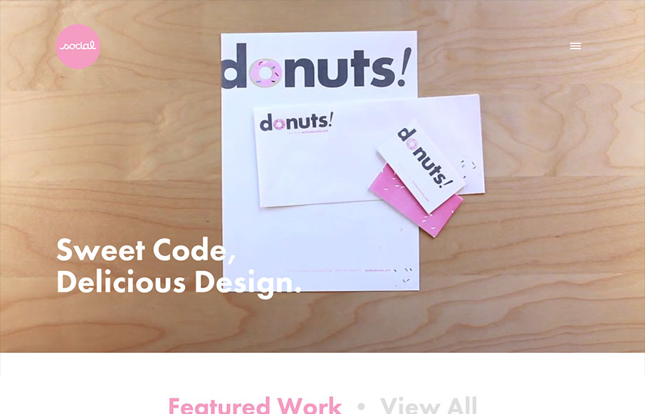
I've always like the video on Social's home page, so I'm glad they've found ways to utilize it with each redesign of the site. I especially like the consideration they take when the site's viewed on a smaller device. It's smartly responsive, and not having the video...
Jesters Wild
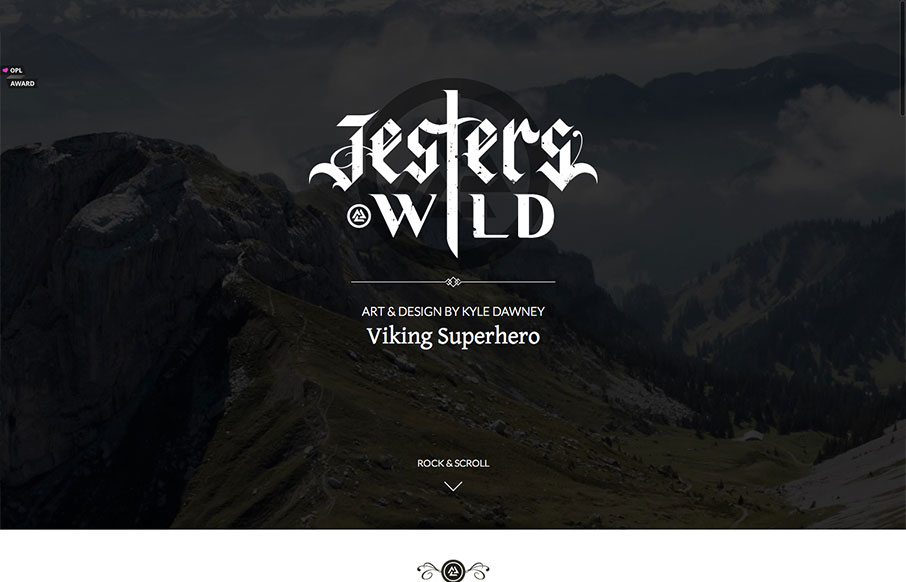
Really simple execution and layout for this portfolio site but overall I really dig it. Slight animation on the text and then the slight parallax on the top most background image give it some really nice details. Down to the bottom with the skills graph - this being...
Acko.net
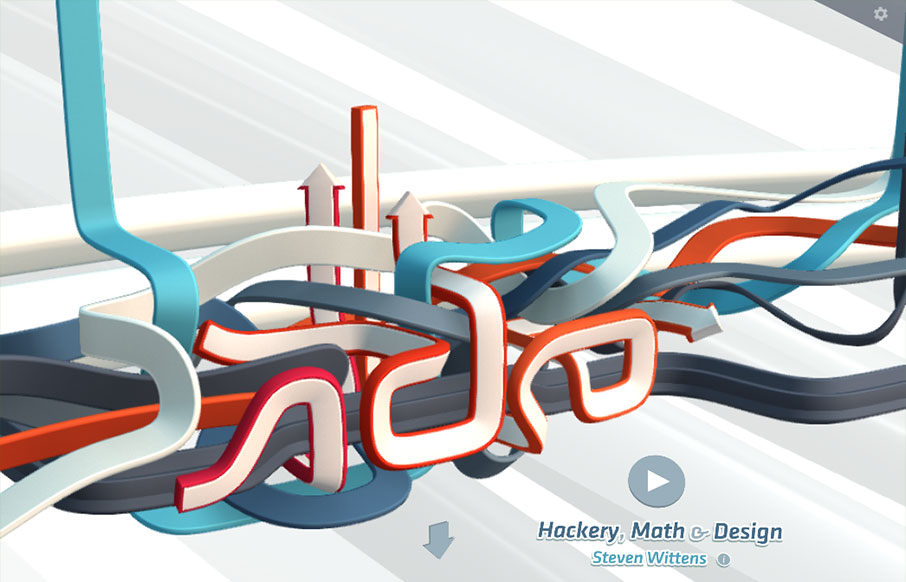
You've all probably seen this site already. It HAS to be in the UMS gallery for posterity. Simply badass IMHO - 'nuff said.
Mixd
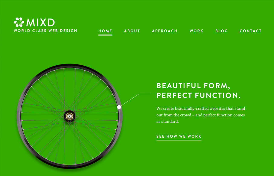
This site shows the agency’s design philosophy by comparing their online design work to simple, functional, perfectly designed offline products. Sometimes the simplest ideas are the best. This concept is reinforced through the website by using bold, strong colours, an...
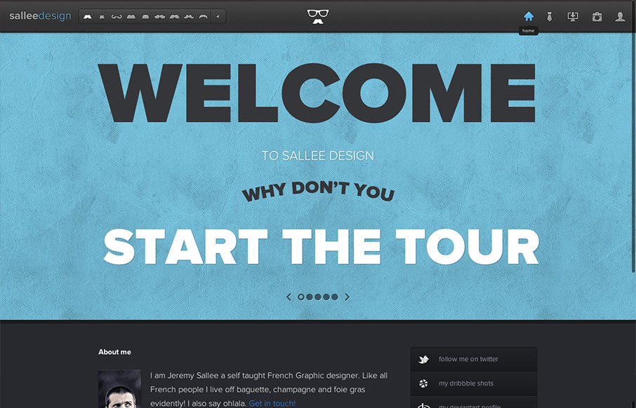
Sallee Design
Nicely executed with tons of little details. The site is clever and really show's off the designer's sense of humor and quality of work well.
nav.co
A rather straight forward site design, using some of the latest cool stuff. But something about it, maybe the clean layout and/or easy going vertical rhythm makes it sing to me. My favorite part is the "clients" drop down section under the header. Very clever.
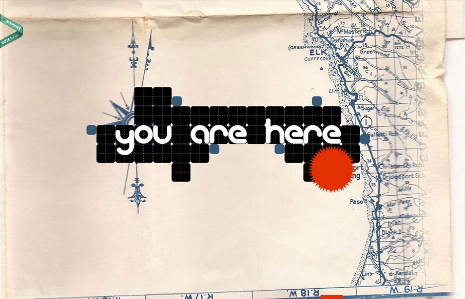
Designer’s Atlas
Interesting visual narrative as you scroll. Letting the line take you on a trip through the content is clever and I'm not sure i've seen something like this done quite this way yet. Neat.
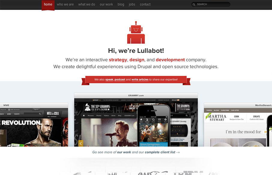
Lullabot
I love the simply stated yet perfectly executed design of the Lullabot website. The rhythm of this site is superb as you scroll down the page. Everything just queues up perfectly for you. The site starts off as a place to get into what type of work the firm does, then...
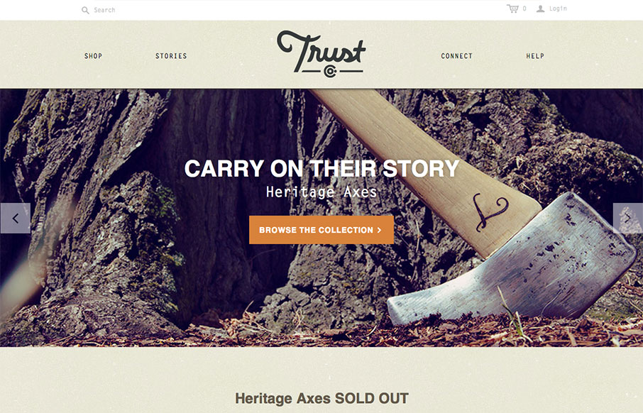
Trust Co Axes
What a great website. First off it's about Axes, which are just cool to think about and use. The design of the site has lots of little surprises but executed in a simple way. The main nav has these great large icons that are worked into the drop-down navigation lists....
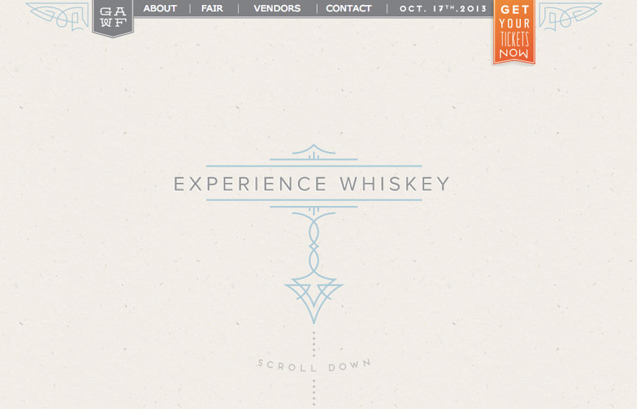
Experience Whiskey
Super simple design but I love the illustration work and limited feel to the layout while being ornate at the same time. It's almost like whiskey itself, simple yet full of volume when it comes to taste.
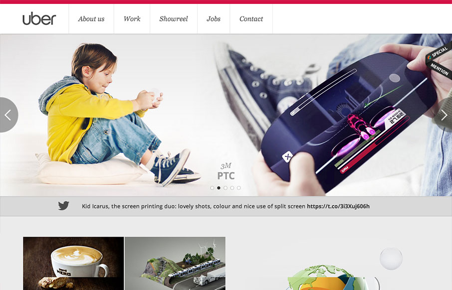
Uber Digital
Pretty standard layout here but it has enough little bells and whistles to keep it feeling quite fresh. I love the slight squeeze that the main nav across the top does as you scroll down. It's enough to make you notice it and follow it. The rest of the layout down the...
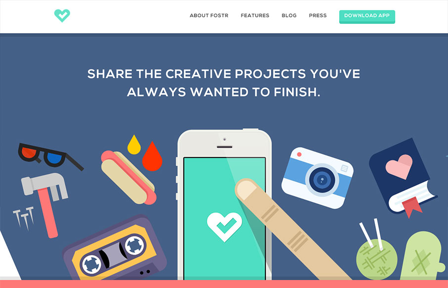
Fostr
It's hard to tell exactly what Fostr is quite yet, but it's some sort of iOS app for people to 'Support, follow and cultivate creativity'. The site is pleasingly clean with nice colorful and poppy icons. I like how there's a lot of space and minimal copy. If I'm going...
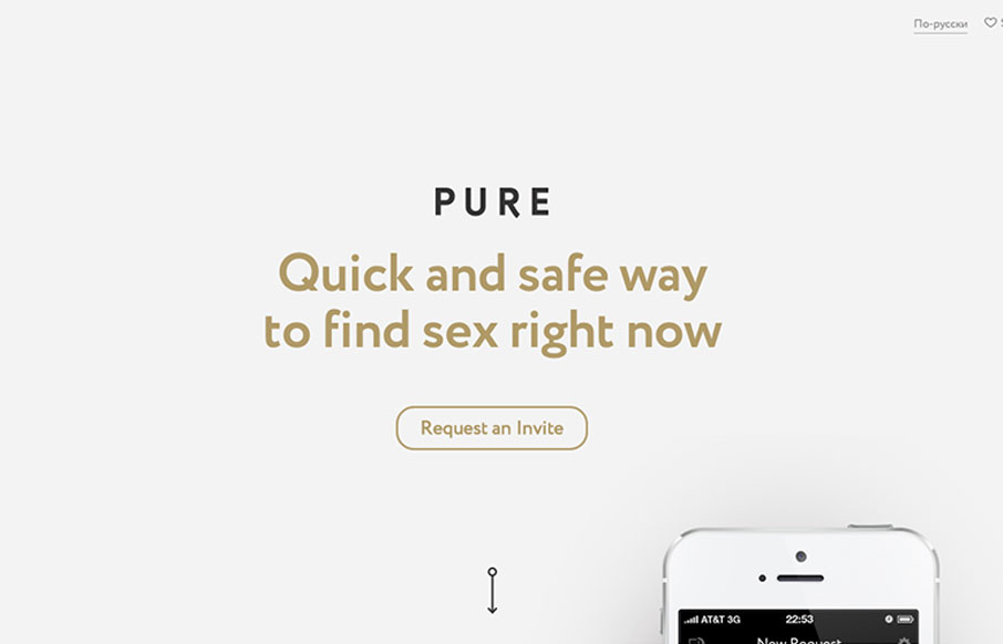
getpure
I have now seen everything. Pure is a hookup app with no illusions about it's intended purpose: booty calls. So, there's that. Now lets talk about the site! getpure.org/en is a slick little single page scroller that snaps to particular scroll heights. The scrolling...
Frostbite
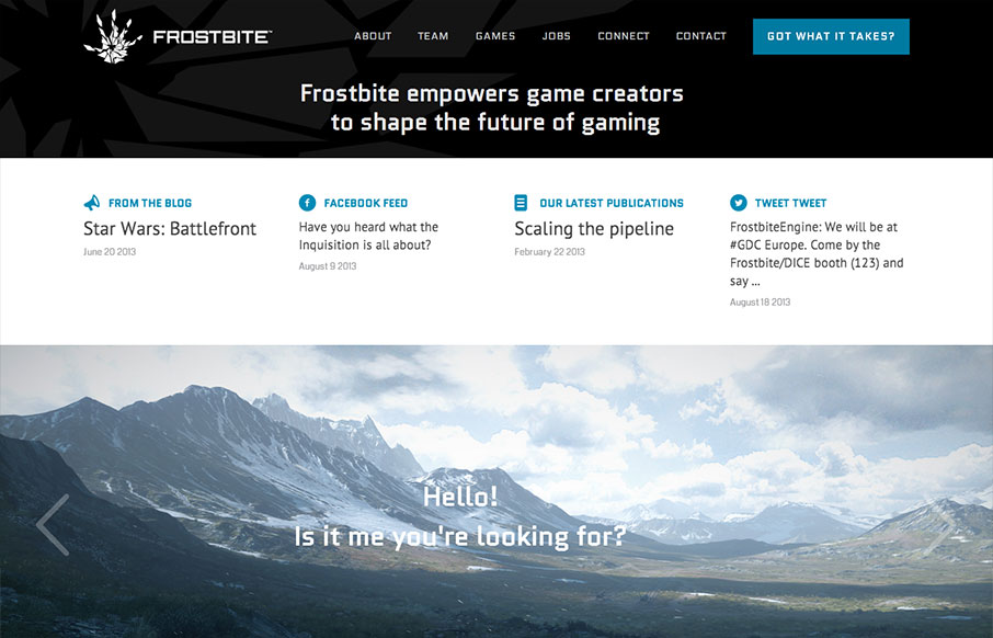
First of all: Badass domain name. Second: Frostbite 3 looks like it'll blow your hair back and then some and I can't wait to see it on the next generation of consoles. I'm a gamer and it looks beautiful. Third: Pretty nice site. Game studio/engine sites are usually...
Hashrocket
I really dig the Hashrocket site design. It's concise but not minimal, it's functional but not trendy. Lovely! It's just fine looking working website which is something I really like. There's plenty of nice illustration pieces across the site to be interesting too....
Cyclemon
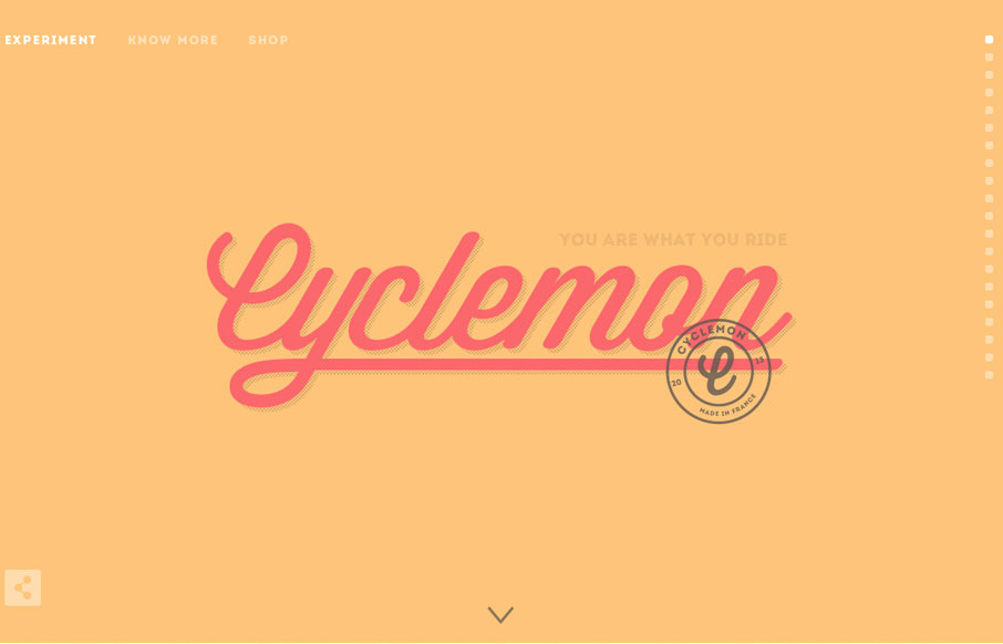
The simple, slightly art deco vibe of this site is really cool. The type is beautifully done and its great how the site engages as you scroll down. It really makes you want to scroll down to the bottom, and there's even a bit of a punchline at the end. That said, by...
Pirates d’eau douce
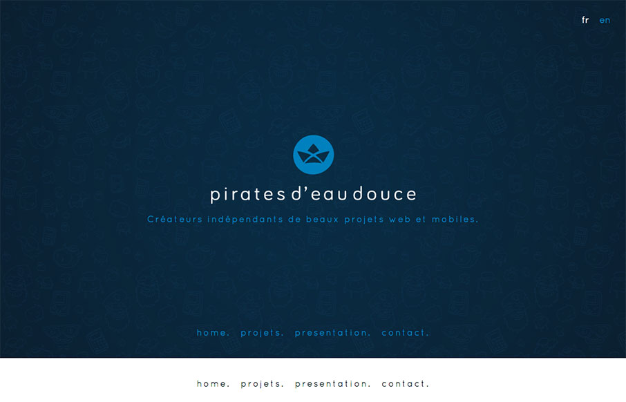
Pirates d'eau douce is a fun site to say the least. I really enjoy the subtle animated characters and the playful branding of each of their apps. Blink, blink.
Jamie Oliver’s Fifteen
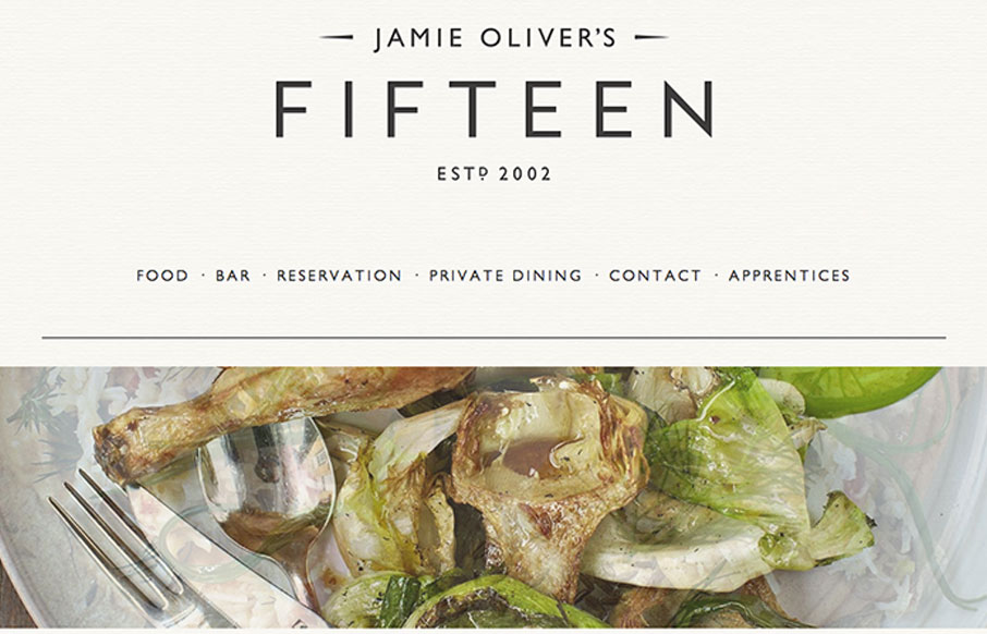
Just another polished, parallax site with beautiful imagery and svelte typography. Ho hum. 🙂 Doesn't mean we can't call it out for being nice, right? Either way, it's got a nice feel and I appreciate subtle details like the rotating images and the progressively...
5d Institute
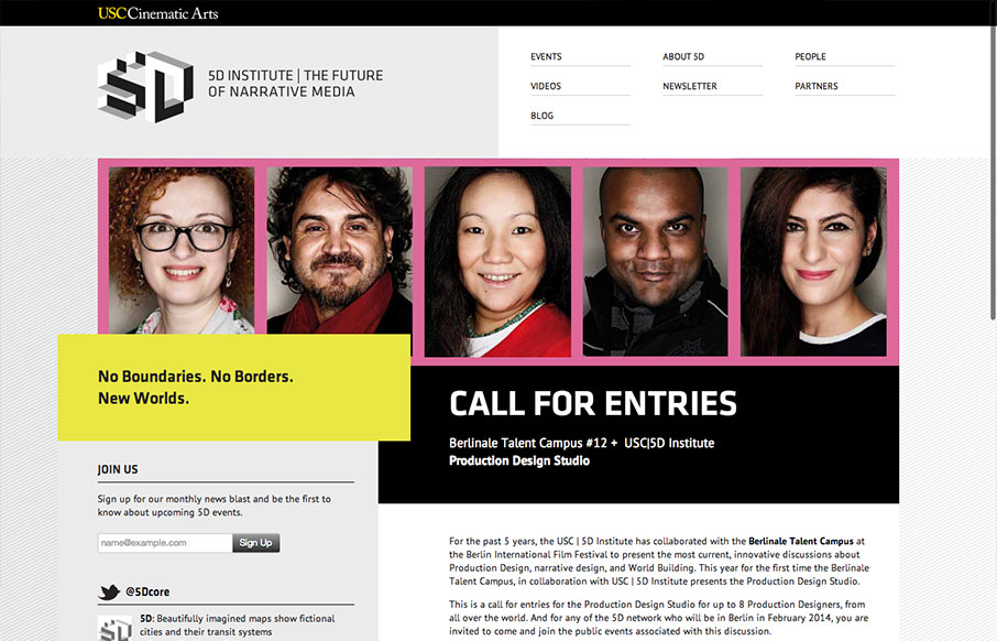
I was immediately drawn to this website by its unusual use of the grid on the larger screened “desktop” layout. The navigation and logo area are split into two 50% columns. This simplicity allows other elements to be moved purposefully “off grid”. It’s eye-catching,...
whiteboard.is
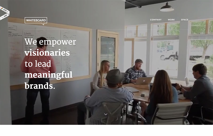
Man this site is mind blowing. It's really simple in it's layout and visual framework but it's just so chock full of cool stuff to look at. I really love the scrolling videos in the background they help tell the story so quickly without really telling it. That's some...
Mezzolab
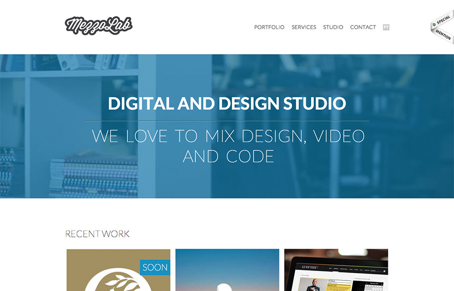
Mezzolab is a nice modern portfolio site with attractive ice cream colors. Many of the interactions are fairly standard: rollovers with detailed information on the portfolio links, static nav, scaling logo, etc., but the complete package is impressive. The design...
Creative Jar
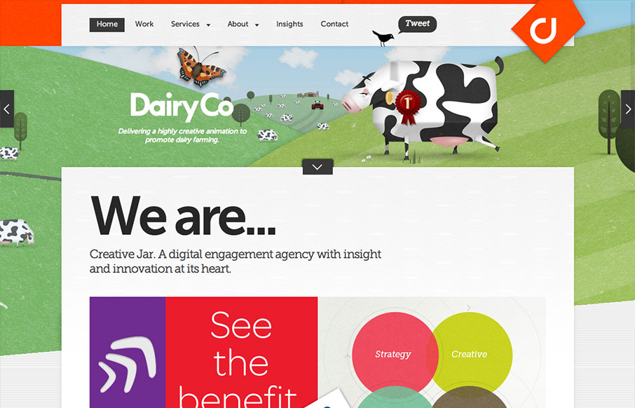
Dern. This site has a lot going on at once. I really like to see designs that push conventions into new territory and creativejar have done that in a few ways. The layout of the homepage content is modular, but only loosely structured. This is interesting, but if...
VCU.edu
The new VCU site (specifically the home page) is chock full of info that's nicely organized and presented. Despite all that's going on here, I feel like they struck a good balance between practical and promotional elements. Even more impressive is the publicity of the...
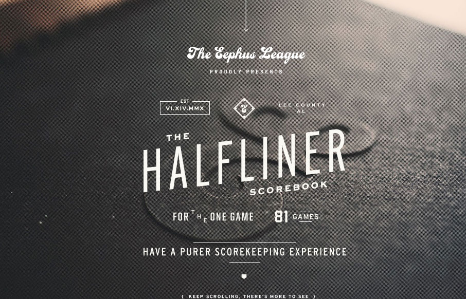
The Eephus League
The Eephus League website is damn pretty. When you get down to it, the site is fairly simple and straight-forward: big, lovely imagery, interesting throwback typography, and just enough small details to keep things interesting; but simple and straight-forward does not...
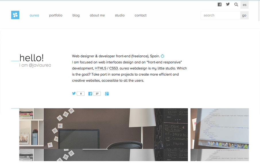
aurea
Aurea is simple, clean and highly readable. I really enjoy the minimal palette and open layout. It's a tight design with lots of contemporary details and a well designed aesthetic. Very nice. Cute dog too.
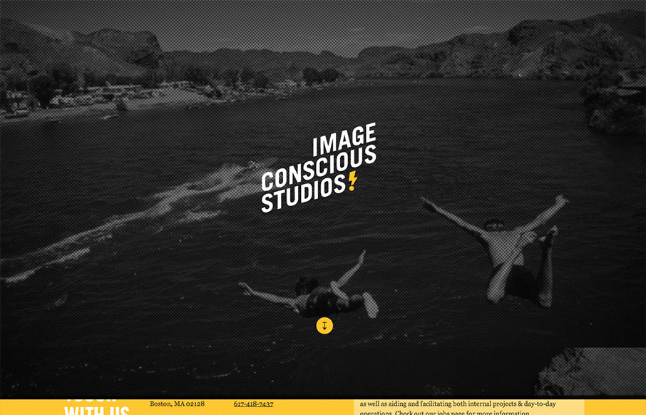
Image Conscious Studios
This site is a beautiful mix of energetic, graphic type and low fidelity imagery. The effect is a highly dynamic scrolling experience with small blocks of content flowing by in counterpoint to large dramatic imagery. I enjoy the sense of humor and technical savvy. The...
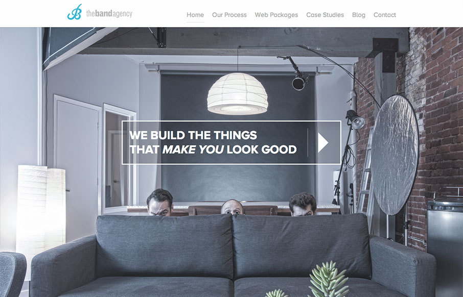
The Band Agency
I don't know these guys, but I already love them. This site is funny as hell, but serious. I take them seriously. Seriously.... But seriously, the design has more character and fun that you can shake a stick at. And it looks good at all sizes. And it's well designed....
Do
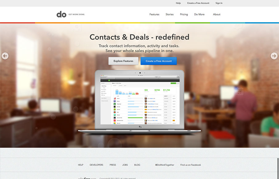
I really love the simplicity of the Do site design. It's boiled down to just what's needed. The overall palette is muted, but not really which is a clever understatement to work into the design. I also dig the Features page, I like how it goes from just showing a...
netnibbles
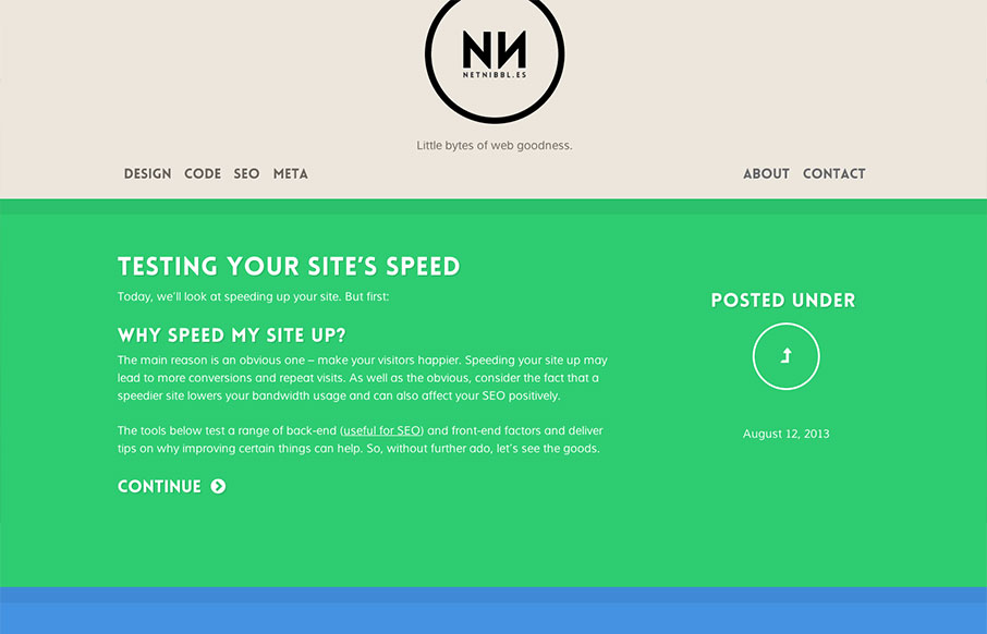
netnibbl.es takes simplicity to heart. The site is dead simple in layout, design and detailing, but the effect is sophisticated none-the-less. While differentiating post categories via color has it's usability issues, netnibbl.es does a good job of adding an...
Electric Pulp
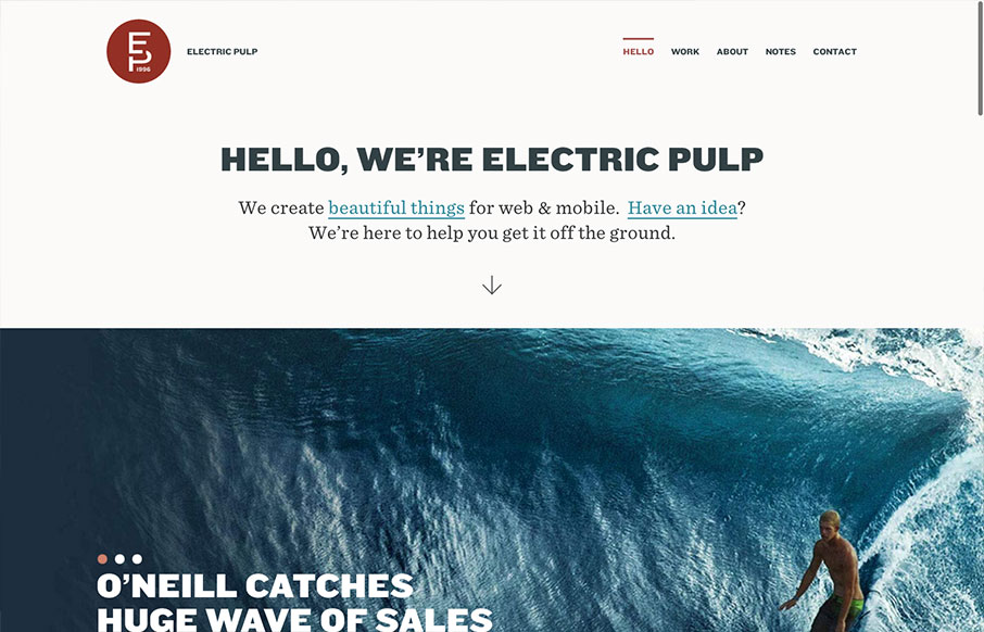
I'm always a fan of Electric Pulp's work, their company website designs have always delivered as well. Often being copied outright - which you know what they say about imitation and flattery... This site design follows a trend of simplifying the overall design. At...

