
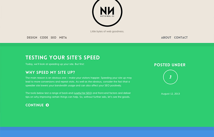
netnibbl.es takes simplicity to heart. The site is dead simple in layout, design and detailing, but the effect is sophisticated none-the-less. While differentiating post categories via color has it’s usability issues, netnibbl.es does a good job of adding an additional hint with the ‘posted under’ graphic. Also, fields of intense color can be overwhelming, but netnibbl.es has found a palette that certainly leaves an impression without being problematic. Really nice.


Fitts’s Law: Why the Easy Button Wins
Large, close targets are faster to hit than small, distant ones, that’s Fitts’s Law. A look at the 1954 rule behind buttons, prime and magic pixels, thumb zones, and dark patterns.


0 Comments