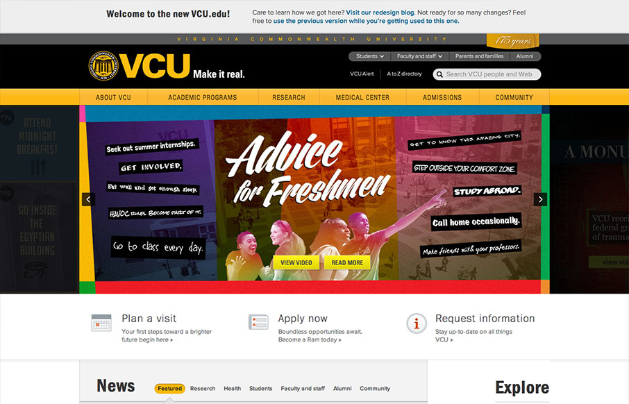
The new VCU site (specifically the home page) is chock full of info that’s nicely organized and presented. Despite all that’s going on here, I feel like they struck a good balance between practical and promotional elements. Even more impressive is the publicity of the redesign itself. They’ve got this great blog that outlines some of their goals, process, and success metrics. Along with that is a feedback mechanism and the ability to subscribe to news about future improvements. I think that really speaks to the very heart of the school and positively reflects it being one of the nation’s top public research universities. Well done.


The Call to Action, Revisited
The Call to Action hasn’t changed in a decade, but the bar has. A fresh look at prominence, copy, mobile tap targets, and accessibility, with lessons from three major design systems.


0 Comments