
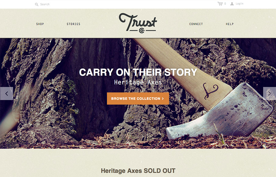
What a great website. First off it’s about Axes, which are just cool to think about and use. The design of the site has lots of little surprises but executed in a simple way. The main nav has these great large icons that are worked into the drop-down navigation lists. For me that’s a cool little moment when you mouse over them and see those illustrations. Then the area below the slideshow and main marquee items is designed in a way that feels like a collage of items. This breaks up what could be a pretty static design and keeps you interested visually all the way down the page. Wonderful and simple design.


Fitts’s Law: Why the Easy Button Wins
Large, close targets are faster to hit than small, distant ones, that’s Fitts’s Law. A look at the 1954 rule behind buttons, prime and magic pixels, thumb zones, and dark patterns.


0 Comments