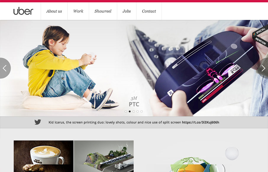
Pretty standard layout here but it has enough little bells and whistles to keep it feeling quite fresh. I love the slight squeeze that the main nav across the top does as you scroll down. It’s enough to make you notice it and follow it. The rest of the layout down the home page is dynamic with the image and the blocks of copy next to each one.


The Call to Action, Revisited
The Call to Action hasn’t changed in a decade, but the bar has. A fresh look at prominence, copy, mobile tap targets, and accessibility, with lessons from three major design systems.


0 Comments