Web Design Inspiration Curated
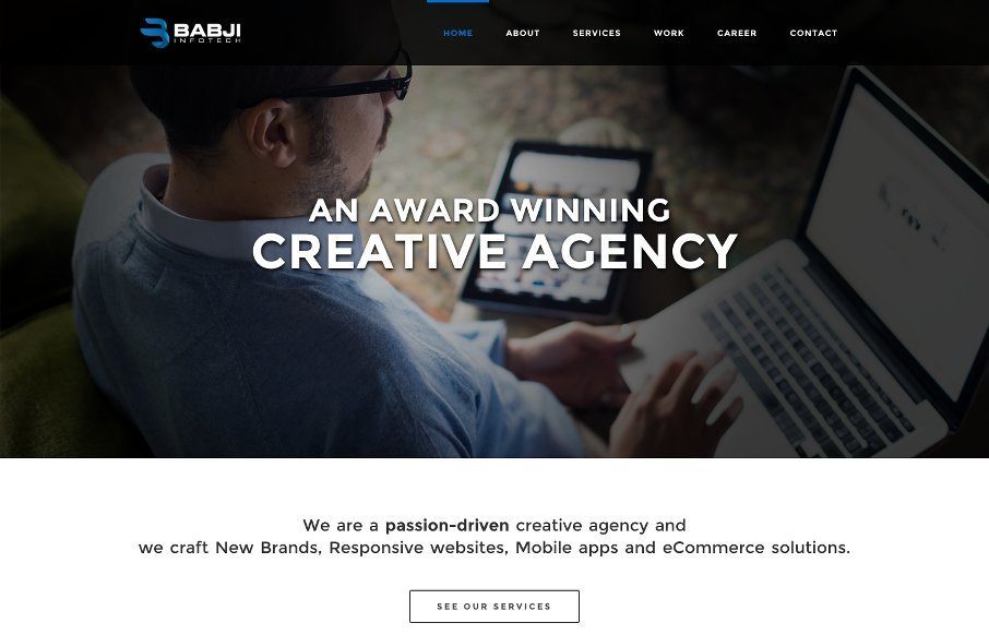
Babji Infotech
Pretty tight agency website. It has all the hallmarks of a good agency site and is also very well done. The grid is strong and easy to scan and there's enough little pieces to make it feel good as you scroll and interact with it. They also have some really strong case...
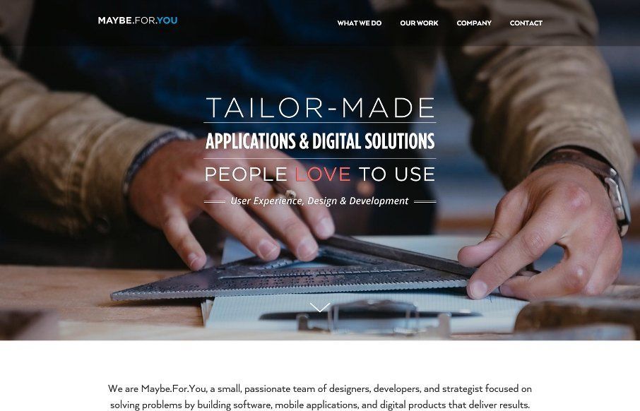
Maybe.For.You
I'm starting to see A LOT of websites that look really similar in their structure and layout. Leaving the differentiators to the photography and copy. Sometimes someone will put in a bit of elbow-grease and make the interactions really shine. The Maybe.For.You website...
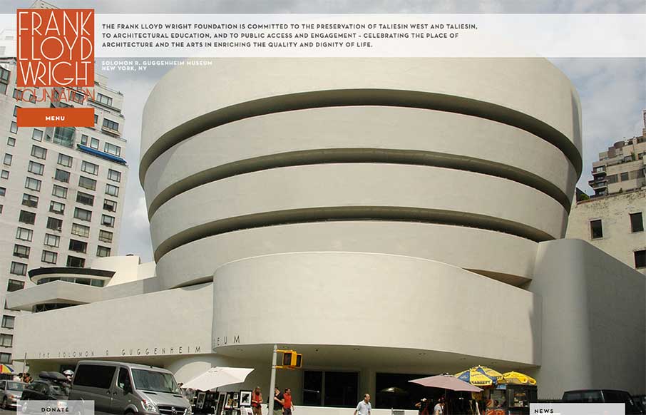
Frank Lloyd Wright Foundation
I gotta say, if I thought of a website for Frank Lloyd Wright I'd think of giant oversized images and minimal interface. Welp, that's what we get here, eh? Pretty nifty minimal vibe which makes things wright...
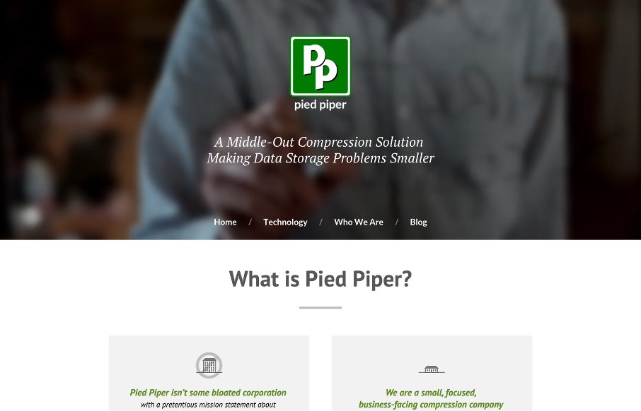
Pied Piper
Pretty nifty website for Pied Piper - if you're not watching this HBO series (after Game of Thrones) you're really missing out. I keep seeing characters on the show that remind me of people who come around the Cowork here. Fun! The website is fairly simple, but it...

UMS Radar #92
Hey folks! We've been doing this for a while now, but wanted to add this to the gallery space (while we're working on a new design for Unmatchedstyle). Each week, we do a round up of curated "stuff from the interwebs" that we call Radar. If you like it and want to...
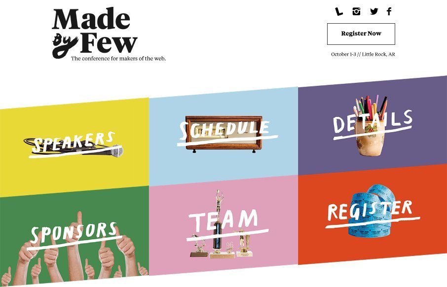
Made By Few
Beautiful website for the Made By Few conference! It's always a good looking site, but this year they've taken it up a notch. I love the hand made elements worked into a solid grid layout like this. All the way to the footer this thing is full of nice details and...
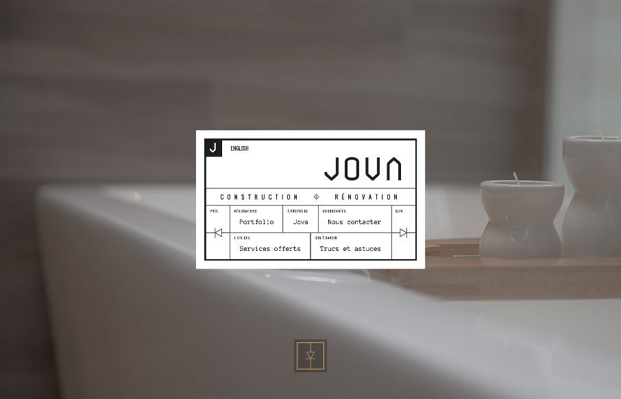
Jova Construction
Pretty trippy website. It reminds me A LOT of the way we approached flash based web design. Tons of animation and interaction. The Jova Construction website is solidly useable in the end which makes it worthy of being reviewed. From the Designer: JOVA Construction’s...
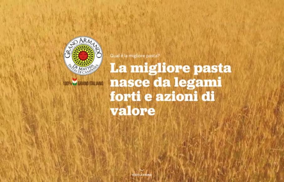
La Migliore Pasta
Man! I love the illustrations on this website. I can stare at them all day! They are well done and the animations that load them up as you scroll down the page for the first time are very well timed. The colors and style all work so well with the content too. Lovely,...
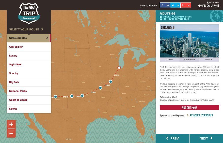
USA Road Trip Recommender
This website is fun. It's fun to use and has fun content. It makes me want to go get in the car and start driving around the country. Cool stuff. The interactions need no instruction and you can be playing with it in seconds. Good stuff. From the Designer: "Using an...
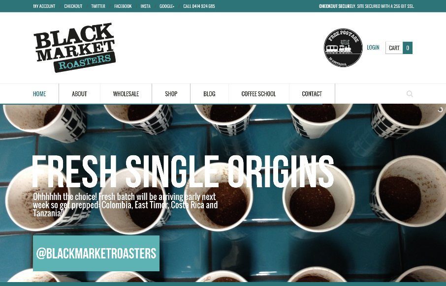
Black Market Roasters
A strong grid and blocky design elements always make a good pair. Throw in some good photography and you have a winner. From the Designer: We are the dudes that source, roast & deliver fresh roasted coffee. From our base in Sydney, Australia, we run Barista...
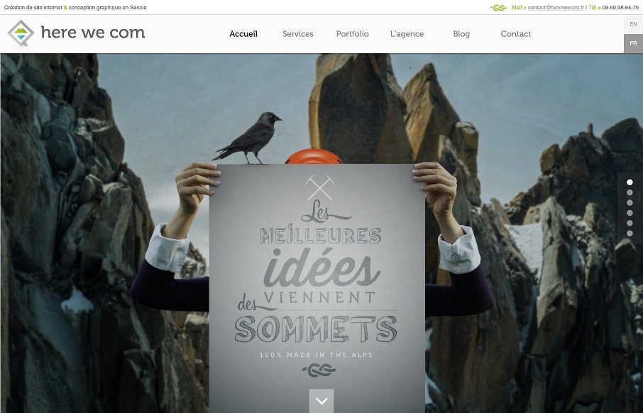
Here we com
I like the illustrations, like the ice berg and some of the sub sections of this website more than the overall layout itself. It's a strong website through and through, but some of it formulaic, then when you discover some of the sub sections you see what it is and...
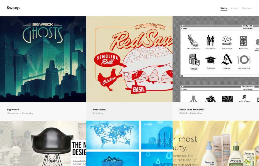
Sweep Studio
Sometimes simple is all you need to let the value of the work show through. This site is a perfect example of that and showing restraint. Take heed and enjoy. From the Designer: Sweep Studio is a Toronto based creative consultancy specializing in graphic design for...
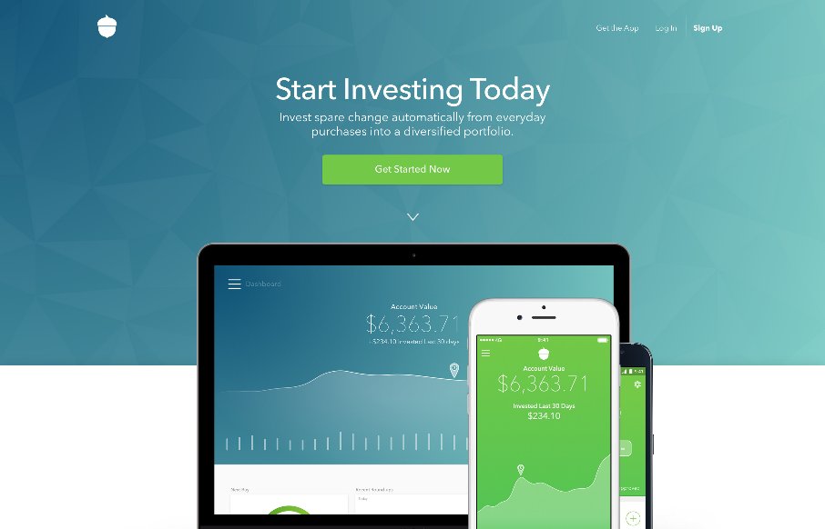
Acorns
It's a subtle thing but the way the main "hero" image slightly scrolls over the header/display copy is brilliantly done. Then there are other targeted little interactions and animations that really sells the "high class" vibe of this site design. This website is...

Haven
This product based website for Haven is beautifully done. I love the large hero style image and the way the elements "load in". I love the way things appear as you scroll down the page and the blocking of content together the way they've done. It's also very slick...
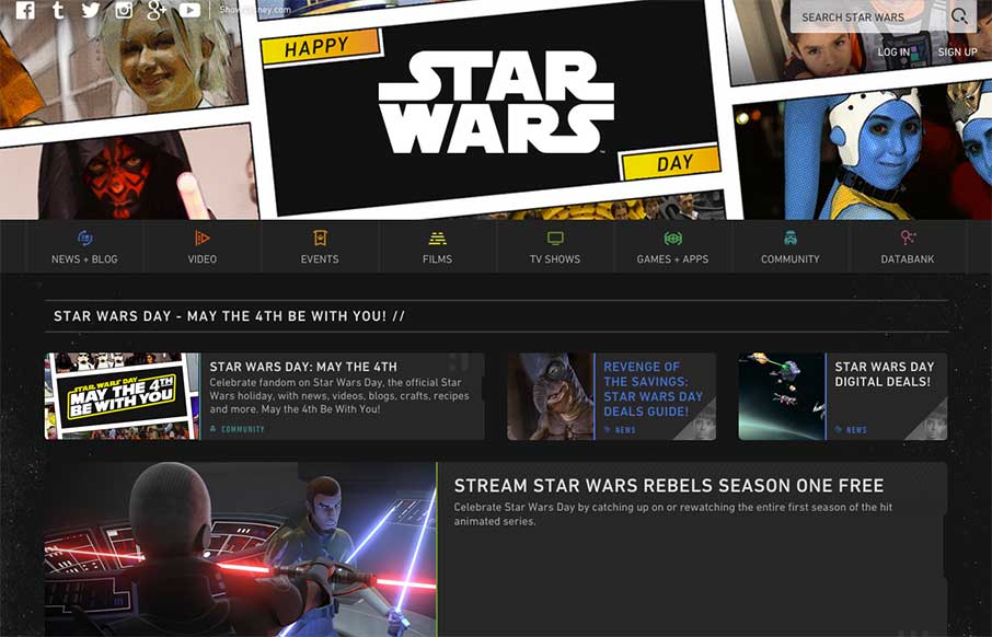
Star Wars – Again
But first - May the Fourth Be With You We plan always review the Star Wars site for May 4th - because, that's what you do on May 4th if you run a web design inspiration gallery for geeks and nerds all across the universe (or world - we're working on the former). I...
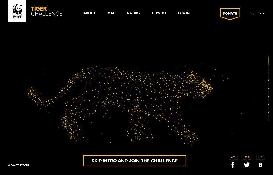
Tiger Challenge
We here at Unmatchedstyle apologize for falling off the map last week a little - we were running one of our web designer conferences, getting ready to teach our Iron Yard class, and one of us had a baby... either way - we thought we'd start the week off with an...
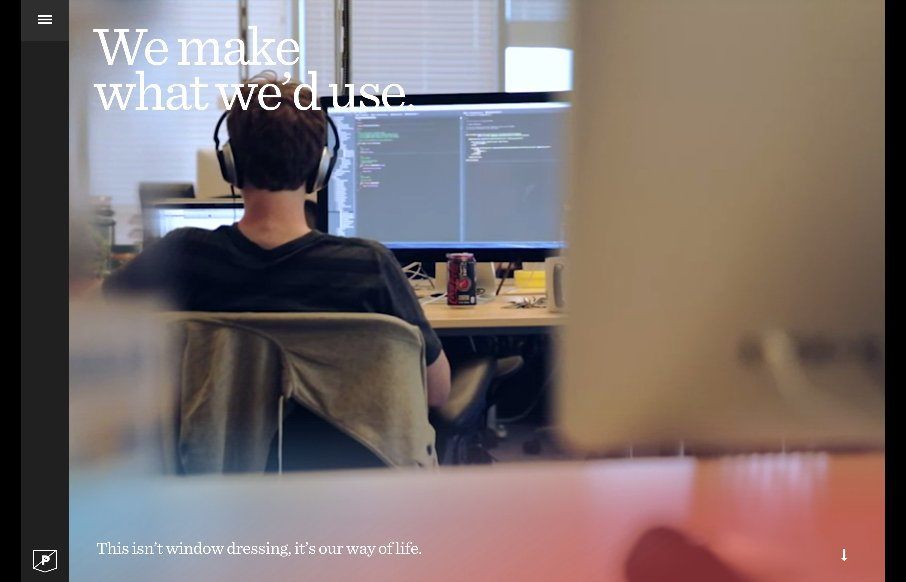
Purple Rock Scissors
Best use of video background work (and other things too) we've seen so far - coming from Purple Rock Scissors out of Orlando. Every page has a hand-crafted look - whether it's the fast loading video backgrounds, the animated SVG work, or that cool list view with...
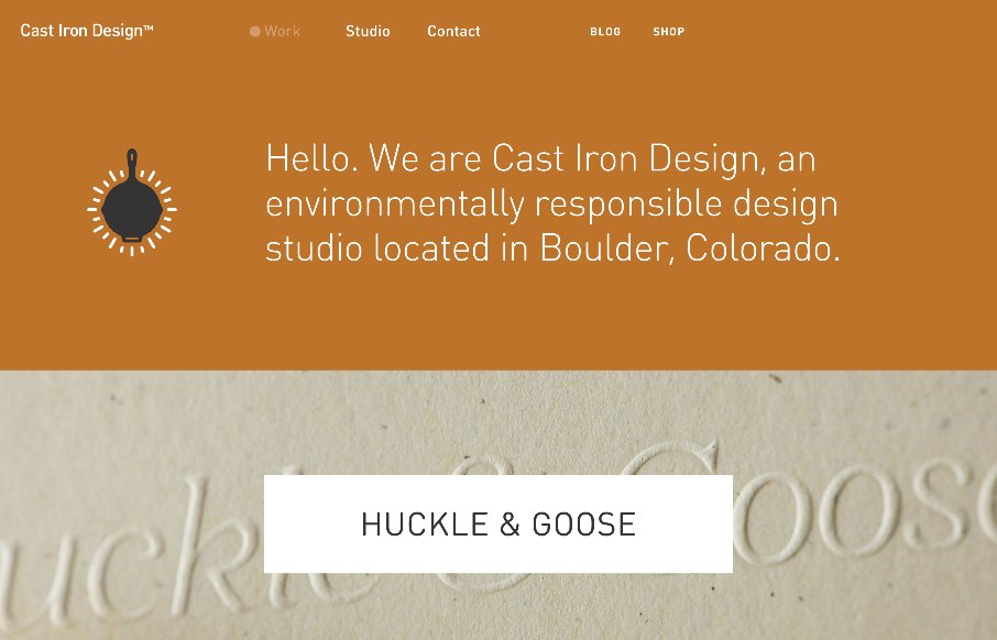
Cast Iron Design
Man - this is some sweet work from Cast Iron Design out of Boulder, Colorado. After going back through the site, I almost made this a Friday in-depth review. They go straight to the heart of showing off their work on the home page, using this trend of background image...

Good Fortune & Wildflower
Love these sites from Resn out of New Zealand. They use Canvas / WebGL for a "quick" site. The Wildflower site you can share with a loved one.. over Twitter (or FB). There's some zen to all of it. Two related projects by same company, showcasing generated flowers on...
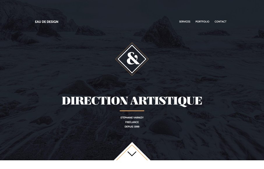
Eau de design
We really like this site from Stephane Varnizy out of Paris. Excellent movement on scroll and in the drawing of the SVGs. Also really like the coloring - and the Portfolio - good stuff there. From the Designer: Hi, my name is Stéphane Varnizy and I’m a French...
EMAIL NEWSLETTER
News & Articles
Draft Episode 14: Design in the Browser
 In this episode of Draft we discuss “designing in the browser” what it means for your techniques and how we work.
BizCraft Episode 14: Dan Mall
 Special guest: Dan Mall from SuperFriendly and other well known web stuff. In this episode we discuss interns, fighting apathy and how to actually make a difference with what you do.
Draft Episode 13: Content First
In this episode of Draft we discuss “content first” and what it really means for the web design process.

HARD WORK. CLEAN FUEL. NO EXCUSES
Use “WARRIOR2023″ for 10% off.