Web Design Inspiration Curated
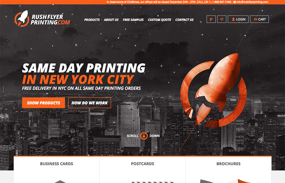
Rush Flyer Printing
We've done some work for some printing companies (both 2 and 3d) in the past year, and know how hard it can be to merge the design side of a client facing website, with the functionality of an ordering web app. This site from Rush Flyer Printing out of NYC, is a good...
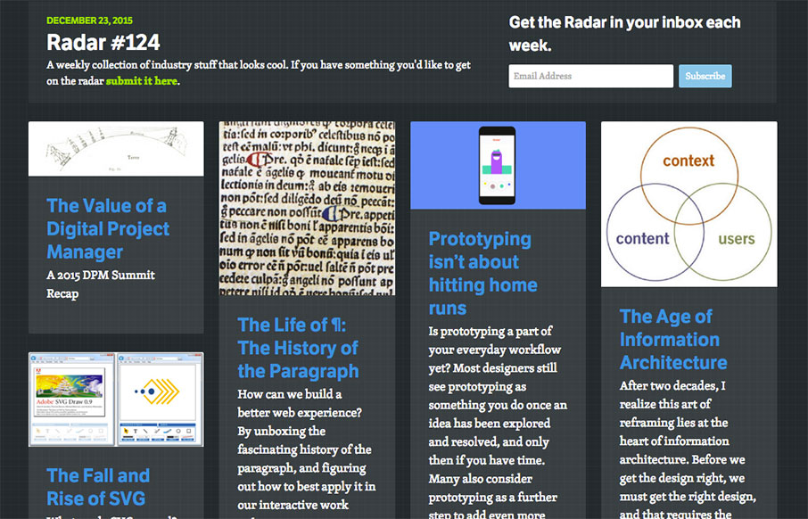
Radar 124
Each week, we do a round up of curated "stuff from the interwebs" that we call Radar. In this week's 124th Radar: The Value of a Digital Project Manager A 2015 DPM Summit Recap The Life of ¶: The History of the Paragraph How can we build a better web experience? By...
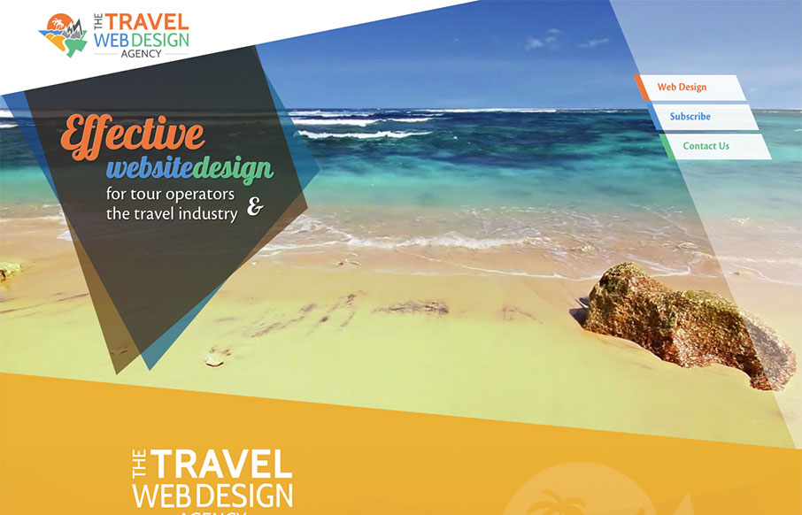
Travel Web Design Agency
I'll admit - it took me a minute to get into this website, The Travel Web Design Agency, by WebbedFeetUK. I like movement on sites, but I wasn't sure if this was too much all at once on-scroll - plus, it's very SEO'd - so that deterred me - since we get a lot.. a...
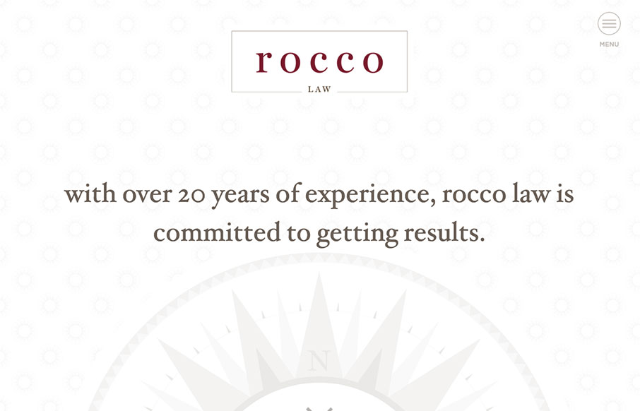
Rocco Law
We've seen and built hundreds of law sites - so always interested to see other's takes lawyer sites. This one for Rocco Law out of Philadelphia, built by Blinebury Design - is very good. It's the small things that get me - besides the compact color scheme, with good...
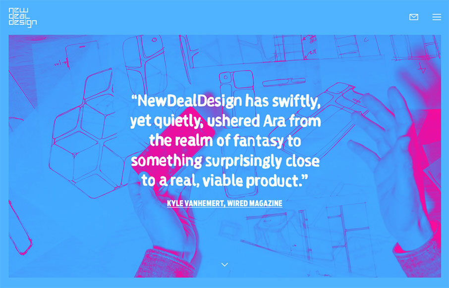
NewDealDesign
Good stuff from NewDealDesign out of San Francisco. The site's cool and vibrant - their work is freaking awesome. From the Designer: Matchmaking people, culture and technology, we build joyful physical and digital experiences for innovators big and small. Strategic...
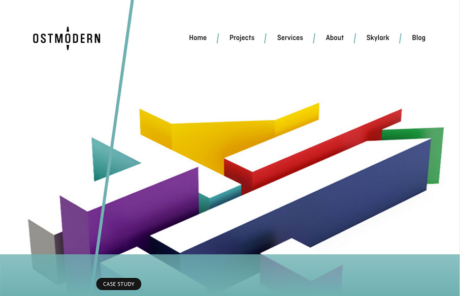
Ostmodern
We're not Arsenal fans here at the house, but I still like the work of Ostmodern (even their Arsenal site) out of London. Clean and bright, and not overbearing. From the Designer: Hard for me not to be biased as we designed and built this site! Ostmodern are a 60...
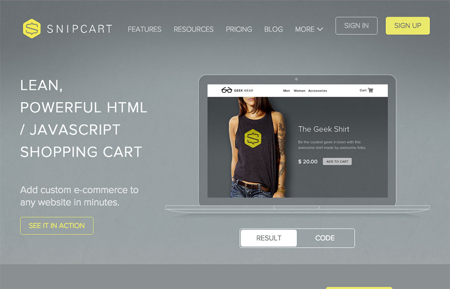
Snipcart
Decent site from Snipcart out of Quebec - one thing I like is the mega-dropdown in the nav - keeps the site cleaner. Also like the line illustrations on each page (and in the nav) - cool. From the Designer: Complete marketing website for Snipcart, a developer-first...
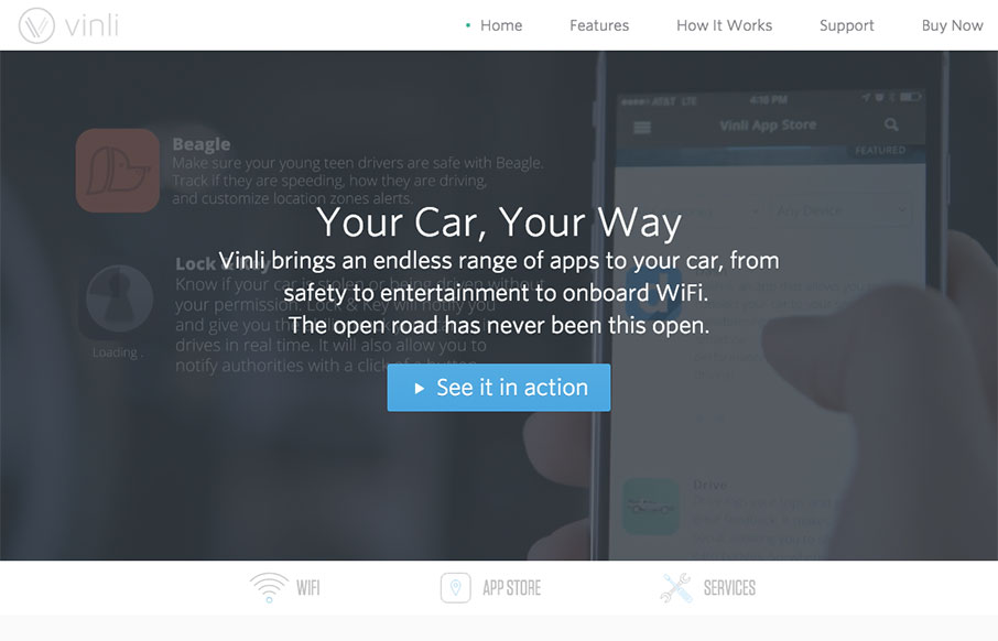
vin.li
I want one. Cool site from Vinli that allows wifi and apps for your car - I like the movement and quick svg line drawings to give a cool, but light feel to the site. And, um, I want one.
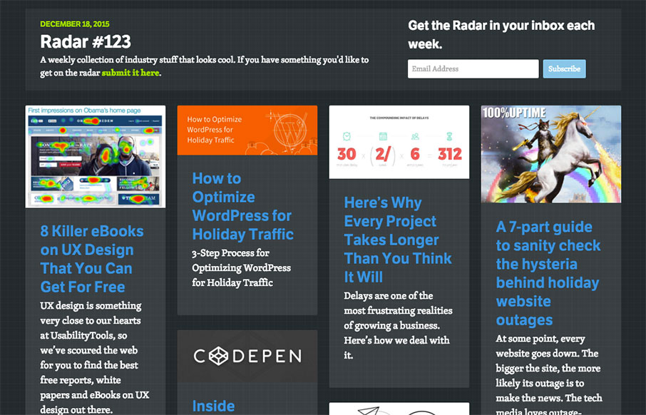
Radar #123
Each week, we do a round up of curated "stuff from the interwebs" that we call Radar. In this week's 123rd Radar: 8 Killer eBooks on UX Design That You Can Get For Free UX design is something very close to our hearts at UsabilityTools, so we’ve scoured the web for you...
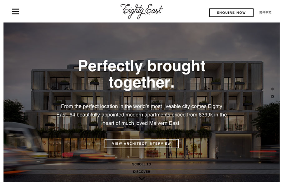
Eighty East
Good looking real estate site for Eighty East out of Melbourne, Australia - done by Yoke. I actually like the Chinese version a little better - the characters fit in with the aesthetic of the site even better in that version. Twitter: @welcometoyoke Role: Designer &...
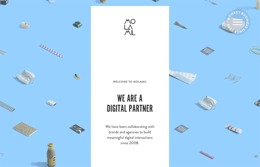
MOLAMIL
Fun, fun, fun. I like this site from Molamil out of Denmark - even if the wack-a-mole heads of the employees are a little creepy... Great transitions into other pages - and fun vibe all the way through! Submitted by: Joakim Norman Twitter: @molamil Role: Designer...

Frank Underwood 2016
We don't review political websites normally - And - maybe I'm a little politically jaded, but he's the only candidate that I've seen that's actually honest with his intent. If you don't immediately recognize this as a reference to NetFlix's House of Cards - I can't...
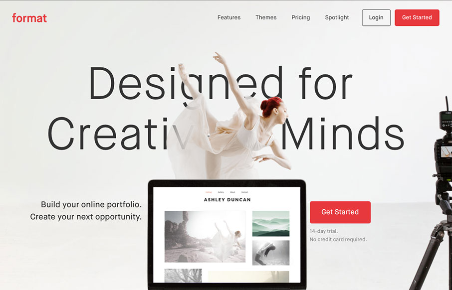
Format
You know, I have heard a lot of belly-aching from designers about pre-designed website platforms like Format (not specifically them, but others). My question to them has always been, "listen, is that website meeting the customer's needs? Yes? Then what's wrong with...
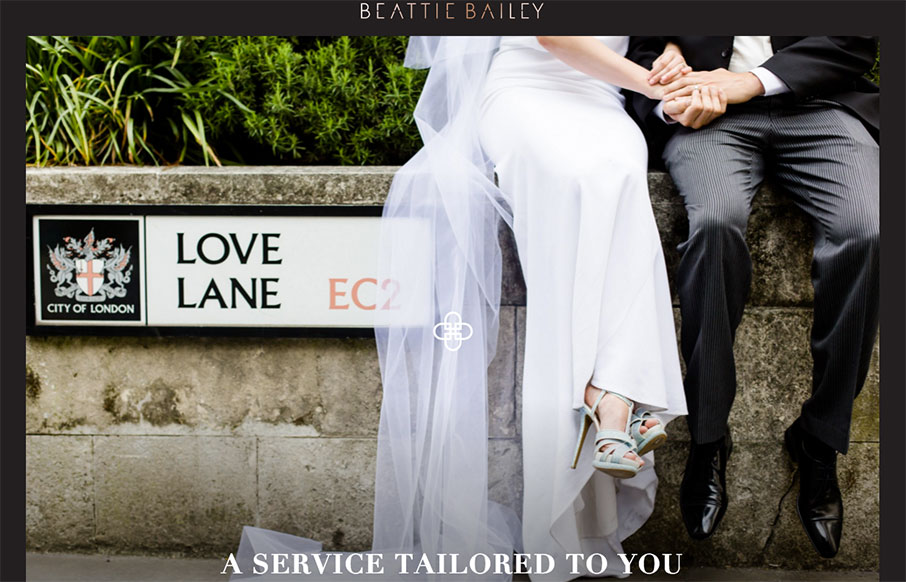
Beattie Bailey
I think we would have replaced our wedding planner with Beattie Bailey (out of London), just based on their website. Love the framing of the site, the movement (from top to bottom, and in the logo), and the nav (how it starts in the footer, and moves up on scroll to...
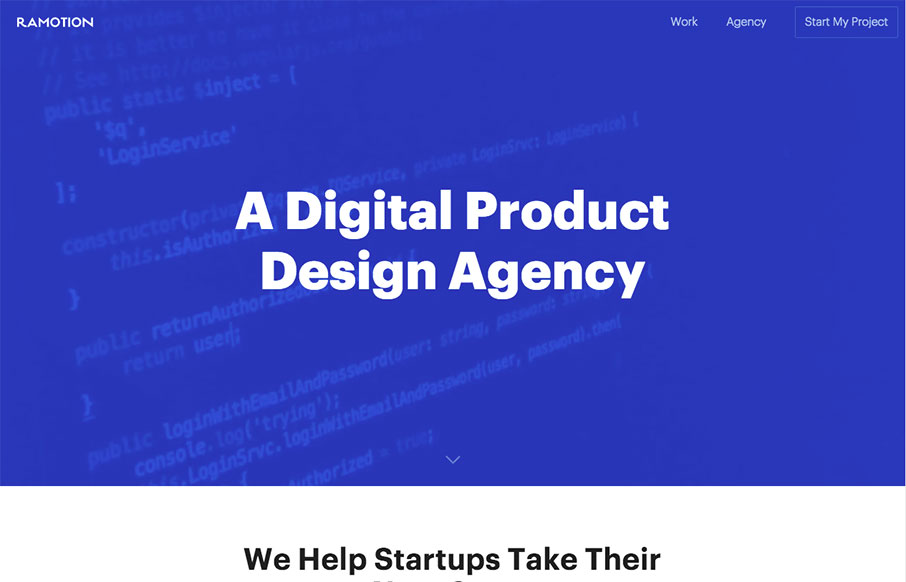
Ramotion
Good, clean design from Ramotion out of San Francisco. Very work-centered, and just enough color and animation to make the first three work samples pop.
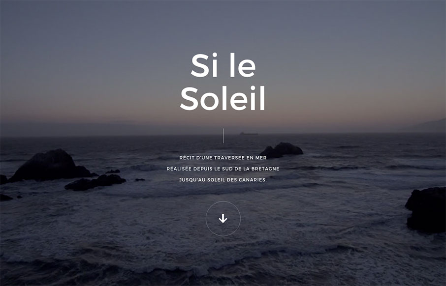
Si le Soleil
Pretty crazy site design. I love the animated interactions and imagery and stuff. It's also pretty rad that they were able to keep it pretty much intact on smaller mobile screen widths too. Check out that nav design too, pretty intense but super rewarding on desktop.
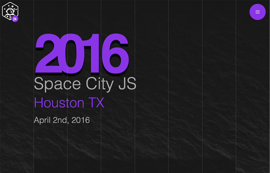
Space City
So far, today is friends day at UMS - here's another friend of ours: Matt Keas (@matthiasak) has his 3rd year (I think) conference Space City JS in Houston, Texas in April a couple of weeks before our ConvergeSE. We like the super-simple one-pager, perfect for a...
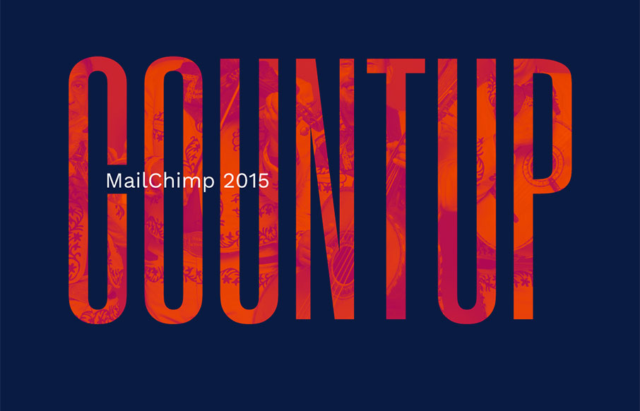
MailChimp 2015
Ahhh - our friends at MailChimp have put our their 2015 Year in Review - and it's pretty sweet! I love how it starts with the mariachi band cover of the Star Wars theme - and even though it's a simple site, the color and vibe really speaks to MailChimp's fun...
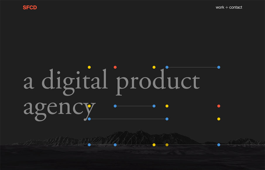
SFCD
As I'm reviewing the SFCD website, I have the Foo Fighters' Something From Nothing blasting in my headphones - when I landed on the page, the video background and animations go really great with each other. Besides that - this is a cool site, that has great movement...
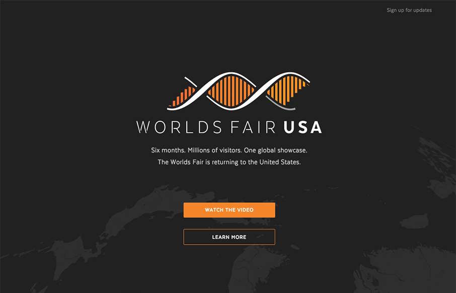
Worlds Fair USA
Sweet little design for the World's Fair USA "petition". It has a bunch of cool features to it. It doesn't quite seem complete - but there are some nice elements in it (plus - yeah, I'd like to see a World's Fair come back to the US too - I still have a program from...
EMAIL NEWSLETTER
News & Articles
What Comes Next is the Future
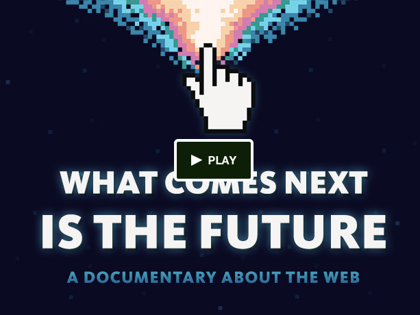 An interview with Matt Griffin of Bearded Studio about their documentary “What Comes Next Is the Future” and why you need to help fund this thing.
ConvergeFL 2014 – November 7-8
 This November 7-8 ConvergeFL is coming back better than ever. How can it be better? Because we’re creating a format that will give you more time with the speakers and more time with each other.
BizCraft Episode 38: The one where we talk about speakers and conferences
 In this episode of BizCraft we talk all about speaking at conferences; what to ask for, what to expect and some opinions form both sides of the discussion.

HARD WORK. CLEAN FUEL. NO EXCUSES
Use “WARRIOR2023″ for 10% off.