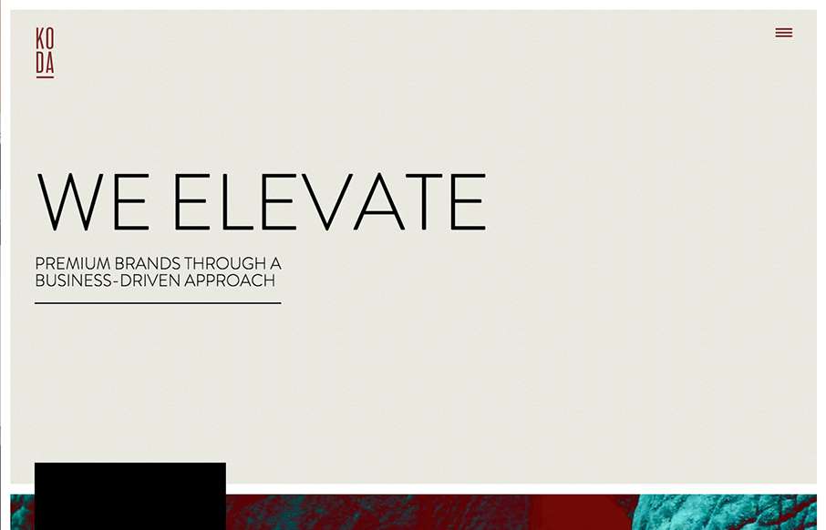
I love the “vibe” of this website. The way the main section changes across screens is smart and subtle. I also love the way they used the fixed background image as you scroll to keep a nice rhythm going for you. The play between muted and strong colors goes a long way too. Great looking site!


The Call to Action, Revisited
The Call to Action hasn’t changed in a decade, but the bar has. A fresh look at prominence, copy, mobile tap targets, and accessibility, with lessons from three major design systems.


0 Comments