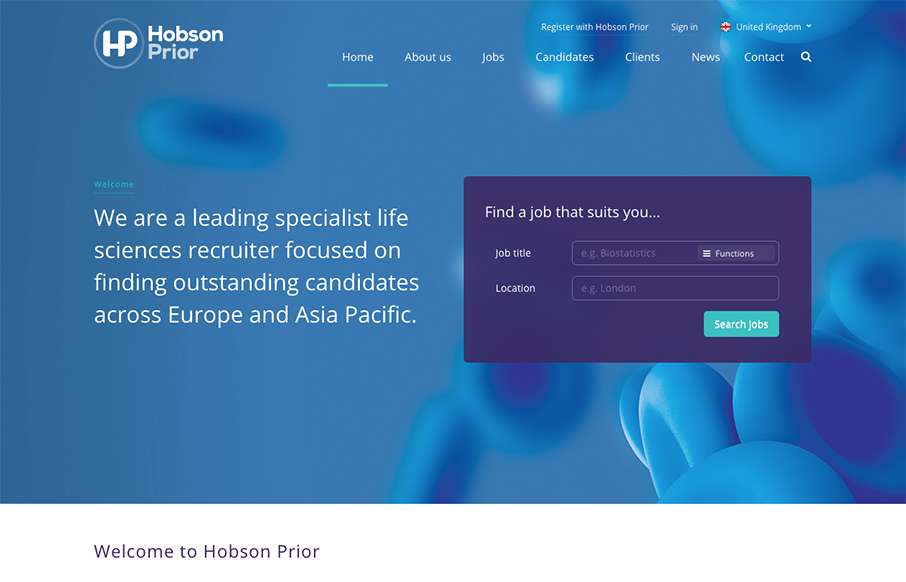
I really dig the way the jobs search box is designed for this site. It’s first and foremost to the user and is simple and easy to understand before you even use it. Cool. I also like the responsive take on the design when you scale down to mobile screens as well.
Glassmorphism: The Transparent Design Trend That Refuses to Fade
Glassmorphism brings transparency, depth, and light back into modern UI. Learn how this “frosted glass” design trend enhances hierarchy, focus, and atmosphere, plus how to implement it in CSS responsibly.


0 Comments