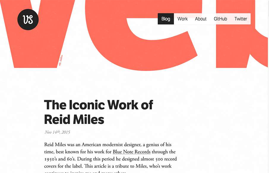
Many designers skip straight to their Work on their portfolios, and the art of the Blog is been pushed to the background. So I like how Viljami Salminen’s portfolio site does the opposite. Sometimes – if you have good posts – this can be a more effective self-branding tool than just displaying your work. I like how the Work is represented by letter blocks, instead of showing a sample of a website that doesn’t match your website’s look and feel. Kudos.
Submitted by: Viljami Salminen
Twitter: @viljamis
Role: Designer & Developer
Country: Finland


0 Comments