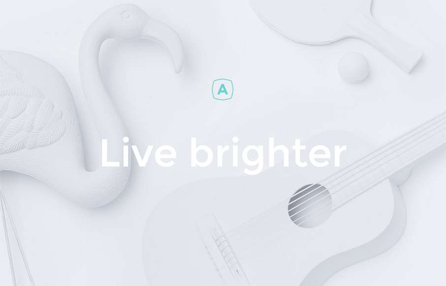
At first glance I felt like this site design was for an architecture or law firm or maybe some kind of financial consulting company, but it’s a dentist. It’s beautiful and feels very modern, like modern architecture does. I love the interactions and the asymmetrical layout to the elements. I wonder about the right fit for the market but maybe i’m wrong?
Glassmorphism: The Transparent Design Trend That Refuses to Fade
Glassmorphism brings transparency, depth, and light back into modern UI. Learn how this “frosted glass” design trend enhances hierarchy, focus, and atmosphere, plus how to implement it in CSS responsibly.


0 Comments