Web Design Inspiration Curated
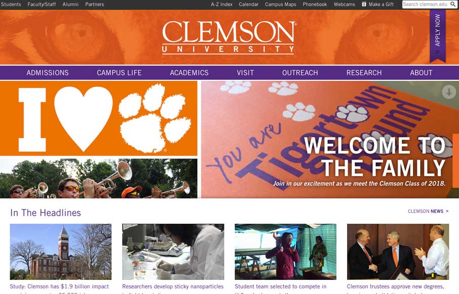
clemson.edu
Really nice Responsive design solution for a major university website. The website is so huge (like most Univ. sites are) that i'm not going to go into any subpage stuff. The main thing I want to point out is the way the navigation is worked into the hero area as a...
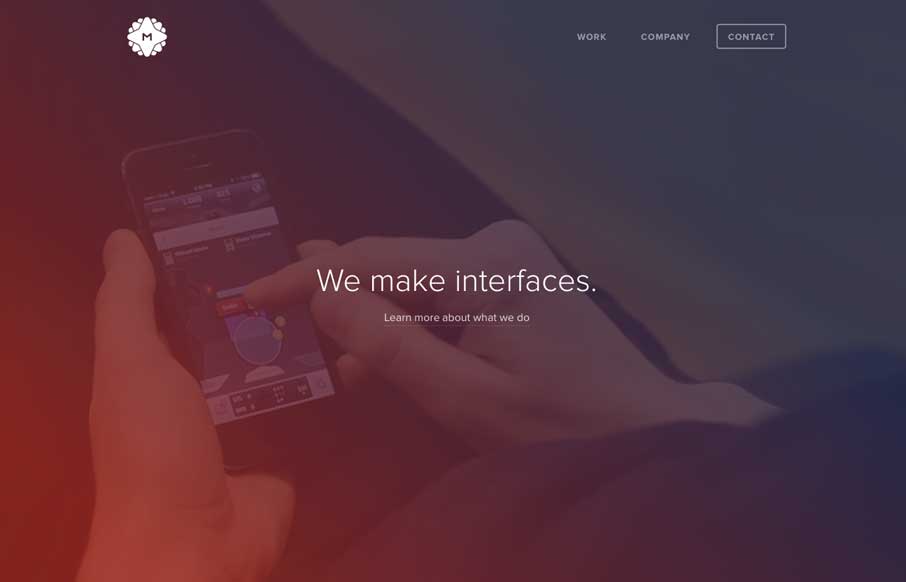
Metalab
I really like the overall simplicity in this design. It get's you to the point really really fast. I think it boarders on being too subtle at times, but that's not always a bad thing 🙂 I love the visual rhythm in the work page the most. They could keep stacking work...
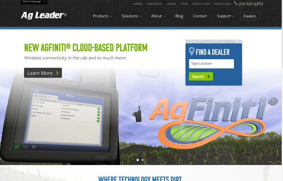
AG Leader
You see these nice responsive sites with their sticky nav and circular images and slick transitions and think, "Yeah, that's cool, they did everything right." I'll be honest, you don't typically see this much content loaded in and still embody those nice details in...
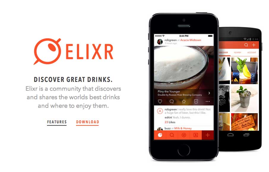
Elixr
Neat app site design. I really like how the top navigation comes from the bottom(ish) of the space you see after the initial home page area loads. Sliding up to take it's place at the top of the page. Then the slight parallax behind each screenshot, then how you can...
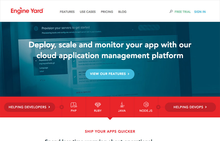
Engine Yard
Beautiful redesign of the Engine Yard website. What I like to read most is that they focused on the content first and dug into what people needed to get out of the website before any sort of fanciness. We also dug deep into our site and found what worked for visitors...
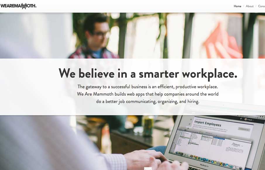
We Are Mammoth
The We Are Mammoth website is a simple site that feels tight and focused in content, clear in message and definitive in style. Not much more to say. Good stuff.
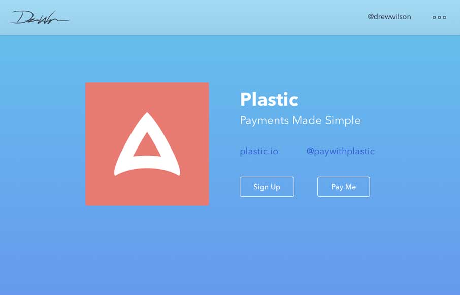
Drew Wilson
Drew Wilson's portfolio site is a delightful experience. From the first few examples of products down to just digging through his project timeline it's smart and easy to take in. Well done sir.
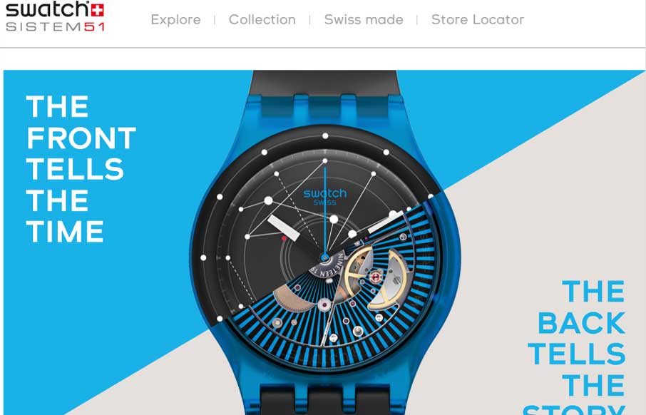
Swatch SI System Watch
Fun product page for the Swatch SI System Watch. It makes strong use of timed animated images of the watches, letting you get a sense of their tactile quality as you scroll. I also dig the map, click on a store location to see the way the map responds. It's subtle but...
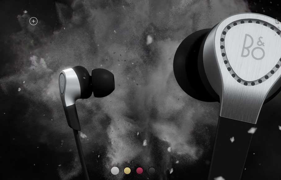
Beoplay H3
Beoplay's H3 site site is truly beautiful. I'm often against the practice of hijacking the user's ability to scroll, but the effect works really well on this site. Every 'page' is clean and minimal, but provides a very different user experience. The videos are lush...
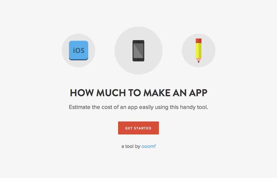
howmuchtomakeanapp.com
This site/app is so dang simple it hurts. It's beautifully done, you could use it to send to a prospect so they understand pricing across the industry. The icon work is great, coloring is great and there's no barrier to use - you just answer questions and click...
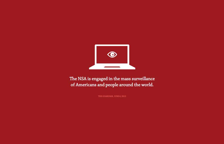
No Way NSA
The Now Way NSA page is largely a big infographic/news piece. It's worth a look through other than to review the design of it, but the design of it is great. Now go and get enraged at the NSA.
psdesignuk.com
This is a great site with beautifully simple interactions. The hover overlays on the work are really soft and lovely and the flat art is engaging without being distracting.
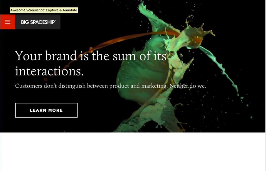
Big Spaceship
Very cool and slick looking design studio website. I love the main nav design too, how it takes over the design of the page but is super snappy and responsive to your interaction. The fixed logo/nav block that floats in the same position as you access sub pages is...
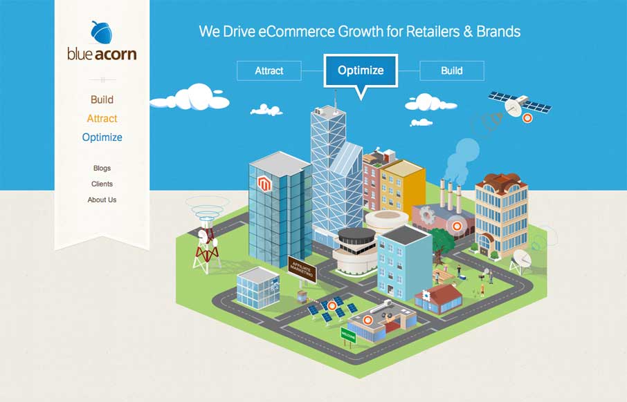
Blue Acorn
Really cool interactive illustration for you to play with. It's super rewarding to watch the building sections drop down onto the map thing. (Maybe i'm just easy to entertain...) It's stuff like this that can keep people on the page longer which is a good goal to work...
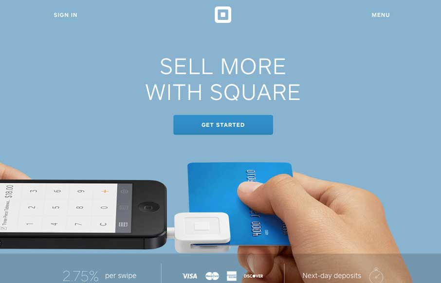
Square
The updated Square website (it'll probably change a bit by the time we post this) is excellently done. The main top section is used to tell the story of what's going on right now with square. Usually involving some sort of tricky interaction or animation. Then the...
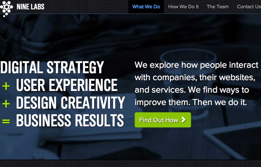
NineLabs
New site for NineLabs. One of the strongest factors working on this site are all the testimonials. It really feels like this team is on the ball and really delivers quality to get so many great referrals to put on the page like this. The visual aspects of the design...
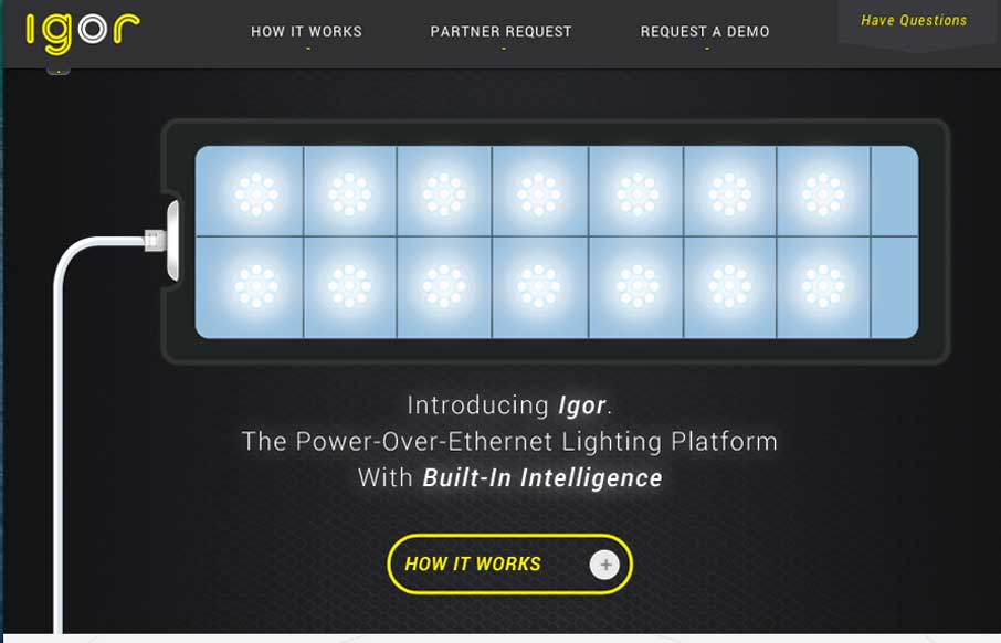
igor
There are some really great interactions here. You are rewarded for clicking through the main "what igor is" graphic prompts with great looking illustrations. Very engaging. The second sub-block of what the product is about are also well done. I love how the...
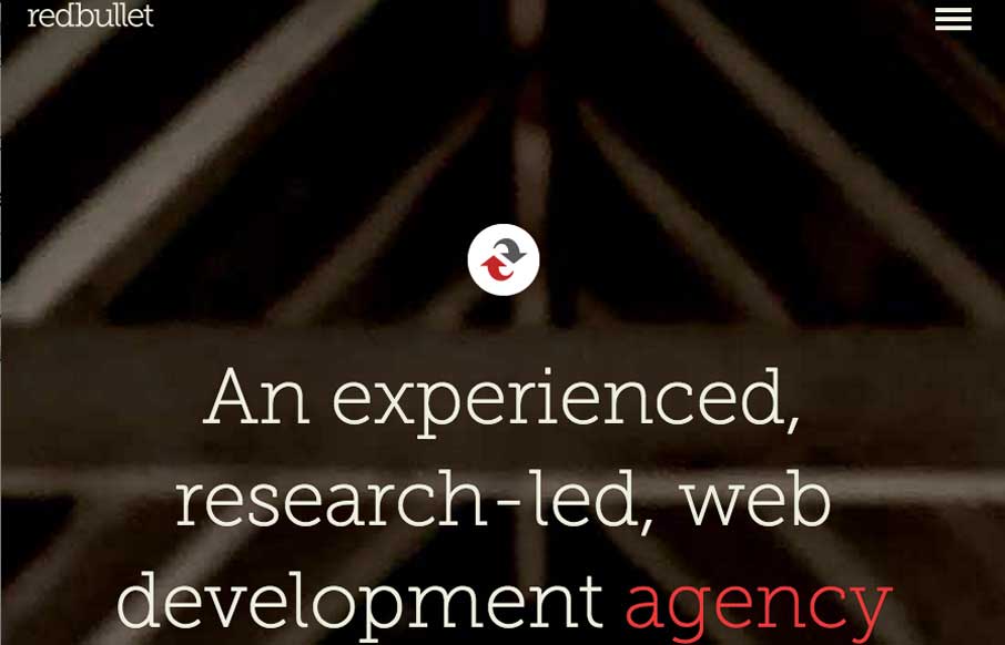
redbullet
Nice minimal(ish) design. I really like the interaction where the top nav area get's highlighted by changing to a red background only when you scroll back up. Just to give you that hint that it's there. Then the hamburger icon leads to one of those full overlay nav...
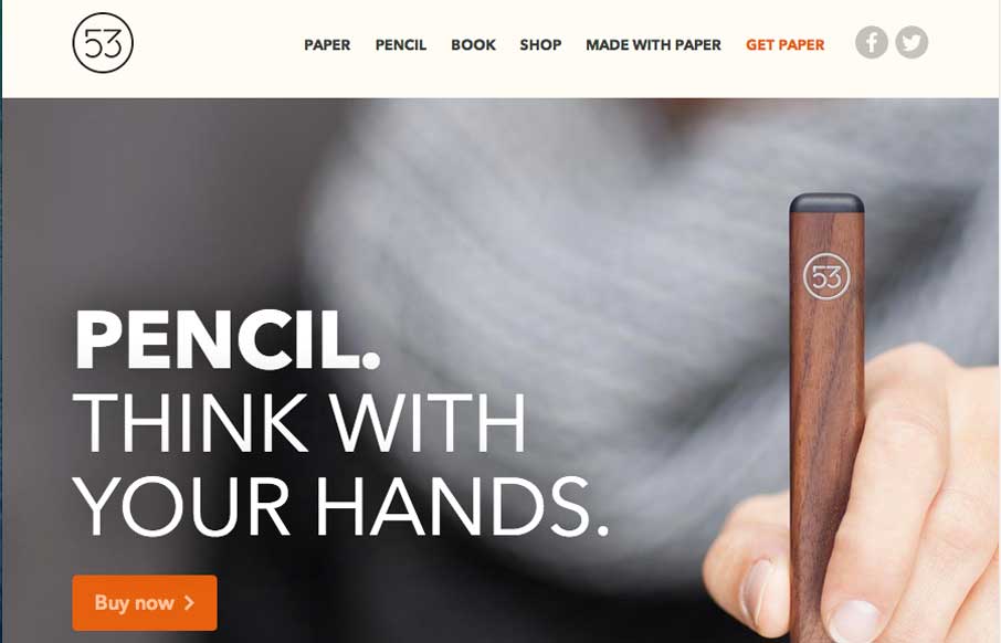
Pencil
Wonderful design for Pencil. This page is just a workshop of how to use super engaging interactions to feature a real life product. I luuurve the way the Pencil product is shown off by letting you explode it apart simply by scrolling the page up or down. Then you can...
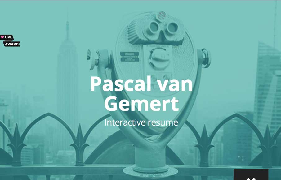
Pascal van Gemert
Very beautiful and cleverly designed resume page. I really dig how the down arrow in the bottom right turns into the page's navigation. There's some really subdued interaction design with the starts and icons as you make your way towards the bottom of the page, just...
EMAIL NEWSLETTER
News & Articles
Icon Pack Giveaway by Picons.me
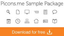
Snag this super icon sample pack from Picons.me, 12 really great vector icons and they’re all royalty free.
An Event Apart Atlanta with Jeffrey Zeldman

Talking with Jeffrey about An Event Apart coming back to Atlanta, how to create a great conference and some great tips for all of us aspiring public speakers.
Book Review: A Book Apart – HTML5 & CSS3 Editions
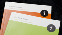
Review of A Book Apart editions; HTML5 For Web Designers & CSS3 For Web Designers. Plus a book giveaway!

HARD WORK. CLEAN FUEL. NO EXCUSES
Use “WARRIOR2023″ for 10% off.