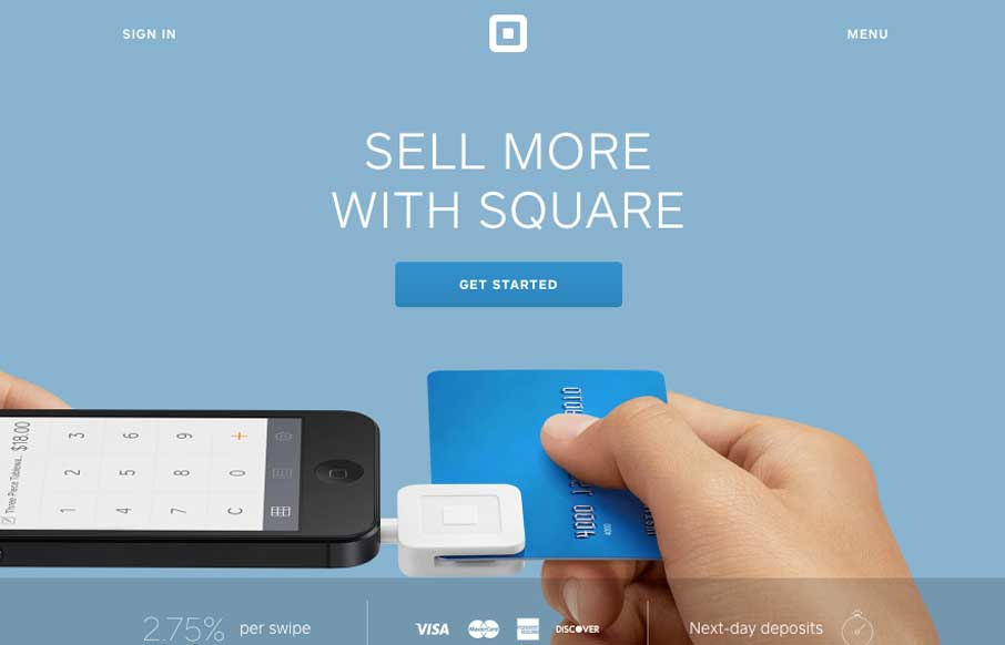
The updated Square website (it’ll probably change a bit by the time we post this) is excellently done. The main top section is used to tell the story of what’s going on right now with square. Usually involving some sort of tricky interaction or animation. Then the rest of the page is succinctly designed overall – keeping you focused on the company’s main produce uses.


The Call to Action, Revisited
The Call to Action hasn’t changed in a decade, but the bar has. A fresh look at prominence, copy, mobile tap targets, and accessibility, with lessons from three major design systems.


0 Comments