
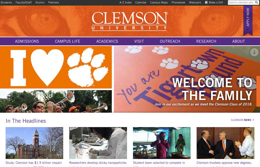
Really nice Responsive design solution for a major university website. The website is so huge (like most Univ. sites are) that i’m not going to go into any subpage stuff. The main thing I want to point out is the way the navigation is worked into the hero area as a big mega-drop-down sort of deal. It’s clever and feels integrated into the home page more than most.


Fitts’s Law: Why the Easy Button Wins
Large, close targets are faster to hit than small, distant ones, that’s Fitts’s Law. A look at the 1954 rule behind buttons, prime and magic pixels, thumb zones, and dark patterns.


0 Comments