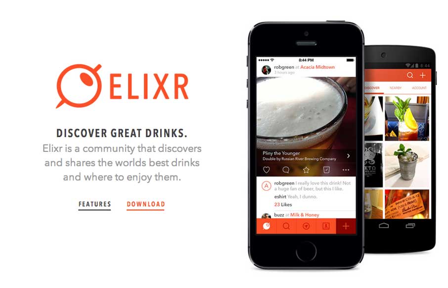
Neat app site design. I really like how the top navigation comes from the bottom(ish) of the space you see after the initial home page area loads. Sliding up to take it’s place at the top of the page. Then the slight parallax behind each screenshot, then how you can look deeper into each screen by clicking the sub sections beside each screenshot.
Glassmorphism: The Transparent Design Trend That Refuses to Fade
Glassmorphism brings transparency, depth, and light back into modern UI. Learn how this “frosted glass” design trend enhances hierarchy, focus, and atmosphere, plus how to implement it in CSS responsibly.


0 Comments