Web Design Inspiration Curated
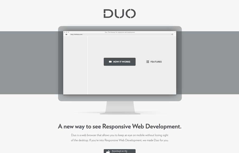
helloduo.com
Really super simple page. Normally something this scaled back wouldn't make it into the gallery, but wait - click the "features" link. That's why it's in here. Very smart effect.
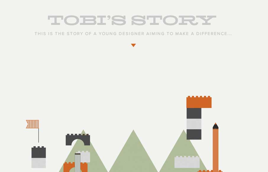
Toby’s Story
The Toby's Story site is just fun. There's really no functional aspect to it, like a call to action or newsletter signup but you know what I don't care. It's cute and exists solely just to be a fun little experiment. I always love seeing that there's someone out there...
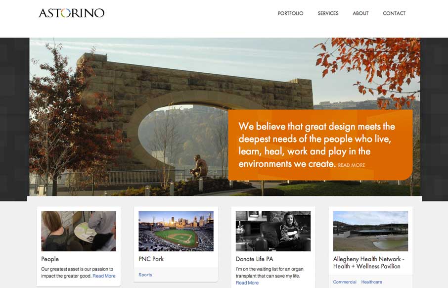
Astorino Architects
Great new site launched for Astorino Architects from the mighty Bearded Studio team. I love the clean layout and responsive design decisions made between the different screen widths. There's a good bit to study and apply from this sit to all of our projects....
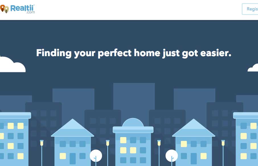
Realtii
Realtii does a great job of using animation to focus the user's attention on key details. The colors are soft and friendly. A pleasant site with simple detailing.
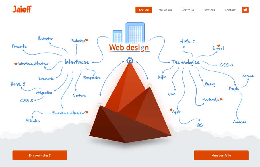
Jaieff
There's a lot to like about this website. But the best part is the interactive illustration on the home page. It's pretty fun to mouse over that little gear and get all the arrows and stuff to show up. Also check it out on smaller screen widths, the stuff that get's...
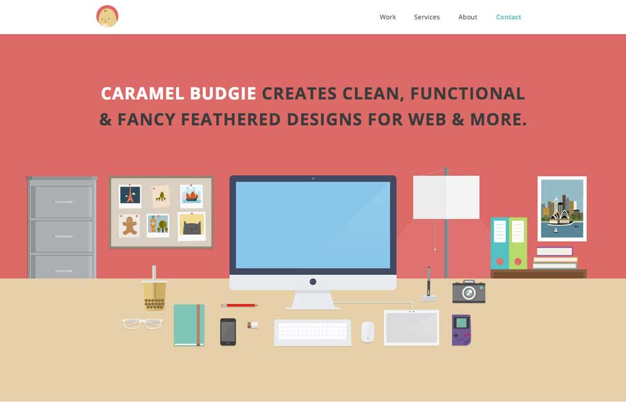
Caramel Budgie
Man I love these illustrations! Super slick and both clean and illustrative at the same time. I like that it's a single page layout - that works pretty well for this instance. Enough eye candy and simplicity to get the site to work for them.
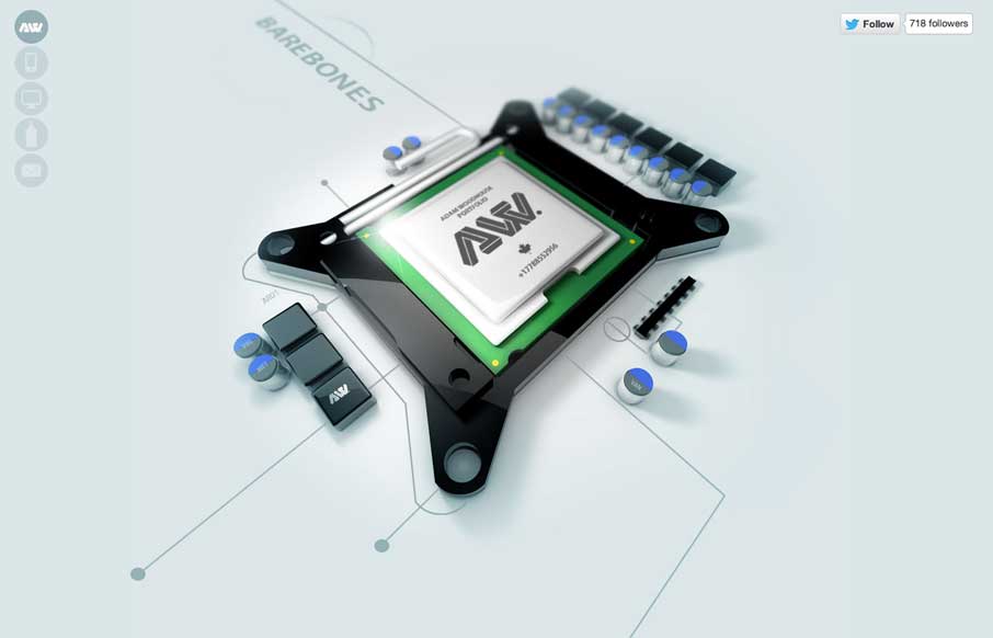
Adam Woodhouse
The Adam Woodhouse website is clearly a design intended to impress with lush, complex animations and a strong graphical sensibility. Not responsive, but beautiful nonetheless. Plus, Bender.
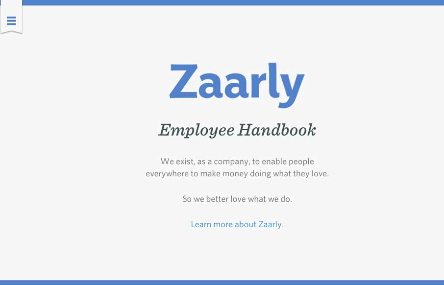
Zaarly Employee Handbook
Nothing super rule breaking about this but it's become commonplace for companies to put things like their employee handbook or benefits info on a website or resource like that. The Zaarly Employee Handbook is just sexy. Nothing more needed to say about it other than...
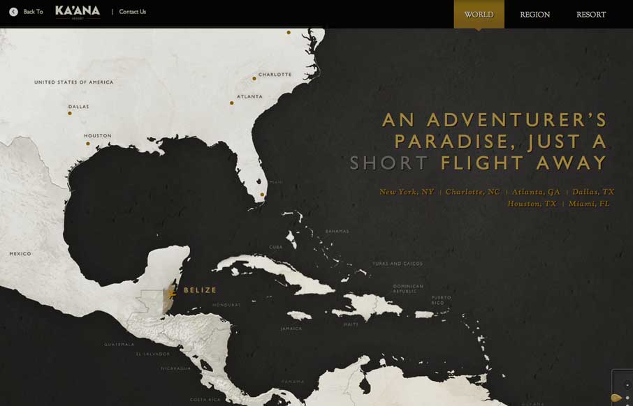
Ka’ana Resort
I can't recall where I saw this description for the map design from first (if it's you please let us know in the comments below) but I it sums it up perfectly: Awesome interactive travel map for Belize. Featuring three levels of zoom with css animations, jQuery photo...
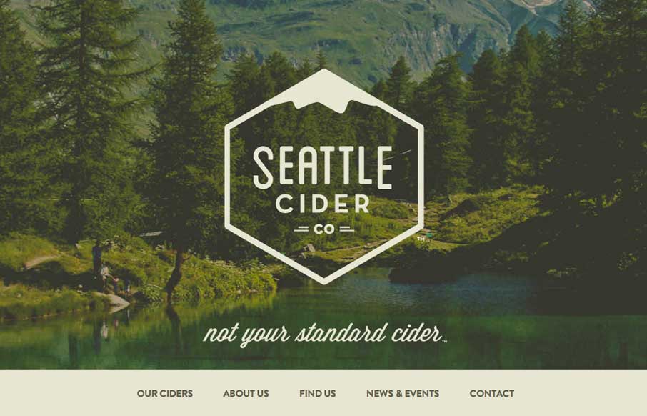
Seattle Cider Company
The Seattle Cider Company website uses flat illustrations and simple interactions to control the narrative of the cider making process. The design style is hip and minimal with a few nifty tricks (like the slide-in fixed nav) and a lot of character. The narrative...
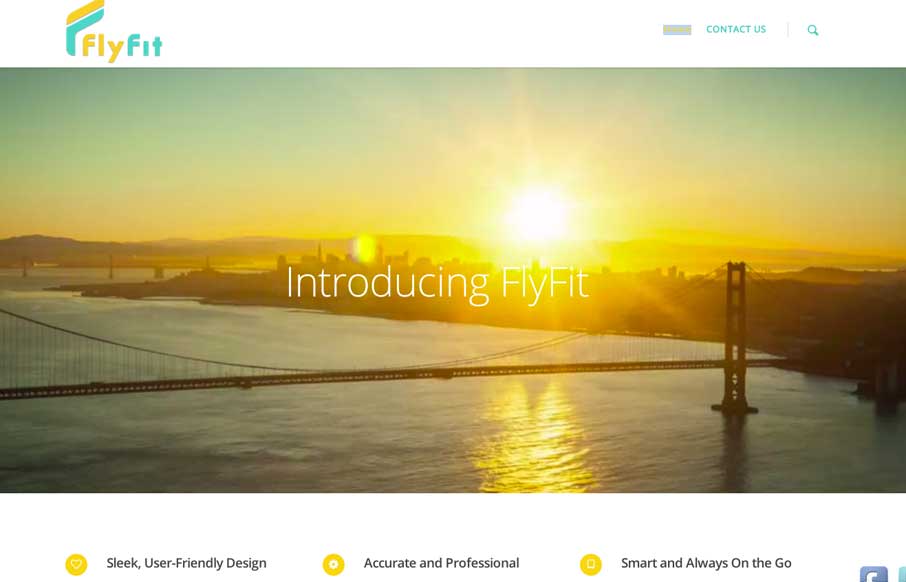
My Fly Fit
This is a fast loading video based site that was made for a large screen. It has subtle parallax elements that don't detract from the main video feature of the site. They could probably go with a cleaner social media linking system, but since it's a new product site,...
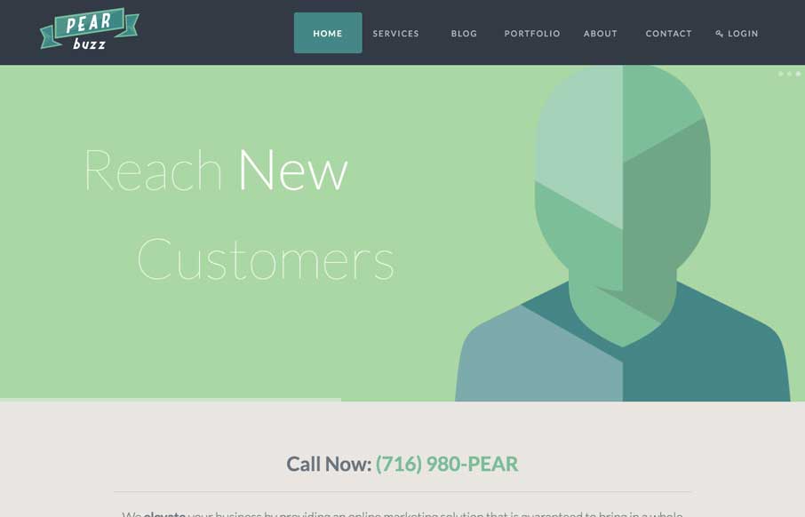
Pearbuzz
Love the colors and icon/illustration work on this site. The layout is pretty formulaic by design trend standards but sometimes that's okay and with well designed elements you can really make things sing.
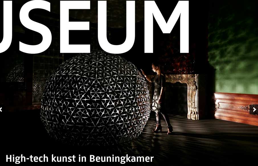
Rijks Museum
There is some really neat design stuff going on with this site. I love how the "Rijks Museum" overlays and play with the slider. Then the top nav is just fun to mess with. Nice responsive work here too.
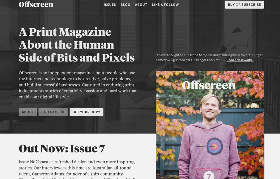
Offscreen Magazine
Offscreenmag.com looks great at all screen sizes. I really enjoy the balance of the typography and soft grays. The site does a great job of balancing a lot of information with a minimal design language. Simple and elegant. We get the mag and that's nifty too. 🙂
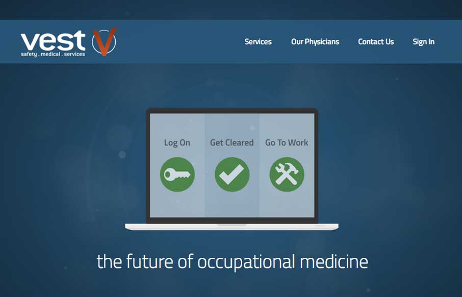
Vest
Vest provides a really nice loading experience, considering it is a site that transfers 1.4MB when loaded. The main view loads a simple graphic and then loads in the heavier images whenever they are a available. The effect is something like a load screen that doesn't...
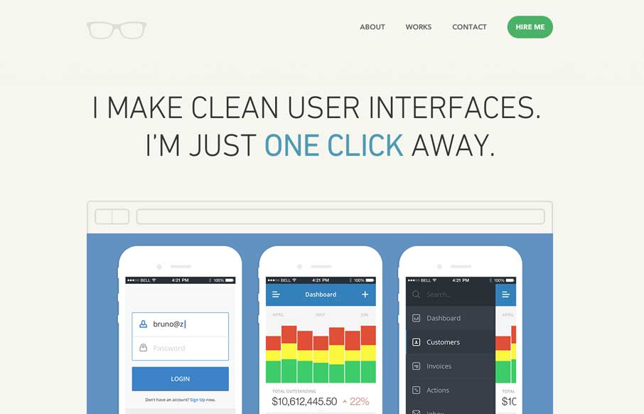
Bruno Felicio
Really simple minimal approach done well. I like the logo, then to see it used again on top of the guy's self-portrait illustration. Nice simple layout that let's me see the work really fast while looking engaging at the same time.
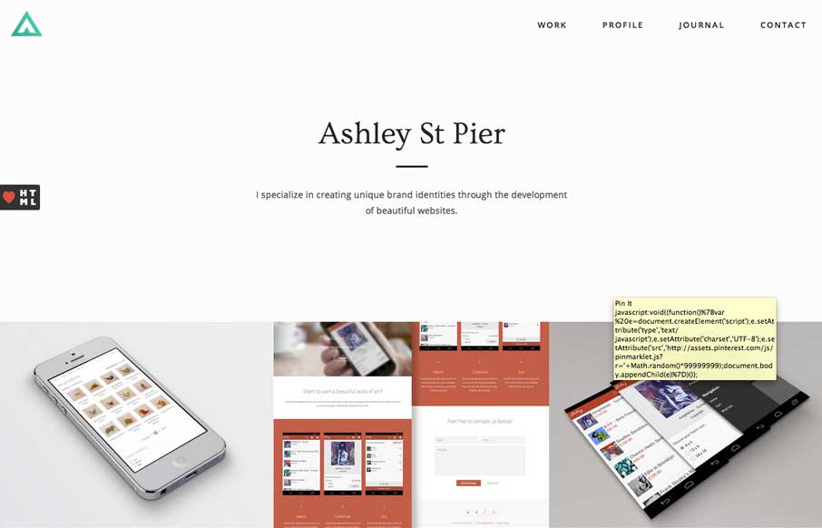
Ashley St Pier
Ashleystpier.com is big and beautiful. This kid is drinking the minimal Kool-Aid and it is working. Very nice portfolio site with minimal detailing and superb balance.
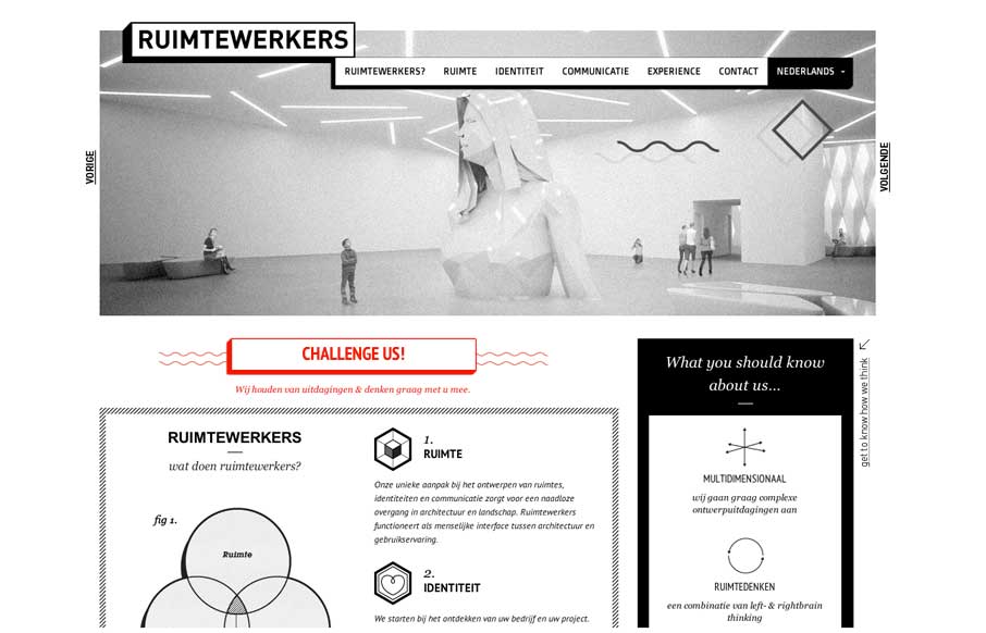
Ruimtewerkers
I like the stark black and white box design of this website. Very simple and clean yet it almost feels gritty due to the way the boxes are used. That fixed nav section is pretty slick. I like how it just folds down to "nav" for mobile screen widths too.
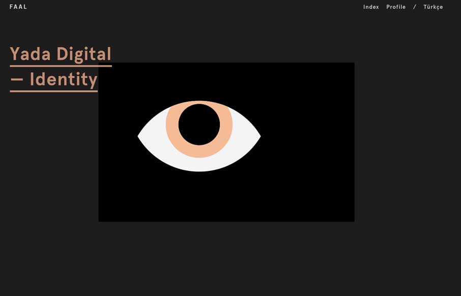
FAAL
Very nice portfolio site. I really dig the dark design and the simple way the title of the work is presented overly large like that. Very cool.
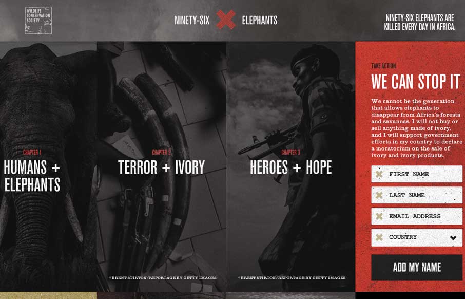
96 Elephants
Beautiful website for a good cause. I really like how the petition slide-out menu works, kind of following you down the page as you scroll end bouncing out when you click. Beautiful photography too. Sign it and maybe save an elephant man!
EMAIL NEWSLETTER
News & Articles
Barcamp Tour: Jonathan Kay
Talking with Jonathan Kay about BarcampTour, the new assemblage of efforts from GrasshopperGroup, Wufoo & Mailchimp.
Stefan Hartwig: Electric Pulp
Designer chat session with Stefan Hartwig of Electric Pulp about their new website and some insight into their business & clients.
Book Review: The Elements of Typographic Style
Taking it back to basics and talking about typography with this classic book. Also comment to win a copy.

HARD WORK. CLEAN FUEL. NO EXCUSES
Use “WARRIOR2023″ for 10% off.