Web Design Inspiration Curated
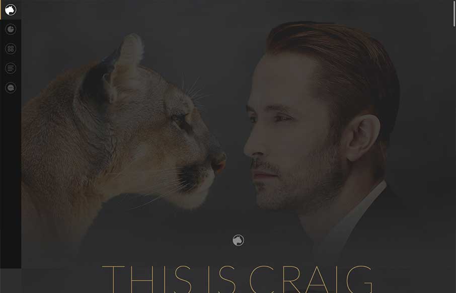
This is Craig
Thank the gods of the interwebs that there is finally a designer portfolio page that has everything you want in a significant other - smart, beautiful, and funny. We joke around here sometimes that we would like to change the message of our client services website to...
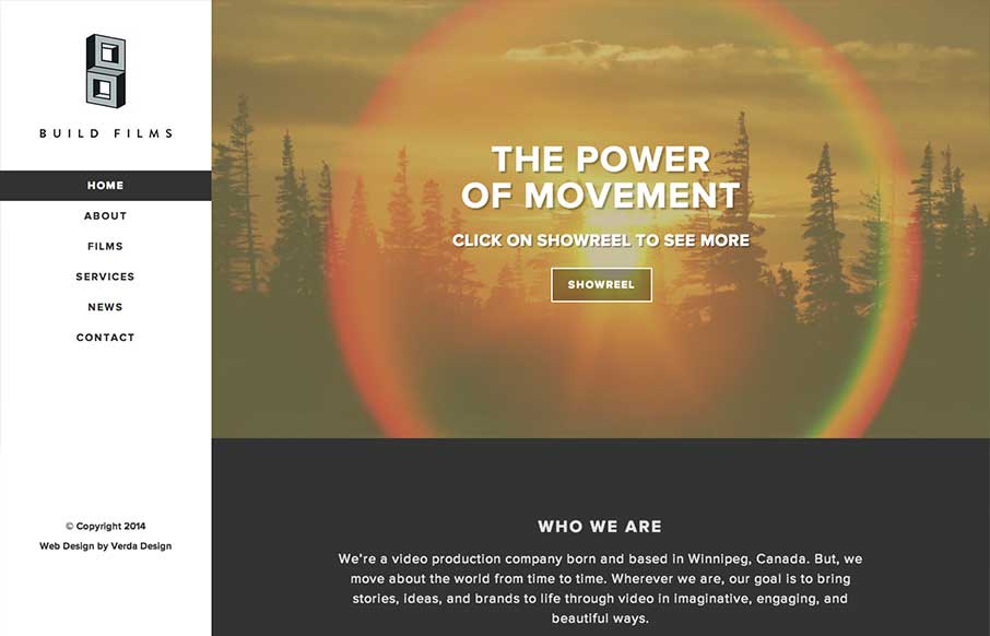
Build Films
I love the vibe of this site. The colors and use of the video work. I also dig the side bar navigation scheme, with it being fixed etc... Submitted by: Madison Zyluk @verdadesign Role: Designer Responsive website for a video production company in Winnipeg, Canada....
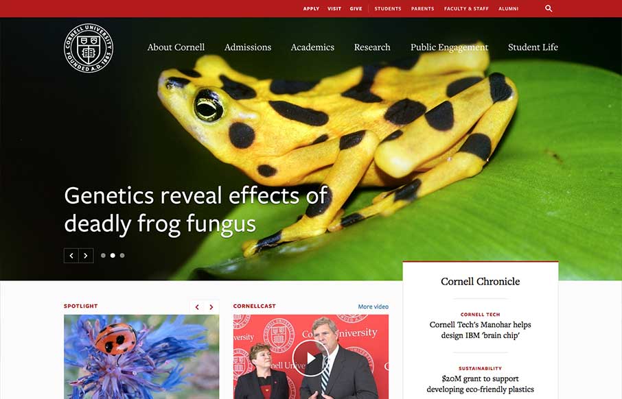
Cornell
One of the better responsive higher ed site's i've ever reviewed. There's tons of nice design patterns in play here as well as other detail work. What's most striking is that the responsive design isn't just the home page, but seems to go pretty deep throughout the...

ps.design v6
Nice clean simple website for a web designer's portfolio. I like the long form write ups and just the simple showing of work. Submitted by: Phil Stringfellow @psdesignuk Role: Designer & Developer This is v6 of my personal website and portfolio, featuring parallax...
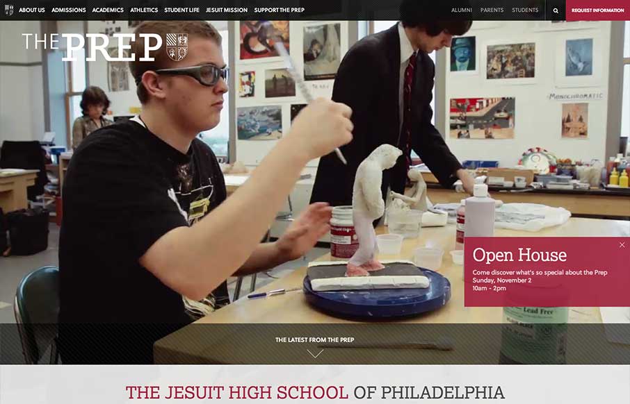
St. Joseph’s Prep
The St. Joseph's Prep website is quite nice. I like the video background and how when the page scales down to smaller widths they swap out for a static image and then down to nothing for mobile devices. Nice strong easy to scan grid design too. Looks to be powered by...
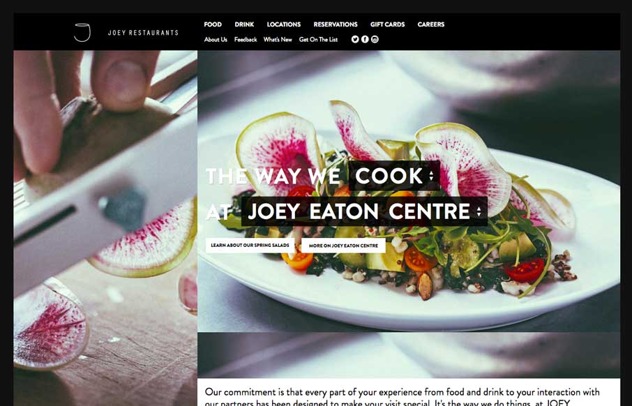
JOEY Restaurant Group
Decent responsive effort on the JOEY Restaurant Group website, it doesn't appear to scale all the way down past say an iPad width though. I like how they keep the home page short and succinct and stuff.

Airbus Group
Pretty cool grid based layout, very solid. I'm not wild about using the hamburger icon alone as the navigation kick off for all screen widths and stuff. But I do give them points for just sticking with it. Airbus Group (formerly EADS), the largest aviation and...
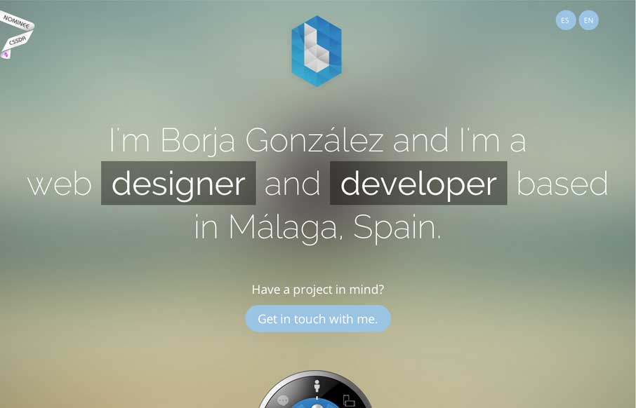
Borja González
Borja has a cool CSS feature that you probably don't on your portfolio site - a dial that brings up different content. Why should you care - because portfolio sites should not just be about showing your previous work, but also to: Try. New. Things. So go this weekend,...
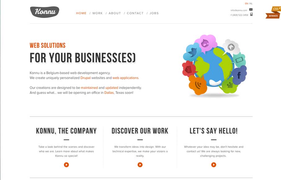
Konnu
The things I would have said about Konnu's website were exactly what their founder said about it (below). Added to what he said, I like how the navigation works in the mobile version - gives it a little of the current app navigation feel. Submitted by: Tim Vanhalewyck...
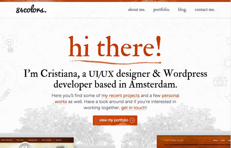
84colors
Christiana Bardeanu's portfolio site shows off her work, and probably shows off a little of who she is a human too. She has her portfolio of work page which is good, but pay special attention to the floral background images - then go to her blog, and you'll see her...
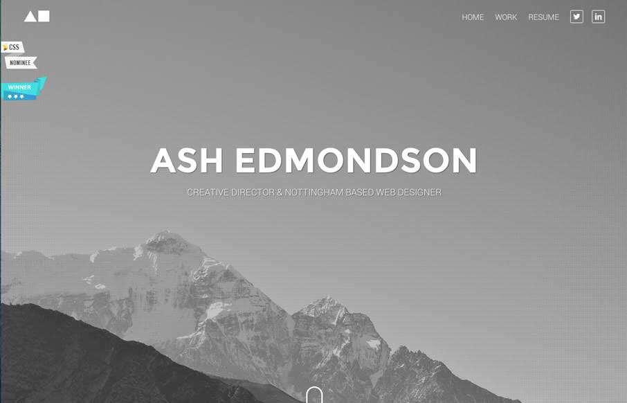
Ash Edmondson
Great portfolio site that is simple, but has some sweet subtle functionality items that make it cool. And make sure you look at his resume - if Ash is this detail oriented with his resume, pretty sure he is with his work...
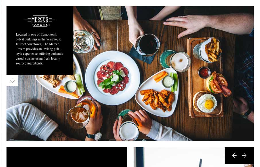
Mercer Tavern
The majority of restaurant websites are awful. Period. Mercer Tavern's website on the opposite side of the spectrum. They prove that you can make a great restaurant website, that is clean, cool, and small. The pictures make the site cool, and the literal white space...
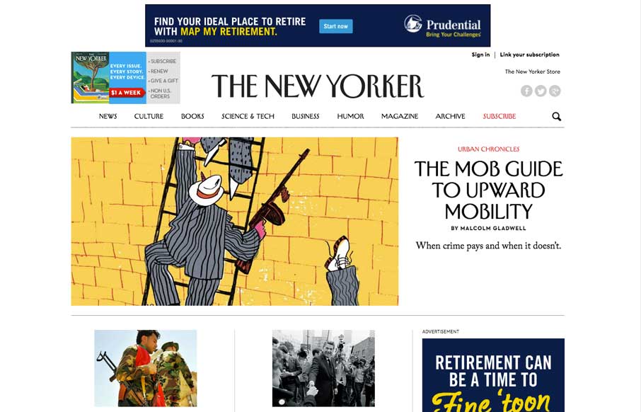
The New Yorker
We've watched over the years as purveyors of print have made uneasy transitions to the web. Last week, the redesign The New Yorker's website shows they've worked hard to translate their magazine into the modern interwebs. Great use of the images and typefacing that...
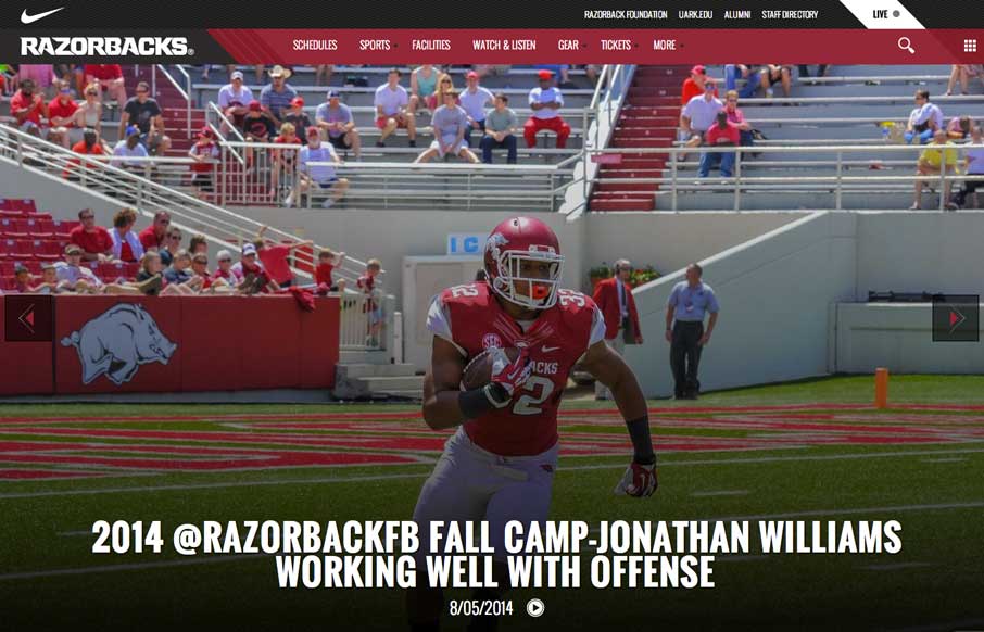
Arkansas Razorbacks
Football (Gridiron) season is in a couple of weeks. Even though this isn't my favorite team, really like their website. The large images and videos give it a bold and loud feeling, that translates really well if you're a fan.
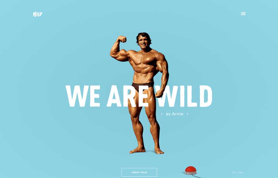
WILD
Um... yeah... where to start? Astronauts rotating around text? Parallax of a boxer being counted out? Wild navigation scheme that makes it fun to move around the site? Hamburger icon that animates into an X? Or the easter egg of all easter eggs - Arnie, with an...

Cleek
Neat, one page agency site that looks like a poster - a poster with css animations and hints of parallax. It's a different style than most agencies use, adding some uniqueness to the agency site landscape. Plus - what other sites have a slot-machine-fashion-plate-like...
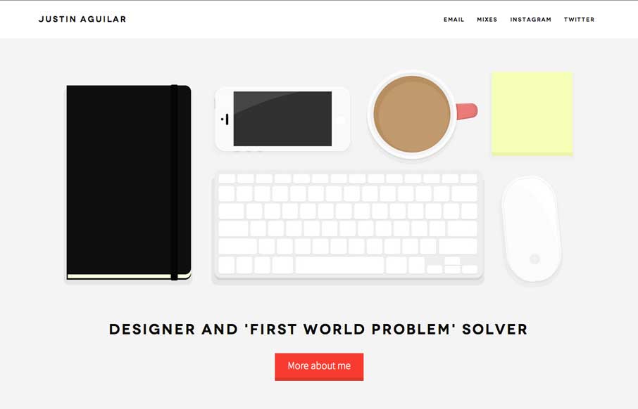
Justin Aguilar
Really like Justin's use of navigation, both in the Work section, and in the header. It's different, active, animated, and gets away from the proverbial hamburger menu icon - which is always a good thing. The rest of the site is clean and crisp, with some good demos...
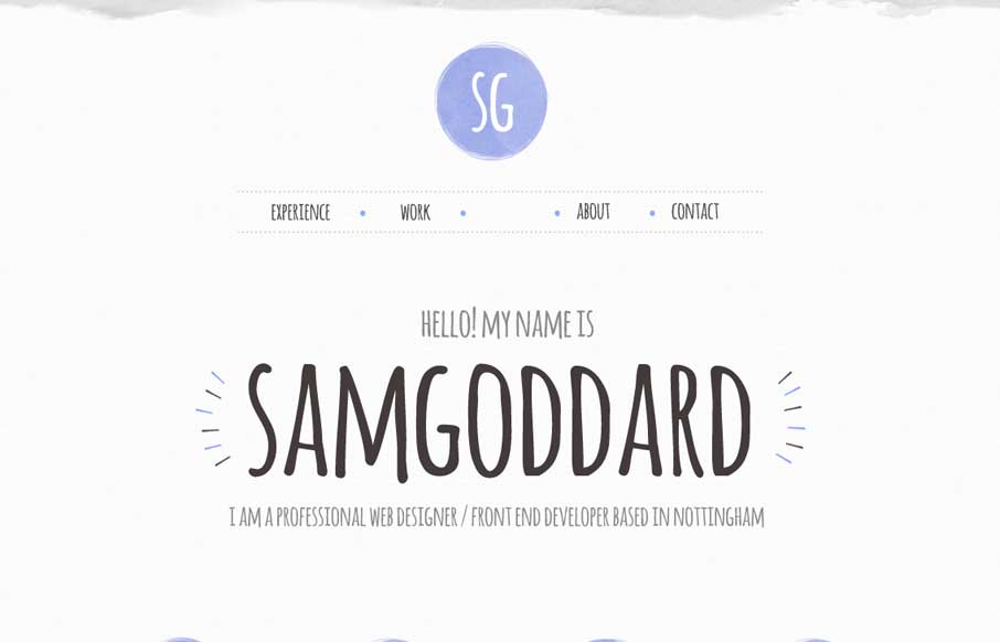
Sam Goddard
Cool portfolio site that looks like Sam is into trying out new stuff - including some nice animations and icon work. Like in the Work areas how he specifically refers to what skills he used per project, instead of a nebulous skill set dashboard like most portfolios....
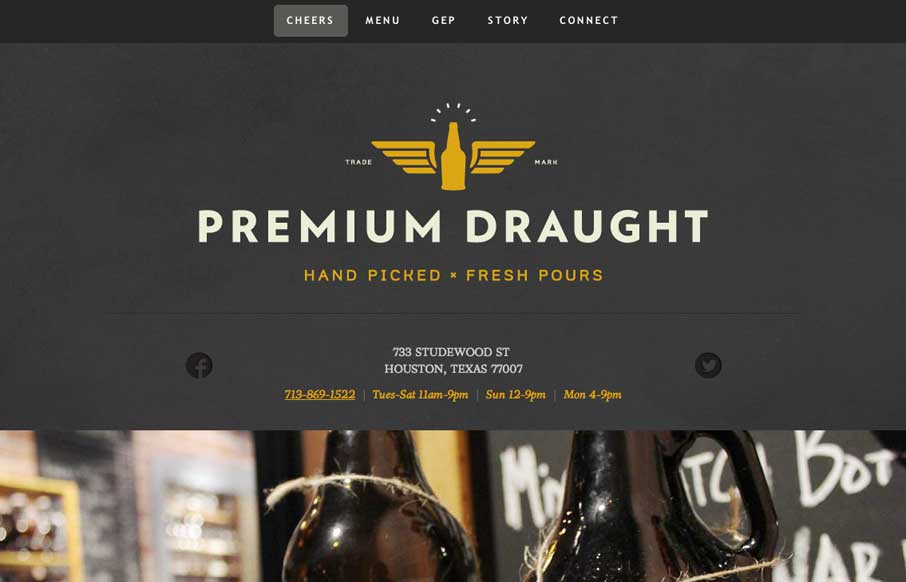
Premium Draught
A good one page site that seems to be an extension of the growler fill station itself (making the site background / tecture look like the chalkboards in the store). In the mobile version, they've made the menu more accessible for your phone, without resorting to a...
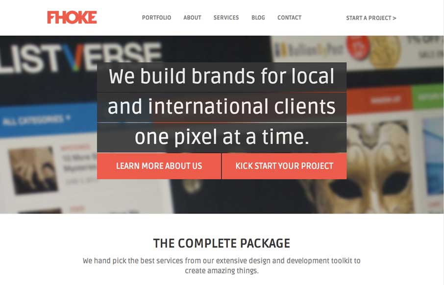
FHOKE
We've reviewed some of FHoke's work before (i.e., Judgement Day) so cool that we get a look at their agency site. Really like the interaction of the jQuery masonry on the Portfolio page (we did this for a client recently - not as easy as it looks to pull off right) -...
EMAIL NEWSLETTER
News & Articles
Aarron Walter on The NBSP Show
![]() This episode’s guest is Aarron Walter author of “Designing for Emotion” and current lead user experience designer at Mailchimp. Hosted by Christopher Schmitt and Dave McFarland.
This episode’s guest is Aarron Walter author of “Designing for Emotion” and current lead user experience designer at Mailchimp. Hosted by Christopher Schmitt and Dave McFarland.
Using the CSS Border-Image Property
 How to get the most out of the CSS Border-Image property. By guest writer Jamy Golden.
Kristina Halvorson on The NBSP Show
![]() This episode’s guest is Kristina Halvorson. Hosted by Christopher Schmitt and Ari Stiles.
This episode’s guest is Kristina Halvorson. Hosted by Christopher Schmitt and Ari Stiles.

HARD WORK. CLEAN FUEL. NO EXCUSES
Use “WARRIOR2023″ for 10% off.