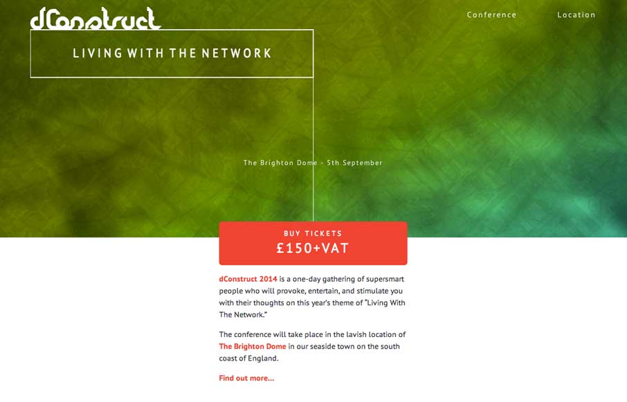
Cool and simple site on the surface, but we know from experience that getting simple down can be hard. We’re seeing more of the canvas / css / svg animations that respond to your input, and this is a nice, light use of it just to get your attention, but not detract from the main purpose of the site. Like the fact that they don’t use just a standard Google map, and they use Mapbox on their location page – more in-line with the look and feel of the site.


The Call to Action, Revisited
The Call to Action hasn’t changed in a decade, but the bar has. A fresh look at prominence, copy, mobile tap targets, and accessibility, with lessons from three major design systems.


0 Comments